Guide to TypeScript and Styled Components

To attract more users and improve the overall user experience, it is crucial to have a visually appealing and well-designed user interface (UI) for our websites, applications, blogs, products, etc.
The UI serves as the point of interaction between the user and the application. For example, consider the eCommerce portal.
This user interface displays how the e-commerce application connects with its users through an attractive, accessible, and easy-to-understand design.
The use of appropriate styling tools and programming languages ensure a smooth and seamless user experience.
- What are Styled Components in TypeScript?
- Configuration of a styled component in TypeScript
- Passing Props
- Theming
- Global styling
- Media Queries
- Additional features of styled components
What are Styled Components in TypeScript?
Styled components are nothing more than an advanced styling tool for using CSS code to construct React and React native components. It is an exclusive CSS-in-JS styling tool for React. React is a JavaScript library used to create user interfaces, while React Native is also used to create user interfaces for mobile applications.
Styled components enable you to style your components using actual CSS code. A styled component eliminates the mapping between components and styles; when you define your styles, you create a standard React component and attach them to it.
Styled components (CSS-in-JS) offer primitives for applying local CSS styles to a component with distinct, automatically created CSS classes."Tagged template literals" are used in styled-components to style the components.
Let's explore the following contents to learn how we will use styled-components in React JS to enhance TypeScript.
Configuration of a styled component in TypeScript
Configuring Styled Components with TypeScript is a straightforward process. Here's a step-by-step guide to help you get started:
Step-1: Install Required Packages
Execute the following commands in your root directory to install styled components and the type definitions.
npm install styled-components @types/styled-componentsStep-2: Configure TypeScript
If you haven't already set up TypeScript in your project, create a tsconfig.json file in the root of your project. This file specifies the compiler options and type-checking rules for TypeScript.
// tsconfig.json
{
  "compilerOptions": {
    "target": "es6", // or your desired ECMAScript target
    "jsx": "react", // if you're using React
    "module": "esnext", // or your desired module system
    "strict": true, // enables strict type-checking
    "esModuleInterop": true, // allows default imports from CommonJS modules
    "skipLibCheck": true // optional, can speed up compilation
  }
}
Step-3: Create a Styled Component:
Import the styled-components package into your App.tsx or App.ts file.
import styled from 'styled-components'Make a styled button element and render it inside an HTML section tag above the App function.
// Button.tsx

const Button = styled.button`
  /* Define your styles here */
  padding: 10px 20px;
  background-color: blue;
  color: white;
  border: none;
  border-radius: 4px;
  cursor: pointer;
`;
Step-4: Use the Styled Component:
You can now use the Button styled component in your React components. TypeScript will automatically recognize the typings for the styled component.
// App.tsx
import React from 'react';
import Button from './Button';

const App: React.FC = () => {
  return (
    <div>
      <Button>Click me</Button>
    </div>
  );
};

export default App;
Step-5: Optional: Typing Props
If your styled component accepts props and you want to type them, you can use TypeScript's generic support for styled-components. You can create an interface for the props and pass it as a generic to the styled function.
// Button.tsx
import styled from 'styled-components';

interface ButtonProps {
  primary?: boolean;
}

const Button = styled.button<ButtonProps>`
  /* Define your styles here */
  padding: 10px 20px;
  background-color: ${(props) => (props.primary ? 'blue' : 'gray')};
  color: white;
  border: none;
  border-radius: 4px;
  cursor: pointer;
`;
Now you can use the primary prop in the Button component:
// App.tsx
import React from 'react';
import Button from './Button';

const App: React.FC = () => {
  return (
    <div>
      <Button>Default Button</Button>
      <Button primary>Primary Button</Button>
    </div>
  );
};

export default App;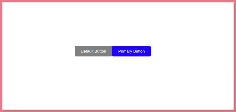
Passing Props
UI components are made more dynamic by the usage of properties, or props for short. One significant benefit of using CSS in a JavaScript solution is the ability to pass customized props at runtime and adapt CSS in accordance.
Consider a scenario where you need two buttons with different border colors but all other CSS values are the same. You may give props to each button under the condition that if the props value is present, the CSS property should be changed.
...
<BUTTON submit={true}> first Btn </BUTTON>
<BUTTON pay="shopping"> Second Btn </BUTTON>
...
From the aforementioned code, I assigned the first button the prop of submit and a boolean as the data type, and I assigned the prop of pay and a string to the second button.
Now, I define an interface containing both properties at the top of the styled button.
...
interface IBtn {
  submit: boolean;
  pay: string;
}

const BUTTON = styled.button`
  border: 1px dotted yellow;
  background: white;
  color: black;
  font-weight: 500;
`;
...
Now, all you have to do is pass this interface to the styled button, which will help the typescript check the types of properties that should be accepted for the component.
...
const BUTTON = styled.button<IBtn>`
...
And after that, without TypeScript raising any errors, we can define the CSS properties based on the props the component receives.
...
const BUTTON = styled.button<IBtn>`
  border: 1px ${props => (props.submit ? 'solid' : 'dotted')} yellow;
  background: white;
  color: black;
  font-weight: ${props => (props.pay === "shopping" ? 'bold' : 500)};
`;
...
Theming
By providing a wrapper component called <ThemeProvider>, styled-components offer complete theming functionality. Through the context API, this component grants a theme to all React components that are nested within it.
All styled components in the render tree, regardless of how many levels deep they are, will have access to the specified theme.
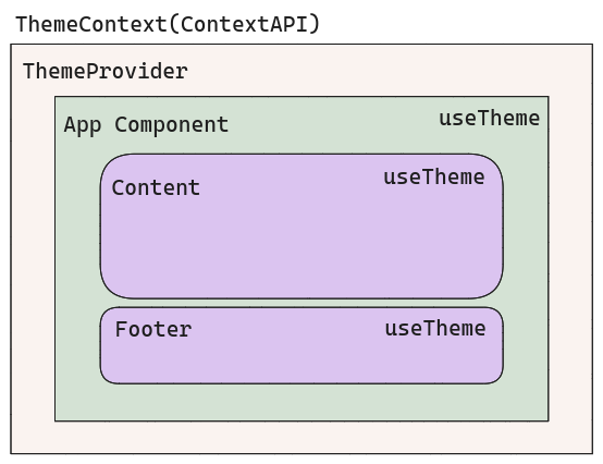
As you can see in the pictorial representation above, we want to define a ThemeContext and then wrap the whole app inside a ThemeContext.Provider.
Let's define a Theme interface first. Here, I want to construct a Theme interface with keys named according to the naming pattern for CSS variables. While color values vary depending on the current theme, color names are constant across all themes.
interface Theme {
    '--primary': Color;
    '--secondary': Color;
    '--background': Color;
}
Then I developed a Color enum that lists every colour used in the app.
enum Color {
  ORANGE = "#F86F03",
  BLUE = "#525FE1",
  LIGHT_GRAY = "#F4F4F4",
  WHITE = "#FFF",
}
To identify the chosen theme, we additionally require a ThemeType type.
type ThemeType = 'dark' | 'light';Finally, we require a themes configuration that details all of the colours used in each theme.
const THEMES: Record<ThemeType, Theme> = {
  light: {
    "--primary": Color.ORANGE,
    "--secondary": Color.BLUE,
    "--background": Color.LIGHT_GRAY,
  },
  dark: {
    "--primary": Color.ORANGE,
    "--secondary": Color.WHITE,
    "--background": Color.BLUE,
  },
};
Then, Themes Provider,
import React, { Dispatch, SetStateAction } from "react";
import { THEMES } from "./Theme.config";
import { ThemeType, Theme } from "./Theme.types";

interface ThemeContextProps {
  themeType: ThemeType;
  theme: Theme;
  setCurrentTheme: Dispatch<SetStateAction<ThemeType>> | null;
}

export const ThemeContext = React.createContext<ThemeContextProps>({
  themeType: "light",
  theme: THEMES["light"],
  setCurrentTheme: null,
});

export const ThemeProvider: React.FC = ({ children }) => {
  const [currentTheme, setCurrentTheme] = React.useState<ThemeType>("light");
  return (
    <ThemeContext.Provider
      value={{
        themeType: currentTheme,
        theme: THEMES[currentTheme],
        setCurrentTheme,
      }}
    >
      {children}
    </ThemeContext.Provider>
  );
};

export const useTheme = () => React.useContext(ThemeContext);
A popular react context implementation is the ThemeContext.I created a context type first. ThemeContextProps the context was then constructed with a starting state.
export const ThemeContext = React.createContext<ThemeContextProps>({
  themeType: "light",
  theme: THEMES["light"],
  setCurrentTheme: null,
});
Next, a ThemeProvider that accepts children as an argument must be made. It's crucial to have ThemeProvider support for rendering React components.
CurrentTheme state is managed by ThemeProvider. Finally, ThemeContext.Provider with the value object is returned. I passed themeType, theme, and setCurrentTheme in this example.
- themeType - To know which theme is active at any given time and to be able to respond to that knowledge.
- theme - This object includes each of the colors used in the current theme.
- setCurrentTheme - theme-changing function.
I made the decision to wrap the entire react render in the ThemeProvider so that I could utilise the useTheme hook in the App component.
ReactDOM.render(
  <React.StrictMode>
    <ThemeProvider>
      <App />
    </ThemeProvider>
  </React.StrictMode>,
  document.getElementById("root")
);
We can easily obtain the theme via the useTheme hook to use it.
const { theme, themeType } = useTheme()Now, depending on the themeType, we can render a specific graphic or another UI element, like in:
const logo = themeType === 'light' ? darkLogo : lightLogo We must supply the theme object as CSS variables in order to use dynamic theme colours.
<div style={{ ...theme } as React.CSSProperties}>
	{/* Content */}
</div>
In essence, what happened above propagated the theme object in the div's style attribute. Now would be a good moment to remind you of the appearance of the theme object.
Theme object therefore contains keys named according to the naming rules for CSS variables, and the values are colours listed in the Color enum.
These values were supplied as CSS variables, for instance.
'--primary': Color.ORANGE,

.example {
    color: var(--primary)
}
We can access all of the colours for the entire components tree if we supply the theme as a value for the style attribute at the very top level of the app.
Entire Code:
index.tsx
// src/index.tsx
import React from "react";
import ReactDOM from "react-dom";
import { ThemeProvider, useTheme } from "./ThemeContext.tsx";
import "./styles.css";

const App = () => {
  const { theme, themeType, setCurrentTheme } = useTheme();

  const logo =
    themeType === "light" ? "dark logo" : "light logo"; // Replace with your logo components

  const handleThemeToggle = () => {
    setCurrentTheme(themeType === "light" ? "dark" : "light");
  };

  return (
    <div className="app" style={{ ...theme }}>
      <h1>Themed App</h1>
      <button onClick={handleThemeToggle}>Toggle Theme</button>
    </div>
  );
};

const rootElement = document.getElementById("root");
ReactDOM.render(
  <React.StrictMode>
    <ThemeProvider>
      <App />
    </ThemeProvider>
  </React.StrictMode>,
  rootElement
);
styles.css
body {
  font-family: Arial, sans-serif;
}

.app {
  display: flex;
  flex-direction: column;
  align-items: center;
  justify-content: center;
  min-height: 100vh;
  background: var(--background);
  color: var(--primary);
}

.example {
  font-size: 20px;
  margin-top: 10px;
}
ThemeContext.tsx
import React, { Dispatch, SetStateAction } from "react";

enum Color {
  ORANGE = "#F86F03",
  BLUE = "#525FE1",
  LIGHT_GRAY = "#F4F4F4",
  WHITE = "#FFF",
}

type ThemeType = "dark" | "light";

interface Theme {
  "--primary": Color;
  "--secondary": Color;
  "--background": Color;
}

const THEMES: Record<ThemeType, Theme> = {
  light: {
    "--primary": Color.ORANGE,
    "--secondary": Color.BLUE,
    "--background": Color.LIGHT_GRAY,
  },
  dark: {
    "--primary": Color.ORANGE,
    "--secondary": Color.WHITE,
    "--background": Color.BLUE,
  },
};

interface ThemeContextProps {
  themeType: ThemeType;
  theme: Theme;
  setCurrentTheme: Dispatch<SetStateAction<ThemeType>> | null;
}

export const ThemeContext = React.createContext<ThemeContextProps>({
  themeType: "light",
  theme: THEMES["light"],
  setCurrentTheme: null,
});

export const ThemeProvider: React.FC = ({ children }) => {
  const [currentTheme, setCurrentTheme] = React.useState<ThemeType>("light");
  return (
    <ThemeContext.Provider
      value={{
        themeType: currentTheme,
        theme: THEMES[currentTheme],
        setCurrentTheme,
      }}
    >
      {children}
    </ThemeContext.Provider>
  );
};

export const useTheme = () => React.useContext(ThemeContext);
Output:

Global Styling
Users can change the overall style of their entire website using a system and interface called global styles, which eliminates the need to edit individual blocks or pages.
Users can choose a colour for the body background or adjust the line height for all of their heading blocks at once. We will employ the createGlobalStyle function to declare styles that apply to the entire website.
To achieve this, we will add a global.ts file to the src/styles directory.
Global styles:
// src/styles/global.ts
import { createGlobalStyle } from "styled-components";
import BackgroundImage from "../assets/background.jpg";

export default createGlobalStyle`
  * {
    margin: 0;
    padding: 0;
    outline: 0;
    box-sizing: border-box;
  }

  html {
    background: url(${BackgroundImage}) no-repeat center center fixed;
    -webkit-background-size: cover;
    -moz-background-size: cover;
    -o-background-size: cover;
    background-size: cover;
  }

  #root {
    margin: 0 auto;
  }
`;
A centralised background picture will be declared in the HTML and imported from a suitable path, in this case src/assets/background.jpg.
Media queries
Media queries are a crucial component of responsive web design because they let you design different layouts based on the size of the viewport.
However, they can also be used to identify other aspects of the platform your site is running on, such as whether the user is using a touchscreen instead of a mouse.
A website or app's appearance (and sometimes even behaviour) can be changed by media queries in response to a matching set of criteria regarding the user's device, browser, or system settings.
const customMediaQuery = (maxWidth: number) =>
  `@media (max-width: ${maxWidth}px)`;

const media = {
  custom: customMediaQuery,
  desktop: customMediaQuery(992),
  tablet: customMediaQuery(768),
  phone: customMediaQuery(576),
};

const ContentBlock = styled.div`
  width: 4em;
  height: 4em;
  background: white;

  /* Now we have our methods of raw queries */
  ${media.desktop} {
    background: green;
  }

  ${media.tablet} {
    background: yellow;
  }

  ${media.phone} {
    background: blue;
  }
`;

render(<ContentBlock />);
Additional features of styled components
- Combined with code splitting, styled components fully automatically inject their styles while keeping track of which components are rendered on a page.
- For your styles, styled components generate own class names. There are no issues with duplication, overlap, or misspellings.
- CSS deletion is made simpler because it might be challenging to determine whether a class name is used elsewhere in your codebase. It is clear thanks to styled-components since each styling element is linked to a certain component. When a component is eliminated if it is unused (which tooling may identify) then all of its styles are also deleted.
- Styled Components is a simple dynamic styling that allows you to adjust the styling of a component based on its props or a global theme without having to manually maintain dozens of classes.
- No matter how large your codebase is, maintenance is simple since you never have to search through multiple files to find the styling that affects your component.
- Automatic vendor prefixing: Use the current standard when writing your CSS, and let styled-components take care of the rest.
Conclusion
In CSS-in-JS libraries, styled components is a popular framework that allows you to use inline styled components in your React projects.
The styles you create for your components won't influence other components unless you want them to, as they have an isolated scope. Code splitting, automatic vendor prefixing, and basic dynamic styling are supported by styled components.
Since styled components are an advanced form of HTML and CSS, it is necessary to understand the fundamentals of HTML, CSS, and TypeScript before using them with styled components.
Conclusively,
(Styled Component = HTML + CSS) 👉 used with React (UI software) and TypeScript 👉 to style your user interface.
React Performance Monitoring with Atatus RUM
Visualize React errors and performance issues influencing your end-user experience. With React performance monitoring of Atatus you can identify and resolve problems faster with in-depth data points that assist you in analyzing and resolving them.
Ensure that your React app sends all XHR requests. Monitoring and measuring the response times and failure rates of XHR calls. Optimize AJAX request performance by identifying slow and failed calls. Analyze AJAX calls in real time based on the browser, the user, the version, the tag, and other attributes.

Identify the reasons behind bad front-end performance and slow page loading that are impacting your customers. Inspect individual users who are experiencing poor performance because of slow pages, React exceptions or a failing AJAX method.
Take a closer look at your React app's performance with Atatus. To get started activate Atatus free-trial for 14 days!
#1 Solution for Logs, Traces & Metrics
 APM
APM
Kubernetes
Logs
Synthetics
RUM
Serverless
Security
More