Top 10 React Component Libraries/Frameworks for 2024
JavaScript is one of the unconquerable front-end languages. About 95.2% of websites are built using JavaScript. It is a client-side scripting language through which you can interact with the user through windows, buttons, menus and forms. It is used in animations, games, and so on.
JavaScript is one of the most popular languages all over the world and has become the standard for creating websites.
You can build a website from scratch yet the approach would be incredibly time-consuming. That is where JavaScript frameworks come into play.
And it is no secret that React is one of the most popular front-end frameworks in Javascript while building applications.
Let's get into the blog and understand more about react and its libraries. Here is the table of contents I'm going to cover in this blog.
Table Of Contents
#1 What is React.js?
React.js is one of the popular JS frameworks which is used to build user interfaces in applications and it is especially used to build Single Page Applications. Since it is handling the view layer it can be used for developing both web and mobile applications.
Did you think??? 🤔
Why do I want to consider React.js while developing web applications when I have jQuery, angular and other popular frameworks in the market?
Here are a few reasons why did I chose React.js over other frameworks.
- Component-based
- Uses Virtual-DOM
- Single Data Binding
- Easy to build SPA (Single Page App)
- Simple, yet powerful
- Declarative
- Supports server-side
When I compared React.js, Angular and jQuery using google trends to check which framework has been explored the most, I was surprised to see the analytics.
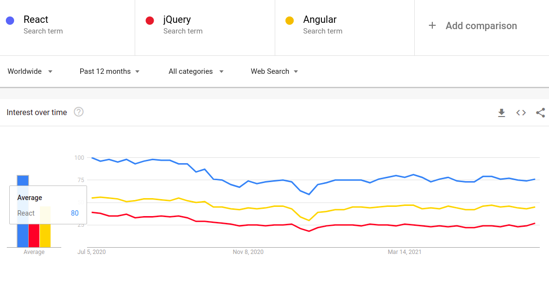
Based on the Stack Overflow survey, more than 35% of respondents reported React.js as the most loved JS framework. And jQuery is slowly losing ground to React.js and Angular year over year.
Best React Component Libraries
Picking the proper React component library for your application could be problematic since there are lot of libraries, available nowadays.
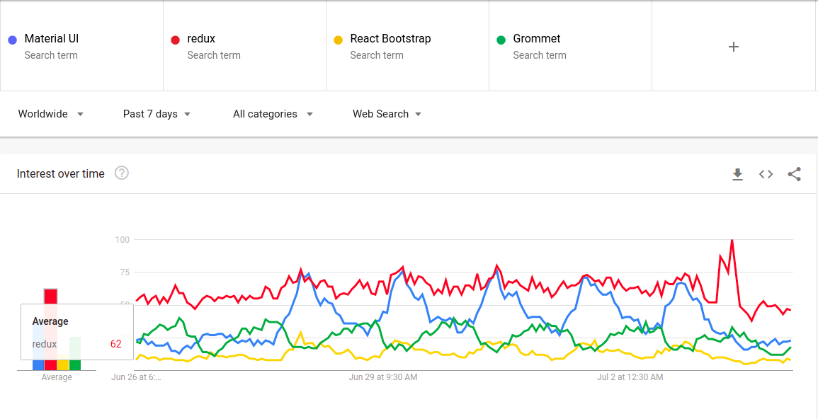
To make your task easy and simple we have collected the 10 best React component libraries that are popular among developers based on google search trends.
- Material UI
- Ant Design
- Redux
- React Bootstrap
- Grommet
- Rebass
- Semantic UI
- Blueprint
- Chakra UI
- Fluent UI
Let's take a deep look into each React component libraries/frameworks.
i.) Material UI
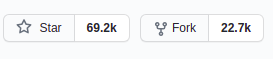
With 69.2k stars and 22.7k forks on GitHub Material UI ranks among the most popular React Component libraries in JS. To build high quality digital experience it offers more simplistic elements.
Material UI contains components for layouts, forms, navigation, data display, and many other widgets. It is a CSS-in-JS solution where you can style you components in "@material-ui/styles", hence it is fast and extensible which has the same advantages as the styled components.
It also provides handful collection of themes which helps us in developing the website quick and more reliable. With the detailed documentation you can easily learn and implement in your project.
It also offers a variety of free and paid themes which start at $59 for standard licence whereas you can also build your own customizable themes. It is a general-purpose library which can be used to build any kind of web applications.
Installation
// with npm
npm install @material-ui/core

// with yarn
yarn add @material-ui/core
Usage:
import React from 'react';
import ReactDOM from 'react-dom';
import Button from '@material-ui/core/Button';

function App() {
  return (
    <Button variant="contained" color="primary">
      Hello World
    </Button>
  );
}

ReactDOM.render(<App />, document.querySelector('#app'));
ii.) Ant Design
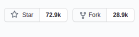
With 72.9k stars and 28.9k forks in GitHub, Ant Design also known as AntD is the second most popular React based framework and often it is used to build enterprise applications.
It is basically written in Typescript with static types. It contains high-quality components to build interactive user interfaces.
The major difference between AntD when compared to Material UI and other libraries is it doesn't has a lot of themes as Material UI and Bootstrap. It has around 12 pre-built themes which ranges from $12 to $999.
AntD offers AntD pro which contains components, templates, packages designed for data visualization and other graphical solutions.
Alibaba, Ant Financial, Tencent and Baidu are the notable companies that used AntD to build their websites.
Installation
a.) Using npm
npm install antdb.) Using yarn
yarn add antdUsage:
import { DatePicker } from 'antd';

ReactDOM.render(<DatePicker />, mountNode);
You can import style sheets manually using the below import statement.
import 'antd/dist/antd.css'; // or 'antd/dist/antd.less'iii.) Redux
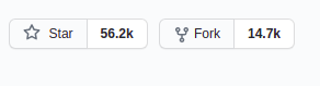
Redux is one of the best react component in React.js since it has around 56.2k GitHub stars and 14.7k forks. It was actually developed to use with React.js but you can also use this with other frameworks like Angular and Vue.js, Ember and other frameworks in JavaScript.
You can easily write consistent codes and it is known as the best friend for many web developers. With Redux, you can also edit your code when your app is in live.
See how redux and can be installed using npm and the basic usage of it.
Installation
npm install @reduxjs/toolkitUsage:
import React from "react";
import { render } from "react-dom";
import { Provider } from "react-redux";

import store from "./store";
import Page from "./Page";

const App = () => (
  <Provider store={store}>
    <Page />
  </Provider>
);

render(<App />, document.getElementById("root"));
iv.) React Bootstrap
React Bootstrap was initially named as Twitter Blueprint which was developed by Mark Otto and Jacob Thornton at Twitter. It is very similar to the original bootstrap but was built using React and has some few differences.
Each component in React bootstrap was built from scratch using React without using the dependencies like jQuery.
When you love using Bootstrap and suppose you are using React to develop your web application you can use React Bootstrap since you can use some all-time favourite Bootstrap components.
There are also free and paid version themes are available in React Bootstrap. Custom bootstrap themes work with React Bootstrap if you have used defined classes and variants.
Installation
npm install react-bootstrap bootstrapUsage:
import React, { useState } from 'react';

import Jumbotron from 'react-bootstrap/Jumbotron';
import Toast from 'react-bootstrap/Toast';
import Container from 'react-bootstrap/Container';
import Button from 'react-bootstrap/Button';

import './App.css';

const ExampleToast = ({ children }) => {
  const [show, toggleShow] = useState(true);

  return (
    <>
      {!show && <Button onClick={() => toggleShow(true)}>Show Toast</Button>}
      <Toast show={show} onClose={() => toggleShow(false)}>
        <Toast.Header>
          <strong className="mr-auto">React-Bootstrap</strong>
        </Toast.Header>
        <Toast.Body>{children}</Toast.Body>
      </Toast>
    </>
  );
};

const App = () => (
  <Container className="p-3">
    <Jumbotron>
      <h1 className="header">Welcome To React-Bootstrap</h1>
      <ExampleToast>
        We now have Toasts
        <span role="img" aria-label="tada">
          🎉
        </span>
      </ExampleToast>
    </Jumbotron>
  </Container>
);

export default App;
v.) Grommet
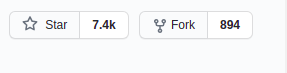
Grommet was developed by HPE and can be used for any kind of screens like mobile phone or laptops. It offers more vibrant and colorful themes than Material UI and Ant Design.
Grommet has around 7.4k stars and nearly 900 forks in GitHub. It is a component library which is designed for responsiveness and accessible web projects.
It does not contain a lot of themes but it does provide two useful tools to customize themes.
- Grommet Theme Designer
- Grommet Designer
They have an active Slack community for support and bugs can be submitted through GitHub. It provides codesandbox with each component including template pattern and component library on storybook.
Many large companies like Uber, Boeing, Netflix, Samsung and Twilio used Grommet to design their websites. Have a look at the Grommet's components using which you can build an unique website.
Installation
npm install grommet grommet-icons styled-components --saveUsage:
import React from 'react';
import { Grommet, Heading } from 'grommet'
function App() {
  return (
    <Grommet className="App">
    </Grommet>
  );

}
export default App;
It also has set of SVG icons which you can install using the below command.
npm install grommet-iconsvi.) Rebass
Brent Jackson, current Gatsby front-end developer created Rebass. You can build customizable UI elements based on Styled system library. This is compatible with CSS-in-JS libraries which lessens the need to write custom CSS in your application.
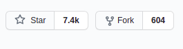
Rebass is light-weight with the footprint of about 4 KB. It has around 7.4k stars and 605 forks in GitHub.
Coming to the components in Rebass it has a foundational set of primitive components which can be extended while building a component library with the consistent API. It includes primitive text, app structure, images, cards and forms with sub-components in forms such as textarea, inputs, sliders, switches, and checkboxes.
It doesn't have library of pre-designed themes, thus themes can be applied using the Theme Provider component and it follows few theme specifications for defining theme objects to use with UI components.
You can easily understand how Rebass works through the documentation. Once it is understood you can fully customize and extend the library.
Here are the steps for installation and basic usage of Rebass.
Installation
npm i rebassUsage
import React from 'react'
import { Box, Heading, Button } from 'rebass'

export default props =>
  <Box>
    <Heading>Hello</Heading>
    <Button>Rebass</Button>
  </Box>
vii.) Semantic UI
Semantic UI is more similar to Semantic UI and is the flavour of semantic web framework in React. It is equivalent to Bootstrap React since it is also jQuery free to make it fully React compatible.
It has library over 50 components and developers can create more responsive web designs with syntactically and coherent code.
It offers auto-controlled state by enhancing the concept of controlled and uncontrolled components of React which helps you to manipulate props.
Despite of all unique features it offers, if you are new to Javascript you will find a bit complexity in learning or using Semantic UI.
Installation
npm install semantic-ui-react semantic-ui-cssOnce the installation is complete, import the minified CSS file in your project.
import 'semantic-ui-css/semantic.min.css'Usage
import React from "react";
import "./styles.css";

import "semantic-ui-css/semantic.min.css";

import { Button, Popup } from "semantic-ui-react";

export default function App() {
  return (
    <div className="App">
      <Popup trigger={<Button>Register</Button>} position="top center">
        Tooltip for the register button
      </Popup>
    </div>
  );
}viii.) Blueprint
Blueprint is used mainly for desktop kind of applications. The components in Blueprint are used mostly for building complex and data-dense interfaces.
Based on the significant dependencies and use cases it has separate components. The core components include buttons, forms, tool tips and much more.
The DateTime component provides a complete set of components to build apps with date-time dependencies and includes DatePicker, DatePicker and so on.
As listed above there are many other separate components like Select, Table, Timezone and Icon components.
While looking for themes it doesn't offer any themes to start from whereas design elements like classes, typography, color schemes can be customizable.
Installation
yarn add @blueprintjs/coreUsage
import { Button } from "@blueprintjs/core";

<Button intent="success" text="button content" onClick={incrementCounter} />
ix.) Chakra UI
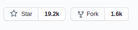
Chakra UI is an upcoming UI with 19.2k stars and 1.6k forks in GitHub and is developed by Segun Adebayo. It offers accessible, reusable and composable react components to design websites and React Native applications.
It offers more around 50 components and most useful are Toast component which helps in creating a pop-up alert and to build user-friendly interfaces it also offers Form components.
You can also build your own components with the help of the documentation provided by Chakra UI.
i.) Installation
a.) Using npm
npm i @chakra-ui/react @emotion/react@^11 @emotion/styled@^11 framer-motion@^4b.) Using yarn
yarn add @chakra-ui/react @emotion/react@^11 @emotion/styled@^11 framer-motion@^4
ii.) To set up the provider add the below JS code in your root of your app.
import * as React from "react"

// 1. import `ChakraProvider` component
import { ChakraProvider } from "@chakra-ui/react"
function App({ Component }) {
  // 2. Use at the root of your app
  return (
    <ChakraProvider>
      <Component />
    </ChakraProvider>
  )
}
You can also Gatsby plugin to do everything automatically.
Installation using Gatsby Plugin
a.) Using npm
npm i @chakra-ui/gatsby-pluginb.) Using yarn
yarn add @chakra-ui/gatsby-pluginThen add the plugin to your gatsby-config.
// gatsby-config.js

module.exports = {
  plugins: ["@chakra-ui/gatsby-plugin"],
}
x.) Fluent UI
Fluent UI formerly known as Fabric React is created by Microsoft which has features similar to office products such as Graphics and behaviours.
It is compatible with Desktops, Android and iOS devices and it is used in Microsoft sites such as Office 365, OneNote, Azure DevOps and so on.
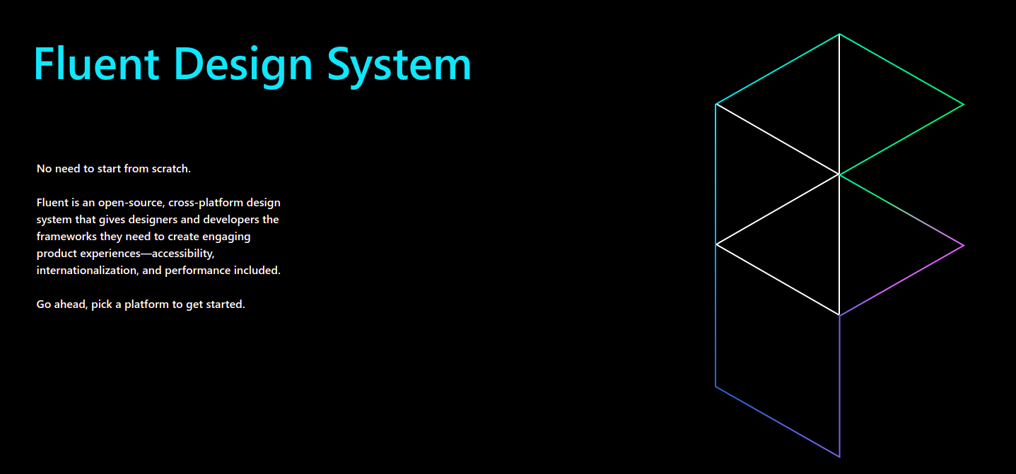
You can use this if you want to design a web app like office UI. It also offers components which is called as Controls by Microsoft which are built using React UI frameworks.
To explore more about Fluent UI they maintain a wikipedia page and documentation from where you can understand the workflow of it.
Installation
npm i @fluentui/reactWrapping Up
Hope this article helps you in choosing the best React library for your site and while choosing the frameworks and libraries always focus on the uses and the features of library.
There are many such libraries in the market and do not easily jump into one. Always explore and get ideas before choosing one.
Do comment your favourite React library and share the feedback with us in the comment section.
Monitoring React Websites With Atatus
To monitor your website's front-end performance you can use a Atatus's Real User Monitoring Tool and measure metrics such as page load time, core web vitals, AJAX calls, JS errors, react route time, SSL connection and more.
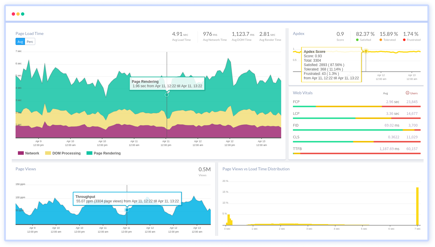
Get an overview on how your React app is performing and start optimize your site to deliver better performance for your customers.
Try Atatus for free. No credit card required!!!
#1 Solution for Logs, Traces & Metrics
 APM
APM
Kubernetes
Logs
Synthetics
RUM
Serverless
Security
More