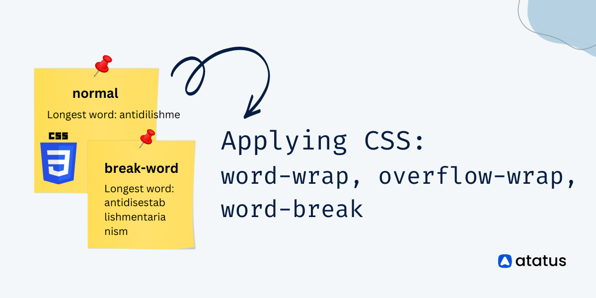
Applying CSS: word-wrap, overflow-wrap & word-break
A website's responsiveness is very significant these days in order to display correctly on all devices. Although you may try your best, broken layouts may still occur despite your best efforts.
Long words can be broken and wrapped to the next line when you use the CSS word-wrap property. A string being too long can overflow a container in most cases, so this method can be helpful in preventing overflow.
The reason for broken layouts is that certain words are too long for their containers to contain them. You can experience content overflow when dealing with user-generated content.
For instance, the comments section of a blog post is subject to content overflow. The result is that you must apply styling to your content in order to prevent it from overflowing its container.
Table of Contents
#1 overflow-wrap
By defining overflow-wrap, the browser is able to break lines within an unbreakable string to prevent overflowing content.
Values
In the overflow-wrap property, there are only three values: normal, break-word, and anywhere. Defining the word-wrap property using overflow-wrap is considered a standard name.
i.) normal
Lines will only be broken in accordance with normal line-breaking rules. In the case of overflowing the container, words will not break. As a default, this property takes this value.
overflow-wrap: normalii.) anywhere
Unless there are other acceptable breakpoints in the line, long words and URLs will break at any point. Even if the hyphens property is set, the hyphenation character will not be broken.
overflow-wrap: anywhere;iii.) break-word
In order to force a line break, long words and strings of characters that do not fit inside their container will break at an arbitrarily placed point, but soft wrapping opportunities familiarised by word breaks are not taken into statement when computing min-content intrinsic sizes.
overflow-wrap: break-word;Syntax
overflow-wrap: normal | anywhere | break-word | initial | inherit;Overflow-wrap example
<style>
    body {
        display: grid;
        place-items: center;
        min-height: 100vh;
        margin: 0;
        color: #fff;
        background-image: linear-gradient(20deg, #b3f6d8, #007ea7);
        font: 1.5rem/1.333 'Oxygen Mono', monospace;
        overflow-x: hidden;
    }

    @media (max-width: 500px) {
        body {
            font-size: 1.125rem;
        }
    }

    main {
        position: relative;
        margin: 15px 10px;
    }

    main::after {
        content: '';
        display: block;
        position: absolute;
        top: 16px;
        left: calc(28ch + 9px);
        bottom: 0;
        border-left: 2px dashed #fff6;
    }

    h1 {
        position: relative;
        z-index: 2;
        width: min-content;
        margin: 0 10px;
        padding: 5px 10px;
        border-radius: 4px;
        background-color: #000;
        font-weight: normal;
        font-size: 0.667em;
        white-space: nowrap;
        transform: translateY(50%);
    }

    p {
        width: 28ch;
        margin: 0 0 15px;
        padding: 20px 10px 10px;
        border-radius: 4px;
        background-color: #0006;
    }

    .break-word {
        overflow-wrap: break-word;
    }

    .anywhere {
        overflow-wrap: anywhere;
    }

    .unset {
        overflow-wrap: unset;
    }
</style>
<main>
<h1>normal</h1>
<p> Pneumonoultramicroscopicsilicovol </p>
<h1>overflow-wrap: break-word</h1>
<p class="break-word"> Pneumonoultramicroscopicsilicovol </p>
<h1>overflow-wrap: anywhere</h1>
<p class="anywhere"> Pneumonoultramicroscopicsilicovol </p>
<h1>overflow-wrap: unset</h1>
<p class="unset"> Pneumonoultramicroscopicsilicovol </p>
</main>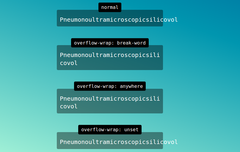
#2 word-wrap
Lines are wrapped into words in the word-wrap property to fit within the container. Words that aren't unbreakable can even be broken by this property.
The word-wrap property in CSS breaks long words into lines and wraps them onto the next line. In order to prevent layout problems arising from overflowing text strings, overflow-wrapping is used.
Values
In the word-wrap property, one of the following values can be specified:
i.) normal
This is the default setting. Regardless of whether a word or an unbroken string overflows the container, the browser will break the line according to the normal line-breaking rules.
word-wrap: normal;ii.) break-word
A line break will be forced at an arbitrary place if the words or strings of characters are too large for their container. By using the hyphens property, a hyphen character will not be rendered.
word-wrap: break-word;iii.) inherit
Upon inheriting the overflow-wrap property from its immediate parent, the targeted element must inherit its value.
word-wrap: inherit;Syntax
In CSS, word-wrap has the following syntax:
word-wrap: normal | break-word | initial | inherit;A word-wrap example
<style>
    body {
        display: grid;
        place-items: center;
        min-height: 100vh;
        margin: 0;
        color: #fff;
        background-image: linear-gradient(20deg, #b3f6d8, #007ea7);
        font: 1.5rem/1.333 'Oxygen Mono', monospace;
        overflow-x: hidden;
    }

    @media (max-width: 500px) {
        body {
            font-size: 1.125rem;
        }
    }

    main {
        position: relative;
        margin: 15px 10px;
    }

    main::after {
        content: '';
        display: block;
        position: absolute;
        top: 16px;
        left: calc(28ch + 9px);
        bottom: 0;
        border-left: 2px dashed #fff6;
    }

    h1 {
        position: relative;
        z-index: 2;
        width: min-content;
        margin: 0 10px;
        padding: 5px 10px;
        border-radius: 4px;
        background-color: #000;
        font-weight: normal;
        font-size: 0.667em;
        white-space: nowrap;
        transform: translateY(50%);
    }

    p {
        width: 28ch;
        margin: 0 0 15px;
        padding: 20px 10px 10px;
        border-radius: 4px;
        background-color: #0006;
    }

    .normal {
        word-wrap: normal;
    }

    .break-word {
        word-wrap: break-word;
    }

    .inherit {
        word-wrap: inherit;
    }
</style>
<main>
<h1>overflow-wrap: normal</h1>
<p class="normal"> Pneumonoultramicroscopicsilicovol </p>
<h1>overflow-wrap: break-word</h1>
<p class="break-word"> Pneumonoultramicroscopicsilicovol </p>
<h1>overflow-wrap: inherit</h1>
<p class="inherit"> Pneumonoultramicroscopicsilicovol </p>
</main>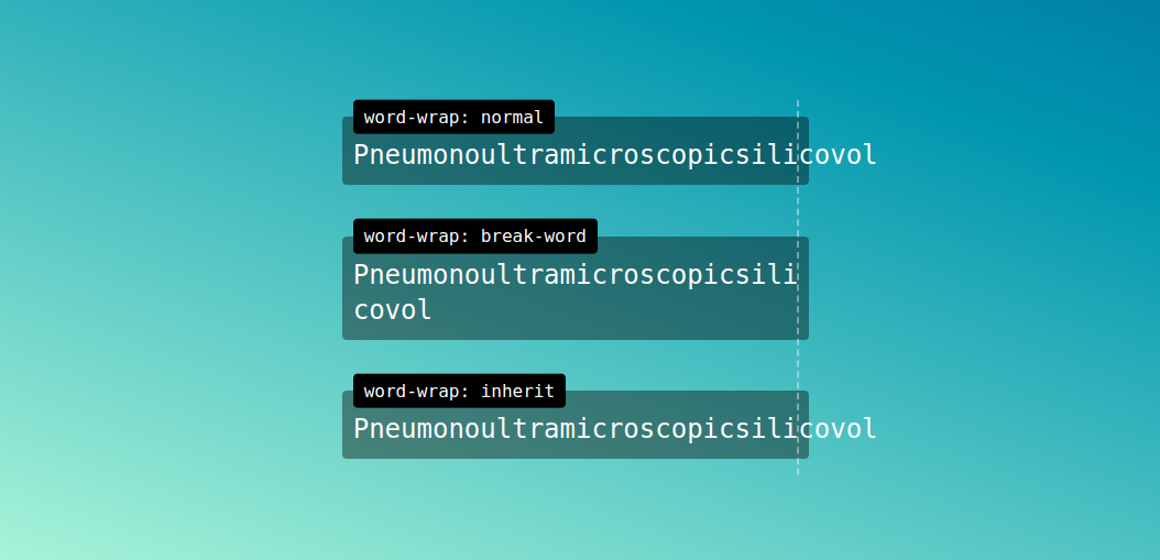
#3 word-break
When the content box would otherwise overflow, line breaks are inserted using the word-break CSS property.
A line break is usually only inserted when there is a space or hyphen in the space. Nevertheless, when the word-break property is set to break-all, the browser breaks lines wherever they occur.
By using the word-break CSS property, words can be broken or split depending on where they appear in a line. Using the word-wrap property, long words can be split/broken and wrapped into the next line.
Values
Below is a list of values that can be used to specify the word-break property.
i.) normal
This program uses line break rules. As a default, this property has this value.
word-break: normal;ii.) break-all
By specifying this value, a break will be generated exactly where the text would overflow the container if it was left unbroken. Consequently, it will be difficult to read as it breaks the word in any character.
word-break: break-all;iii.) keep-all
It is not recommended to use word breaks when writing Chinese/Japanese/Korean (CJK) text. The behaviour of non-CJK texts is the same as it is for CJK texts.
word-break: keep-all;iv.) break-word
If it is left unchanged, the text will overflow the container at the exact point where it would otherwise break. As a result, the word will be difficult to read if it is broken by any character.
word-break: break-word;Syntax
word-break: normal | break-all | keep-all | break-word | initial | inherit;An example of word-break
body {
  display: grid;
  place-items: center;
  min-height: 100vh;
  margin: 0;
  color: #fff;
  background-image: linear-gradient(20deg, #b3f6d8, #007ea7);
  font: 1.5rem/1.333 'Oxygen Mono', monospace;
  overflow-x: hidden;
}

@media (max-width: 500px) {
  body {
    font-size: 1.125rem;
  }
}

main {
  position: relative;
  margin: 15px 10px;
}

main::after {
  content: '';
  display: block;
  position: absolute;
  top: 16px;
  left: calc(28ch + 9px);
  bottom: 0;
  border-left: 2px dashed #fff6;
}

h1 {
  position: relative;
  z-index: 2;
  width: min-content;
  margin: 0 10px;
  padding: 5px 10px;
  border-radius: 4px;
  background-color: #000;
  font-weight: normal;
  font-size: 0.667em;
  white-space: nowrap;
  transform: translateY(50%);
}

p {
  width: 28ch;
  margin: 0 0 15px;
  padding: 20px 10px 10px;
  border-radius: 4px;
  background-color: #0006;
}

.normal {
  word-break: normal;
}

.break-all {
  word-break: break-all;
}

.keep-all {
  word-break: keep-all;
}

.break-word {
  word-break: break-word;
}

.initial {
  word-break: initial;
}

.inherit {
  word-break: inherit;
}
<main>
<h1>normal</h1>
<p class="normal"> Pneumonoultramicroscopicsilicovol </p>
<h1>word-break: break-all</h1>
<p class="break-all"> Pneumonoultramicroscopicsilicovol </p>
<h1>word-break: keep-all</h1>
<p class="keep-all"> Pneumonoultramicroscopicsilicovol </p>
<h1>word-break: break-word</h1>
<p class="break-word"> Pneumonoultramicroscopicsilicovol </p>
<h1>word-break: initial</h1>
<p class="initial"> Pneumonoultramicroscopicsilicovol </p>
<h1>word-break: inherit</h1>
<p class="inherit"> Pneumonoultramicroscopicsilicovol </p>
</main>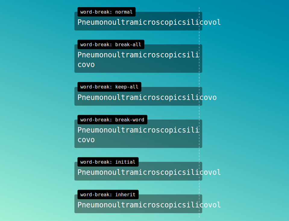
Wrapping-up
An alternate name of word-wrap's legacy name is overflow-wrap. The two can therefore be used interchangeably. Despite this, overflow-wrap properties are not well supported by all browsers.
If you want near-universal browser support, you should use word-wrap instead of overflow-wrap. Word-wrap should continue to be supported by browsers and user agents for legacy reasons, according to the draft CSS3 specification.
If It might suffice to use overflow-wrap or its legacy name word-wrap if you are looking to handle the content overflow.
The word-break function can also be used to break a word between two characters when the word exceeds its container. With word-break, you should use caution because browser support is limited, similarly to overflow-wrap.
Real User Monitoring with Atatus
Atatus enable you to gain visibility into poorly performing parts of your website that negatively impact your end users through a scalable, end-user monitoring solution. Improve the user experience with a better understanding of your front-end performance errors.
Improve end-user performance by diagnosing the complex front-end issues arising from slow page load times, route changes, late static assets, poor XMLHttpRequest, and JS errors
In addition to Google's Core Web Vitals and Other Web Vitals, we gather critical performance data that helps you understand what's causing slow performance at the user level if they're experiencing slow loading times, sudden changes, or trouble interacting with the page.

Identify and solve front-end performance issues that are impacting real users with an in-depth view of every page-load event. Identify which assets are slowing down your pages using the detailed full resource waterfall view, which allows you to filter by URL, connection type (2G, 3G, 4G), device, country, and more.
Identify performance issues and user behavior without requiring users to load pages. The Single Page Application route shows how user interactions affect performance independent of the JavaScript framework, showing how user interactions impact their experience after the page has loaded.
Try Atatus for free for 14 days if you are not already a client!
#1 Solution for Logs, Traces & Metrics
 APM
APM
Kubernetes
Logs
Synthetics
RUM
Serverless
Security
More