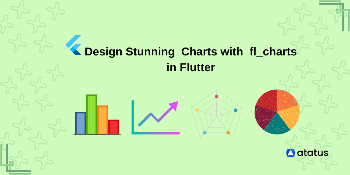
Design Stunning Charts with FL charts in Flutter
The human brain processes image 60,000 times faster than text. This should explain why we love graphs more than data tables in math or statistics or literally any subject of consideration.
Easier said than done, it is not a cakewalk to draw a perfect graph. But now we can put all those worries to rest since the new FL chart library in Flutter is a total blessing.
Flutter is an open-source UI software development kit built by Google. It allows building natively compiled cross-platform applications for Windows, iOS, Linux or any other web sources from a single codebase.
Flutter is compiled in dart language. Its main components include a flutter engine and the foundation library which provides the necessary APIs to communicate with the engine.
Like React, flutter also runs on widgets, the only difference being, it renders it on a per-pixel basis rather than using native platform components. Flutter essentially houses around 10-15 most handy libraries including provider and URL launcher amongst many others.
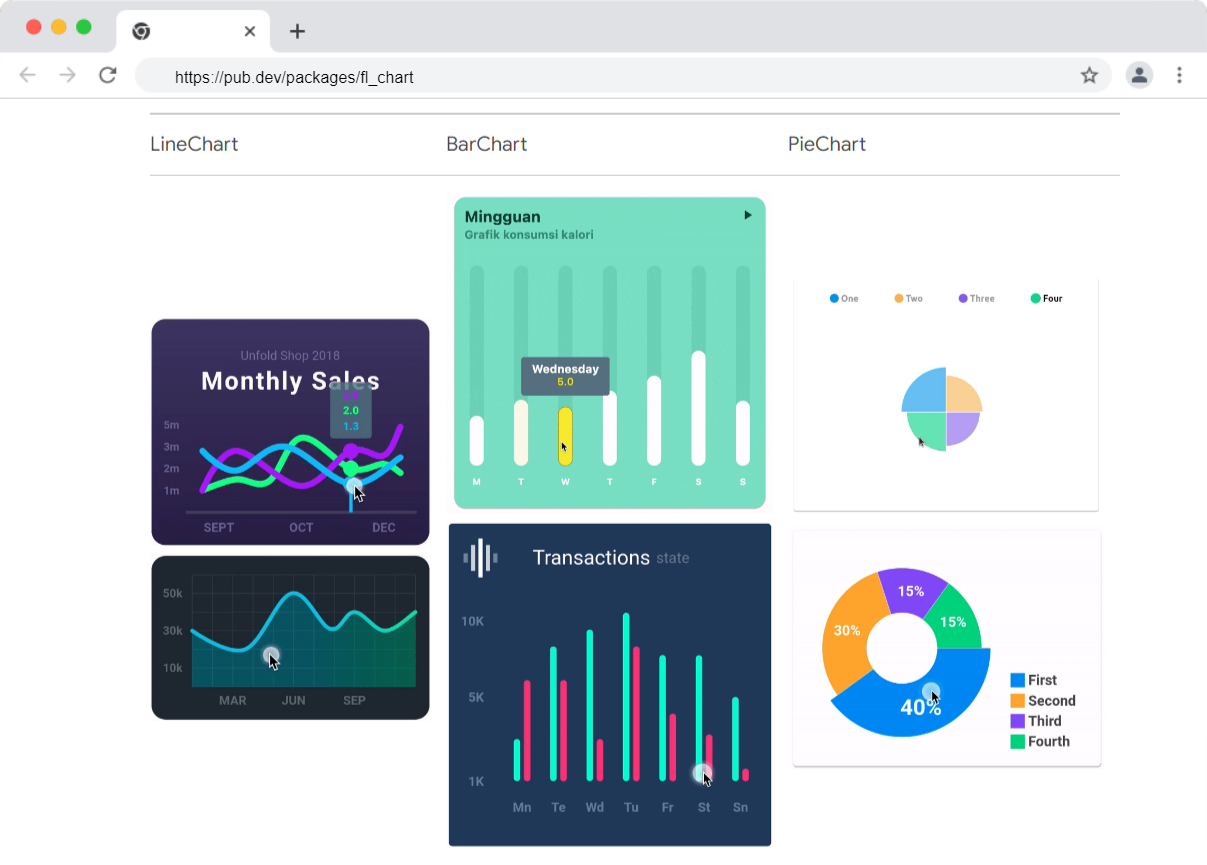
Table of contents
- Setting up Flutter
- What are implicit animations?
- Making a Line chart
- Making a Bar chart
- Making a Pie chart
- Radar chart
- Scatter chart
- Why are FL charts a good choice?
Setting up Flutter
Flutter can be installed easily using the snap command in Linux.
sudo snap install flutter --classic
Using the below command, you can display the Flutter running SDK path:
flutter sdk-path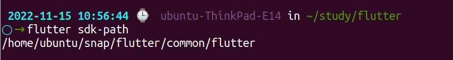
You should run the following command to check if you need to install any dependencies to complete the setup.
flutter doctor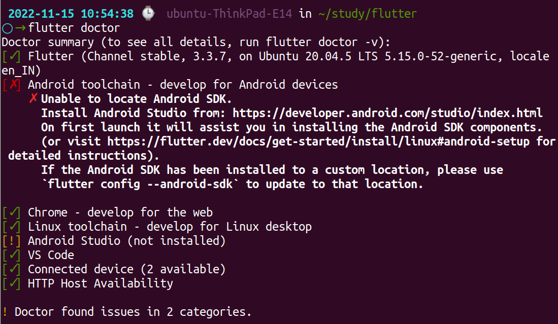
You can directly use the following command flutter pub get on GitHub or run it on dependencies using
flutter pub add fl_chart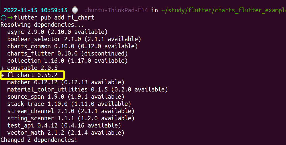
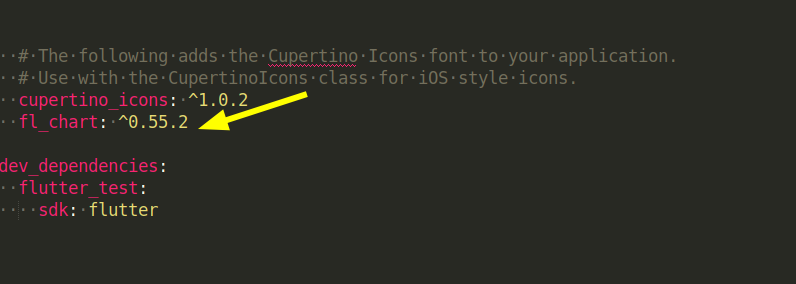
which will add another line to your pubspec.yaml this way:
dependencies:
 fl_chart: ^0.55.2
Now, fl_chart allows to build the following charts on flutter currently,
- Line chart
- Bar chart
- Touch tooltip
- Pie chart
- Radar chart
- Scatter chart
What are implicit animations?
The process of creating visual effects and adding motion to your text data is called animation. In flutter, the widget which manages all the animations is called an implicit animated widget deriving its name from the implicitlyanimatedwidget class which will implement them.
What can you animate?
Chart and chartdata
- Line graph - bar line, the colour of the line, barwidth,
iscurved,linechartstepdata, horizontal and vertical bars,linebarspot - Bar graph - bar space, bar rods, from-to Y, gradient etc
- Pie chart - section value, colour, inner radius, title on section, border side width
Touch tooltip
Linebarspotortouchlinebarspotwill show the description of the spot where you’ve touched on the line.Bartouchtooltipdatashows the pointer on bars where the user touched, tooltip colour, border, radius, padding ,touchedspotto display the data about the touched spot on bars.Pietouchedsectionthat holds the description about the section which the user touched.
Line charts are one of the most used graphs which convey huge volumes of data in simple, highly interpretative formats. Line charts are used to display information as a series of data points connected by straight or curved lines.
Making a Line chart
To draw a line chart using flutter, install the following widget in your pubspec file:
LineChart(LineChartData(
	// write your logic
),
swapAnimationDuration: Duration(milliseconds: 150),
	// OptionalswapAnimationCurve: Curves.linear,
	// Optional
);
swapanimationduration and swapanimationcurve are optional inputs which you can use to control the duration and curve of animations.
Within the linechartdata( add relevant information as your need. For example, the X, and Y pointers, bottom or sidetile titles, the colour of the line in the graph, whether marker dots are required or not etc.
Here we have kept iscurved as false so that the line remains straight edged.
Following is a sample line chart with dummy data:
// main.dart
import 'package:flutter/material.dart';
import 'dart:math';
import 'package:fl_chart/fl_chart.dart';

void main() {
  runApp(const MyApp());
}

class MyApp extends StatelessWidget {
  const MyApp({Key? key}) : super(key: key);
  @override
  Widget build(BuildContext context) {
    return MaterialApp(
        // Remove the debug banner
        debugShowCheckedModeBanner: false,
        title: 'KindaCode.com',
        theme: ThemeData(
          primarySwatch: Colors.indigo,
        ),
        home: MyHomePage());
  }
}

class MyHomePage extends StatelessWidget {
  MyHomePage({Key? key}) : super(key: key);

  // Generate some dummy data for the cahrt
  // This will be used to draw the red line
  final List<FlSpot> dummyData1 = List.generate(8, (index) {
    return FlSpot(index.toDouble(), index * Random().nextDouble());
  });

  // This will be used to draw the orange line
  final List<FlSpot> dummyData2 = List.generate(8, (index) {
    return FlSpot(index.toDouble(), index * Random().nextDouble());
  });

  // This will be used to draw the blue line
  final List<FlSpot> dummyData3 = List.generate(8, (index) {
    return FlSpot(index.toDouble(), index * Random().nextDouble());
  });

  @override
  Widget build(BuildContext context) {
    return Scaffold(
      body: SafeArea(
        child: Container(
          padding: const EdgeInsets.all(20),
          width: double.infinity,
          child: LineChart(
            LineChartData(
              borderData: FlBorderData(show: false),
              lineBarsData: [
                // The red line
                LineChartBarData(
                  spots: dummyData1,
                  isCurved: true,
                  barWidth: 3,
                  color: Colors.indigo,
                ),
                // The orange line
                LineChartBarData(
                  spots: dummyData2,
                  isCurved: true,
                  barWidth: 3,
                  color: Colors.red,
                ),
                // The blue line
                LineChartBarData(
                  spots: dummyData3,
                  isCurved: false,
                  barWidth: 3,
                  color: Colors.blue,
                )
              ],
            ),
          ),
        ),
      ),
    );
  }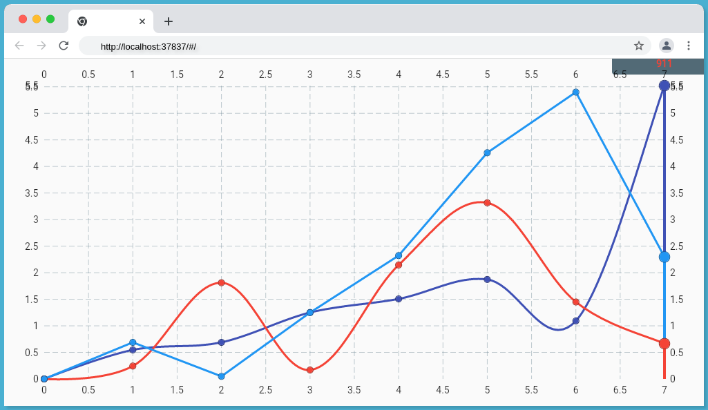
}In this example, we have given some dummy values for coordinates, within the LineChartsBarData we have specified dummy data 1,2,3 respectively in spots(coordinates), isCurved is turned to 'false' and the bar width is fixed at 3. To indicate the three data's separately we have assigned them with different colors - indigo, blue and red.
When the output is run, a line chart with three different datasets appears like this:
Making a Bar chart
A bar chart allows you to visualize the data in context to the quantity of a particular parameter. Composite bar charts tell you the relative features of a similar type of parameter.
To create a bar chart, first install the following widget in your file:
BarChart(
  BarChartData(
    // look into the source code given below
  ),
  swapAnimationDuration: Duration(milliseconds: 150), // Optional
  swapAnimationCurve: Curves.linear, // Optional
);
Below given is the source code for a bar chart:
// main.dart
import 'package:flutter/material.dart';
import 'dart:math';
import 'package:fl_chart/fl_chart.dart';
void main() {
runApp(const MyApp());
}
class MyApp extends StatelessWidget {
const MyApp({Key? key}) : super(key: key);
@override
Widget build(BuildContext context) {
return MaterialApp(
debugShowCheckedModeBanner: false,
title: 'KindaCode.com',
theme: ThemeData(
primarySwatch: Colors.indigo,
),
home: HomePage(),
);
}
}
// Define data structure for a bar group
class DataItem {
int x;
double y1;
double y2;
double y3;
DataItem(
{required this.x, required this.y1, required this.y2, required this.y3});
}
class HomePage extends StatelessWidget {
HomePage({Key? key}) : super(key: key);
// Generate dummy data to feed the chart
final List<DataItem> _myData = List.generate(
30,
(index) => DataItem(
x: index,
y1: Random().nextInt(20) + Random().nextDouble(),
y2: Random().nextInt(20) + Random().nextDouble(),
y3: Random().nextInt(20) + Random().nextDouble(),
));
@override
Widget build(BuildContext context) {
return Scaffold(
appBar: AppBar(
title: const Text('KindaCode.com'),
),
body: Padding(
padding: const EdgeInsets.all(30),
child: BarChart(BarChartData(
borderData: FlBorderData(
border: const Border(
top: BorderSide.none,
right: BorderSide.none,
left: BorderSide(width: 1),
bottom: BorderSide(width: 1),
)),
groupsSpace: 10,
barGroups: [
BarChartGroupData(x: 1, barRods: [
BarChartRodData(fromY: 0, toY: 10, width: 15, color: Colors.amber),
]),
BarChartGroupData(x: 2, barRods: [
BarChartRodData(fromY: 0, toY: 10, width: 15, color: Colors.amber),
]),
BarChartGroupData(x: 3, barRods: [
BarChartRodData(fromY: 0, toY: 15, width: 15, color: Colors.amber),
]),
BarChartGroupData(x: 4, barRods: [
BarChartRodData(fromY: 0, toY: 10, width: 15, color: Colors.amber),
]),
BarChartGroupData(x: 5, barRods: [
BarChartRodData(fromY: 0, toY: 11, width: 15, color: Colors.amber),
]),
BarChartGroupData(x: 6, barRods: [
BarChartRodData(fromY: 0, toY: 10, width: 15, color: Colors.amber),
]),
BarChartGroupData(x: 7, barRods: [
BarChartRodData(fromY: 0, toY: 10, width: 15, color: Colors.amber),
]),
BarChartGroupData(x: 8, barRods: [
BarChartRodData(fromY: 0, toY: 10, width: 15, color: Colors.amber),
]),
])),
),
);
}
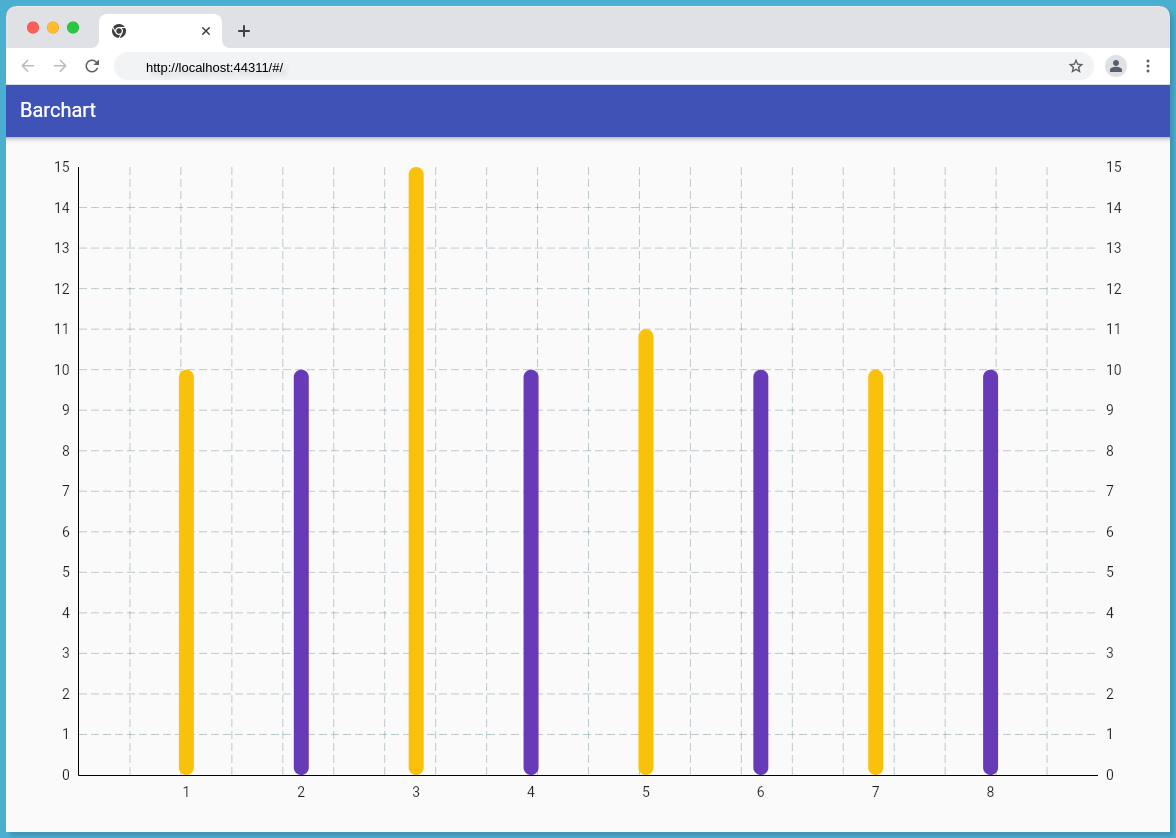
}In the given bar chart, we have arranged the abscissa values from 1 to 8 and consider them as x=1,x=2 and so forth. Similarly, for ordinate, we have assigned different values for each rod in Y, ex., for bar x:1, 'y' value ranges from 0 to 10.
We assign the values under BarChartGroupData for X coordinates and Y coordinates under BarChartRodData for individual bars. Each bar has a width of 15 units and a specific color assigned to it.
You can also add the hovering arrow/marker on the graph by customizing the tooltip. Under linetouchdata widget we can add touchcallback and touchtooltipdata in order to change the appearance of the marker.
Alongside simple bar charts you can also create a composite bar chart, double valued bars or even a negative bar chart.
Making a Pie chart
Pie chart represents statistical data in the form of an arc which tends to the centre by varying degrees of angles. The individual sections represent different classes of varying quantities. To create a pie chart using flutter, read on!
PieChart(
  PieChartData(
    // look into the source code given below
  ),
  swapAnimationDuration: Duration(milliseconds: 150), // Optional
  swapAnimationCurve: Curves.linear, // Optional
);
All the data that you feed will contribute to the sections in the pie chart, so be careful what you are including in your code.
Under piechartsectiondata you can include colour, radius, showtitle, title etc.
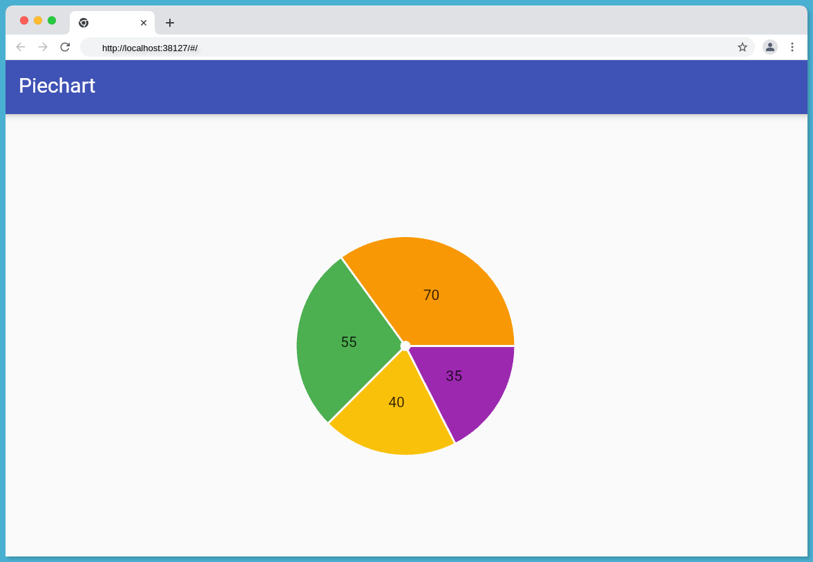
Given below is the source code of the sample data that was used to create this pie chart showing the average marks of a class.
// main.dart
import 'package:flutter/material.dart';
import 'dart:math';

import 'package:fl_chart/fl_chart.dart';

void main() {
  runApp(const MyApp());
}

class MyApp extends StatelessWidget {
  const MyApp({Key? key}) : super(key: key);

  @override
  Widget build(BuildContext context) {
    return MaterialApp(
      debugShowCheckedModeBanner: false,
      title: 'Piechart',
      theme: ThemeData(
        primarySwatch: Colors.indigo,
      ),
      home: HomePage(),
    );
  }
}

class HomePage extends StatelessWidget {
  HomePage({Key? key}) : super(key: key);

  @override
  Widget build(BuildContext context) {
    return Scaffold(
      appBar: AppBar(
        title: const Text('Piechart'),
      ),
      body: Padding(
        padding: const EdgeInsets.all(30),
        child: PieChart(PieChartData(
            centerSpaceRadius: 5,
            borderData: FlBorderData(show: false),
            sectionsSpace: 2,
            sections: [
              PieChartSectionData(value: 35, color: Colors.purple, radius: 100),
              PieChartSectionData(value: 40, color: Colors.amber, radius: 100),
              PieChartSectionData(value: 55, color: Colors.green, radius: 100),
              PieChartSectionData(value: 70, color: Colors.orange, radius: 100),
            ])
            )
          ),
        );
    }
}
As in line chart and bar chart, we enter the chart data under PieChartSectionData , and assign different values (35, 40, 55, 70) for each section, also set appropriate color of choice for each section. centerSpaceRadius is set to 5 units and the sectionSpace at 2. The sections are partitioned on this value. By increasing the section space we can have a broader border between the sections of the circle/pie chart.
The centerspacecolour and centerspaceradius can be changed accordingly. For centerspaceradius giving an output value of zero will make the chart solid-filled.
Similarly, sectionspace can also be altered to zero value for the sections to have a merged margin rather than a visible sectioning gap.
Although fl_charts are mostly used to make the above-mentioned line, bar and pie charts which are relatively easy to draw, fl_charts can create even the laborious radar and scatter charts with relative ease.
Radar chart
Radar charts give the comparative analysis of multiple quantitative variables. It can include more than three parameters in a single chart.
In the case of certain data, where one product outperforms every other similar product in the market on all the parameters except for one, then a radar chart might be the right fit to explain the commonality and outliers of that particular product.
Install the following radar chart widget:
 RadarChart(
  RadarChartData(
    // look into the souce code
  ),
  swapAnimationDuration: Duration(milliseconds: 150), // Optional
  swapAnimationCurve: Curves.linear, // Optional
);`
Radardataset includes radarentry (the data that is fed into the radar chart). The width, colour and radius of the border can be changed as per the programmer’s needs besides filling up solid colours in each radar section.
Check out this cool radar chart sample given by GitHub.
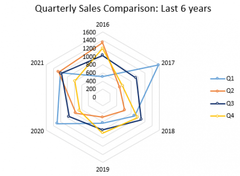
This chart gives us the comparison of quarterly sales of a company for the last 6 years. The sales margin is specified as hexagonal radars starting from 0 in the center to 1600 on the outside. Each quarter is assigned a different color to separate them from one another (Q1 - blue, Q2 - orange, Q3 - indigo, Q4 - yellow). Hexagonal pokes refer to different consecutive years from 2016-21.
For example, quarter 3 sales specified in indigo colour was at 1000 units in 2016, while it dropped to 800 units in 2020 and so on.
Scatter chart
Scatter chart or the scatter plot is one of the least used by us considering the difficulty in interpreting it.
It showcases a numerical value in terms of the ordinate and abscissa parameters. If these variables are coded an additional third parameter can be included in it as well.
Here is where fl_chart comes into action, it makes it easier for us to tweak the data according to demand and virtually draw a chart effortless
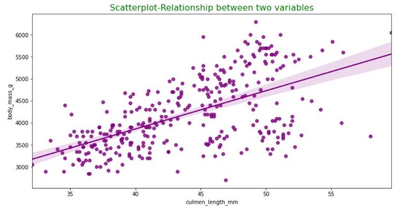
Refer the image source for additional information on the parameters chosen for this scatterplot.
Why are FL charts a good choice?
None of us is fond of huge data piles and the consequent numbers of hours that we’ve to spend looking into them. A graph would make a great save. Let’s look at why fl_charts would be a great solution!
- Includes different chart types
- Fully customizable
- Accessible animations
- Tooltip availability
- Visualizes large data sets
Conclusion
In conclusion, fl_charts is a powerful, configurable, and easy to use charting library for Flutter. A picture is worth a thousand words.
Graphs make data more engaging and readable than it is in its raw form. Flutter’s fl_chart package encompasses different kinds of graphs for all the different contexts their need may arise.
fl_charts is an open source library for Flutter and Dart, which lets you create beautiful charts in your Flutter applications. fl_charts is built on the high-performance cross-platform graphics layer flutter.dart.
It provides a series of customizable chart types, such as line, area, bar and pie. And it also allows you to customize each part of the chart, like its color, size, legend, etc.
Atatus Real User Monitoring
Atatus is a scalable end-user experience monitoring system that allows you to see which areas of your website are underperforming and affecting your users. Understand the causes of your front-end performance issues and how to improve the user experience.
By understanding the complicated frontend performance issues that develop due to slow page loads, route modifications, delayed static assets, poor XMLHttpRequest, JS errors, core web vitals and more, you can discover and fix poor end-user performance with Real User Monitoring (RUM).
You can get a detailed view of each page-load event to quickly detect and fix frontend performance issues affecting actual users. With filterable data by URL, connection type, device, country, and more, you examine a detailed complete resource waterfall view to see which assets are slowing down your pages.
#1 Solution for Logs, Traces & Metrics
![]() APM
APM
![]() Kubernetes
Kubernetes
![]() Logs
Logs
![]() Synthetics
Synthetics
![]() RUM
RUM
![]() Serverless
Serverless
![]() Security
Security
![]() More
More