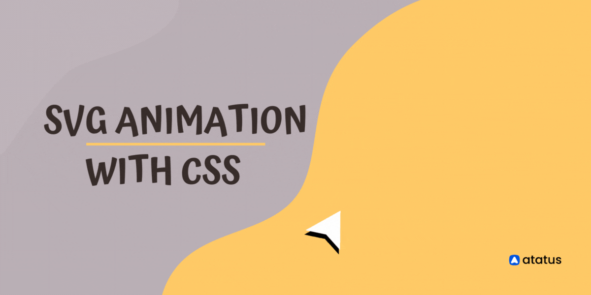
SVG animation with CSS
If you're looking to add some spice to your web designs, you may be considering adding animation. SVG animation with CSS can be used to create rich, interactive experiences on the web. SVG is a vector graphic format that can be scaled to any size without losing quality.
CSS is a style sheet language that can be used to style HTML elements. Combined, these two technologies can be used to create animations that are responsive, fluid, and resolution-independent.
When it comes to animations, SVG gives you more control and flexibility than other image formats. In this tutorial, we're going to show you how to animate SVG with CSS. We'll provide some examples so you can see how CSS animations can be used to create various effects.
What is an animation?
Animation is the process of creating motion and shape change illusion by means of the rapid display of a sequence of static images that minimally differ from each other. The illusion—as in motion pictures in general—is thought to rely on the phi phenomenon.
Animations can be recorded on either analogue media, such as a flip book, motion picture film, video tape, digital media, including formats such as animated GIF, Flash animation or digital video.
The term "animation" can also refer to the process of creating an animation. The process of creating an animation involves creating the individual frames, stringing the frames together, and then adding any necessary sound or other effects.
Animation is becoming increasingly popular in a variety of industries and for a variety of purposes. It can help engage viewers and communicate messages in a more effective and interesting way than live action video.
It can be used to communicate difficult or sensitive topics in a way that is less likely to offend or be misinterpreted. It is used to create educational content that is more engaging and easier to understand than text-based content and can be used to produce content that is more visually stimulating and thus more likely to hold viewers' attention.
What is an SVG?
SVG (Scalable Vector Graphics), is an XML-based vector image format for two-dimensional graphics with support for interactivity and animation. The SVG specification is an open standard developed by the World Wide Web Consortium (W3C) since 1999.
SVG images and their behaviors are defined in XML text files. This means that they can be searched, indexed, scripted, and compressed. As XML files, SVG images can be created and edited with any text editor, but are more often created with drawing software.
Because they are XML files, SVG images can be created and edited with any text editor, but are more often created with drawing software.
<body>
    <svg version="1.1" xmlns="http://www.w3.org/2000/svg">
      <rect width="200" height="100" fill="#2ecc71" />
    </svg>
</body>
Browser supports svg images through:
- HTML
<img>or<svg>elements - CSS
background-image - CSS
list-style-image - CSS
content - SVG
<image>element - SVG
<feImage>element - Canvas
drawImagefunction
SVG animations are highly used to create website icons, logos, infographics and illustrations.
SVG animation techniques
There are two different SVG animation techniques:
Stroke Dasharray
The stroke-dasharray property in CSS sets the length of dashes in the stroke of SVG shapes. More specifically, it sets the length of a pattern of alternating dashes and the gaps between them.
Syntax:
stroke-dasharray: none | <dasharray> | initial | inherit;Example:
path {
  stroke-dasharray: 5; /* dashes and gaps are both 5 units long */
}Stroke Dashoffset
The stroke-dashoffset property in CSS defines the location along an SVG path where the dash of a stroke will begin. The higher the number, the further along the path the dashes will begin.
Syntax:
stroke-dashoffset: length | initial | inherit;Example:
path {
	stroke-dashoffset: 100;
}SVG animation with CSS
Before getting started with animating SVG with CSS, prepare an SVG file to animate it using CSS. CSS animation consists of two parts: keyframes and animation properties. By defining the keyframes and animation properties we can create a CSS animation.
Define SVG path to animate
The first step is the creation of SVG file which is to be used for animation. Here I have created a rectangle using svg. The rect element draws a rectangle on the screen.
<svg viewBox="0 0 485 97">
    <g stroke="none" stroke-width="1" fill-rule="evenodd">
    <path class="path", d="M2.53316 9.04334C3.53822 5.95764 5.95764 3.53822 9.04334 2.53316C19.413 -0.844388 30.587 -0.844388 40.9567 2.53316C44.0424 3.53822 46.4618 5.95764 47.4668 9.04334C50.8444 19.413 50.8444 30.587 47.4668 40.9567C46.4618 44.0424 44.0424 46.4618 40.9567 47.4668C30.587 50.8444 19.413 50.8444 9.04334 47.4668C5.95764 46.4618 3.53822 44.0424 2.53316 40.9567C-0.844388 30.587 -0.844388 19.413 2.53316 9.04334Z" fill="#0055DC"/>
    <path class="path", d="M20.8529 11.638C22.6842 8.12068 27.3158 8.12068 29.1471 11.638L40.3666 33.1864C41.2778 34.9366 41.1513 36.9003 40.3353 38.4213C38.7515 41.3733 34.6787 40.1585 31.7386 38.5527L29.7933 37.4903C26.806 35.8587 23.194 35.8587 20.2067 37.4903L18.2614 38.5527C15.3213 40.1585 11.2485 41.3733 9.66473 38.4213C8.84871 36.9003 8.72217 34.9366 9.63342 33.1864L20.8529 11.638Z" fill="url(#paint0_linear)"/>
    <path class="path", d="M64 26.9412C64 23.845 64.6379 21.1033 65.9137 18.7159C67.227 16.3285 68.9906 14.4821 71.2044 13.1765C73.4558 11.8336 75.9324 11.1621 78.634 11.1621C81.073 11.1621 83.1931 11.6471 84.9942 12.6169C86.8329 13.5495 88.2963 14.7245 89.3844 16.142V11.6657H95.8572V42.4964H89.3844V37.9082C88.2963 39.363 86.8141 40.5753 84.9379 41.5452C83.0618 42.5151 80.923 43 78.5215 43C75.8573 43 73.4183 42.3286 71.2044 40.9857C68.9906 39.6055 67.227 37.703 65.9137 35.2783C64.6379 32.8164 64 30.0373 64 26.9412ZM89.3844 27.0531C89.3844 24.9268 88.9342 23.0803 88.0336 21.5136C87.1706 19.9469 86.0261 18.7532 84.6002 17.9326C83.1743 17.1119 81.6359 16.7016 79.9849 16.7016C78.3339 16.7016 76.7954 17.1119 75.3695 17.9326C73.9436 18.7159 72.7804 19.891 71.8799 21.4577C71.0168 22.9871 70.5853 24.8149 70.5853 26.9412C70.5853 29.0674 71.0168 30.9326 71.8799 32.5366C72.7804 34.1406 73.9436 35.3716 75.3695 36.2296C76.8329 37.0502 78.3714 37.4605 79.9849 37.4605C81.6359 37.4605 83.1743 37.0502 84.6002 36.2296C86.0261 35.4089 87.1706 34.2152 88.0336 32.6485C88.9342 31.0445 89.3844 29.1793 89.3844 27.0531Z" fill="black"/>
    <path class="path", d="M111.771 16.8694V33.9354C111.771 35.0918 112.033 35.9311 112.559 36.4534C113.122 36.9383 114.06 37.1808 115.373 37.1808H119.313V42.4964H114.247C111.358 42.4964 109.144 41.825 107.606 40.4821C106.067 39.1392 105.298 36.957 105.298 33.9354V16.8694H101.64V11.6657H105.298V4H111.771V11.6657H119.313V16.8694H111.771Z" fill="black"/>
    <path class="path", d="M123.088 26.9412C123.088 23.845 123.726 21.1033 125.002 18.7159C126.315 16.3285 128.079 14.4821 130.292 13.1765C132.544 11.8336 135.02 11.1621 137.722 11.1621C140.161 11.1621 142.281 11.6471 144.082 12.6169C145.921 13.5495 147.384 14.7245 148.472 16.142V11.6657H154.945V42.4964H148.472V37.9082C147.384 39.363 145.902 40.5753 144.026 41.5452C142.15 42.5151 140.011 43 137.609 43C134.945 43 132.506 42.3286 130.292 40.9857C128.079 39.6055 126.315 37.703 125.002 35.2783C123.726 32.8164 123.088 30.0373 123.088 26.9412ZM148.472 27.0531C148.472 24.9268 148.022 23.0803 147.122 21.5136C146.259 19.9469 145.114 18.7532 143.688 17.9326C142.262 17.1119 140.724 16.7016 139.073 16.7016C137.422 16.7016 135.883 17.1119 134.458 17.9326C133.032 18.7159 131.868 19.891 130.968 21.4577C130.105 22.9871 129.673 24.8149 129.673 26.9412C129.673 29.0674 130.105 30.9326 130.968 32.5366C131.868 34.1406 133.032 35.3716 134.458 36.2296C135.921 37.0502 137.459 37.4605 139.073 37.4605C140.724 37.4605 142.262 37.0502 143.688 36.2296C145.114 35.4089 146.259 34.2152 147.122 32.6485C148.022 31.0445 148.472 29.1793 148.472 27.0531Z" fill="black"/>
    <path class="path", d="M170.859 16.8694V33.9354C170.859 35.0918 171.121 35.9311 171.647 36.4534C172.21 36.9383 173.148 37.1808 174.461 37.1808H178.401V42.4964H173.335C170.446 42.4964 168.232 41.825 166.694 40.4821C165.155 39.1392 164.386 36.957 164.386 33.9354V16.8694H160.728V11.6657H164.386V4H170.859V11.6657H178.401V16.8694H170.859Z" fill="black"/>
    <path class="path", d="M212.401 11.6657V42.4964H205.984V38.8594C204.971 40.1277 203.639 41.1349 201.988 41.8809C200.375 42.5897 198.649 42.944 196.81 42.944C194.371 42.944 192.176 42.4405 190.225 41.4333C188.311 40.4261 186.791 38.934 185.666 36.957C184.578 34.9799 184.033 32.5925 184.033 29.7948V11.6657H190.394V28.8436C190.394 31.604 191.088 33.7303 192.476 35.2224C193.865 36.6772 195.759 37.4046 198.161 37.4046C200.562 37.4046 202.457 36.6772 203.846 35.2224C205.272 33.7303 205.984 31.604 205.984 28.8436V11.6657H212.401Z" fill="black"/>
    <path class="path", d="M232.124 43C229.685 43 227.49 42.571 225.539 41.7131C223.625 40.8178 222.105 39.6241 220.98 38.132C219.854 36.6026 219.253 34.9053 219.178 33.0402H225.82C225.933 34.3458 226.552 35.4462 227.677 36.3415C228.841 37.1994 230.285 37.6284 232.011 37.6284C233.812 37.6284 235.201 37.2927 236.176 36.6212C237.19 35.9125 237.696 35.0172 237.696 33.9354C237.696 32.7791 237.133 31.9211 236.008 31.3616C234.919 30.802 233.175 30.1865 230.773 29.5151C228.447 28.8809 226.552 28.2654 225.088 27.6686C223.625 27.0717 222.349 26.1578 221.261 24.9268C220.21 23.6958 219.685 22.0732 219.685 20.0588C219.685 18.4175 220.173 16.9254 221.148 15.5825C222.124 14.2023 223.512 13.1205 225.313 12.3372C227.152 11.5538 229.253 11.1621 231.617 11.1621C235.145 11.1621 237.978 12.0574 240.116 13.8479C242.293 15.6011 243.456 18.0072 243.606 21.066H237.19C237.077 19.6858 236.514 18.5854 235.501 17.7647C234.488 16.944 233.118 16.5337 231.392 16.5337C229.704 16.5337 228.409 16.8508 227.509 17.4849C226.608 18.1191 226.158 18.9584 226.158 20.0029C226.158 20.8235 226.458 21.5136 227.058 22.0732C227.659 22.6327 228.39 23.0803 229.253 23.4161C230.116 23.7145 231.392 24.1062 233.081 24.5911C235.332 25.1879 237.171 25.8034 238.597 26.4376C240.06 27.0344 241.317 27.9297 242.368 29.1234C243.418 30.3171 243.962 31.9024 244 33.8795C244 35.6327 243.512 37.1994 242.537 38.5796C241.561 39.9598 240.173 41.0416 238.372 41.825C236.608 42.6083 234.525 43 232.124 43Z" fill="black"/>
    </g>
</svg>
.path {
    stroke: #000;
    fill: transparent;
    stroke-dasharray: 500;
    stroke-dashoffset: -500;
  }
The class attribute is used to apply unique styling and formatting with CSS.
i.) stroke - It is used to add a border to the SVG rectangle.
ii.) stroke-dasharray - Sets the length of the dashes in the strokes.
iii.) stroke-dashoffset - defines the location along an SVG path where the stroke begins.
iv.) fill - It fills in the color of the rectangle.
Animating with CSS
CSS animations are a great way to add interactivity and life to your web pages. By using a few simple properties, you can create complex animations that will engage your users and add personality to your site.
While creating CSS animation sequence, you have to style the svg element you want to animate using the keyframes, animation properties or sub-properties.
CSS animation is mainly made up of two parts:
- By defining animation properties
- By defining @keyframes
1. By defining animation properties
With the help of the animation properties you can configure the timing, duration, and other details of how the animation sequence should progress. This is not the actual animation sequence, it can be done only using the @keyframes.
Sub-properties in animation property:
i.) animation-delay
The animation-delay property is used to specify how long an animation should wait before starting. This can be useful for creating animations that need to start at a later point in time, or when you want to stagger the start of multiple animations. The animation-delay property can be specified in either seconds or milliseconds.
/* Single animation */
animation-delay: 3s;
animation-delay: 0s;
animation-delay: -1500ms;

/* Multiple animations */
animation-delay: 2.1s, 480ms;

/* Global values */
animation-delay: inherit;
animation-delay: initial;
animation-delay: revert;
animation-delay: revert-layer;
animation-delay: unset;
ii.) animation-direction
The animation-direction allows an animation to play in alternate cycles. By default, animations run from start to finish that is in forward cycle. The animation-direction property can override this property.
You can also set it to "reverse", which will play the animation backwards. You can also set it to "alternate", which will play the animation forwards first, then backwards, then forwards again, etc. Finally, you can set it to "alternate-reverse", which will play the animation backwards first, then forwards, then backwards again, etc.
/* Single animation */
animation-direction: normal;
animation-direction: reverse;
animation-direction: alternate;
animation-direction: alternate-reverse;

/* Multiple animations */
animation-direction: normal, reverse;
animation-direction: alternate, reverse, normal;
iii.) animation-duration
The animation-duration property defines the length of time that an animation should take to complete one cycle and this is a great way to control the speed of an animation.. The value can be specified in either seconds or milliseconds.
The default value is 0s, meaning that no animation will take place. A higher value will make the animation go faster, and a lower value will make it go slower. By default, animations run at a speed of 60 frames per second.
If you want an animation to last 10 seconds, you can set the animation-duration property to 10s.
/* Single animation */
animation-duration: 6s;
animation-duration: 120ms;

/* Multiple animations */
animation-duration: 1.64s, 15.22s;
animation-duration: 10s, 35s, 230ms;
iv.) animation-fill-mode
The animation-fill-mode specifies how a CSS animation should apply styles to its target before and after it is executed. The four values of animation-fill-mode are: none, forwards, backwards, and both.
With the none value, the target will not receive any styles from the animation. forwards means that after the animation is finished, the target will retain the styles that were applied last by the animation.
backwards means that the target will receive the styles applied by the animation immediately, before the animation has even started.
Both means that the animation will apply the styles both before and after it is executed. The default value for animation-fill-mode is none.
/* Single animation */
animation-fill-mode: none;
animation-fill-mode: forwards;
animation-fill-mode: backwards;
animation-fill-mode: both;

/* Multiple animations */
animation-fill-mode: none, backwards;
animation-fill-mode: both, forwards, none;
v.) animation-iteration-count
It specifies the number of times an animation should be played. It can be a number, or the keyword "infinite".
When animation-iteration-count is a number, the animation will be played that number of times. For example, if it is 5, the animation will be played 5 times.
If animation-iteration-count is the keyword "infinite", the animation will be played forever.
/* Keyword value */
animation-iteration-count: infinite;

/* <number> values */
animation-iteration-count: 3;
animation-iteration-count: 2.4;

/* Multiple values */
animation-iteration-count: 2, 0, infinite;
vi.) animation-name
The animation-name property is one of the most important property. It can be used to specify the name of an animation, which is then used to reference the @keyframes for that animation.
/* Single animation */
animation-name: none;
animation-name: test_05;
animation-name: -specific;
animation-name: sliding-vertically;

/* Multiple animations */
animation-name: test1, animation4;
animation-name: none, -moz-specific, sliding;
vii.) animation-play-state
The animation-play-state is a CSS property that determines whether an animation is running or paused. It can be used to pause and resume an animation.
The property takes two values: running and paused. By default, an animation is running. To pause an animation, set the animation-play-state property to paused.
/* Single animation */
animation-play-state: running;
animation-play-state: paused;

/* Multiple animations */
animation-play-state: paused, running, running;
viii.) animation-timing-function
When it comes to animating elements on a web page, the CSS property animation-timing-function is an another important property to understand. This property determines how an animation will progress over time, and can be used to create a variety of different effects.
The default value is linear, which means the element will change at a constant rate. However, there are a number of other options that can be used to create different types of animations.
/* Keyword values */
animation-timing-function: ease;
animation-timing-function: ease-in;
animation-timing-function: ease-out;
animation-timing-function: ease-in-out;
animation-timing-function: linear;
animation-timing-function: step-start;
animation-timing-function: step-end;

/* Function values */
animation-timing-function: cubic-bezier(0.1, 0.7, 1, 0.1);
animation-timing-function: steps(4, end);

/* Steps Function keywords */
animation-timing-function: steps(4, jump-start);
animation-timing-function: steps(10, jump-end);
animation-timing-function: steps(20, jump-none);
animation-timing-function: steps(5, jump-both);
animation-timing-function: steps(6, start);
animation-timing-function: steps(8, end);

/* Multiple animations */
animation-timing-function: ease, step-start, cubic-bezier(0.1, 0.7, 1, 0.1);
animation Shorthand:
animation: 3s infinite alternate slidein;2. By defining animation @keyframes
By using @keyframes, you can control the start, end and intermediate steps in a CSS animation. This can be used to create smooth, fluid animations that look great on any device.
Syntax:
@keyframes animationname {keyframes-selector {css-styles;}}
Example:
@keyframes slidein {
  100% {
    margin-left: 100%;
    width: 300%;
  }

  0% {
    margin-left: 0%;
    width: 100%;
  }
}
0% indicates the first moment of the animation sequence, while 100% indicates the final state of the animation. Because these two times are so important, they have special aliases: from and to. Both are optional. If from/0% or to/100% is not specified, the browser starts or finishes the animation using the computed values of all attributes.
In our example, we have used the animation shorthand and set the animation-name as animate, animation-delay to 3 seconds, animation-direction to forwards and animation-iteration-count to infinite.
The @keyframes is set to 100% which indicates that the animation sequence should start and finish at the final state.
CSS code for animation:
body {
  background: #00467F;
  background: -webkit-linear-gradient(to right, #A5CC82, #00467F);
  background: linear-gradient(to right, #FFEFBA, #FFFFFF );
}

.svgWrapper {
  position: fixed;
  top: 65%;
  left: 70%;
  transform: translate(-50%, -50%);

  svg {
    width: 60rem;
  }

  .path {
    stroke: #000;
    fill: transparent;
    stroke-dasharray: 500;
    stroke-dashoffset: -500;
    animation: animate 5s forwards infinite; /* Animation Shorthand */
  }
}

/* Animation Sequence */

@keyframes animate {
  100% {
    stroke-dashoffset: 500;
  }
}
The complete SVG animation with CSS code:
Conclusion
In conclusion, SVG animation with CSS provides possibilities for displaying dynamic, interactive content. With CSS animations, authors can define multiple animations simultaneously and execute them synchronously.
SVG animations use CSS animations as a fallback mechanism, adding the ability to define animations for elements and SVG shapes. SVG animations are best suited for drawing simple shapes or animations based on UI events such as hover, click, or scroll. Complex animations, or animations using non-UI events, are best done with JavaScript.
Finally, SVG animations can be animated with CSS animation properties, such as ease, delay, duration, and timing-function. This opens the door to a plethora of new possibilities for creating animated content.
Atatus Real User Monitoring
Atatus is a scalable end-user experience monitoring system that allows you to see which areas of your website are underperforming and affecting your users. Understand the causes of your front-end performance issues and how to improve the user experience.
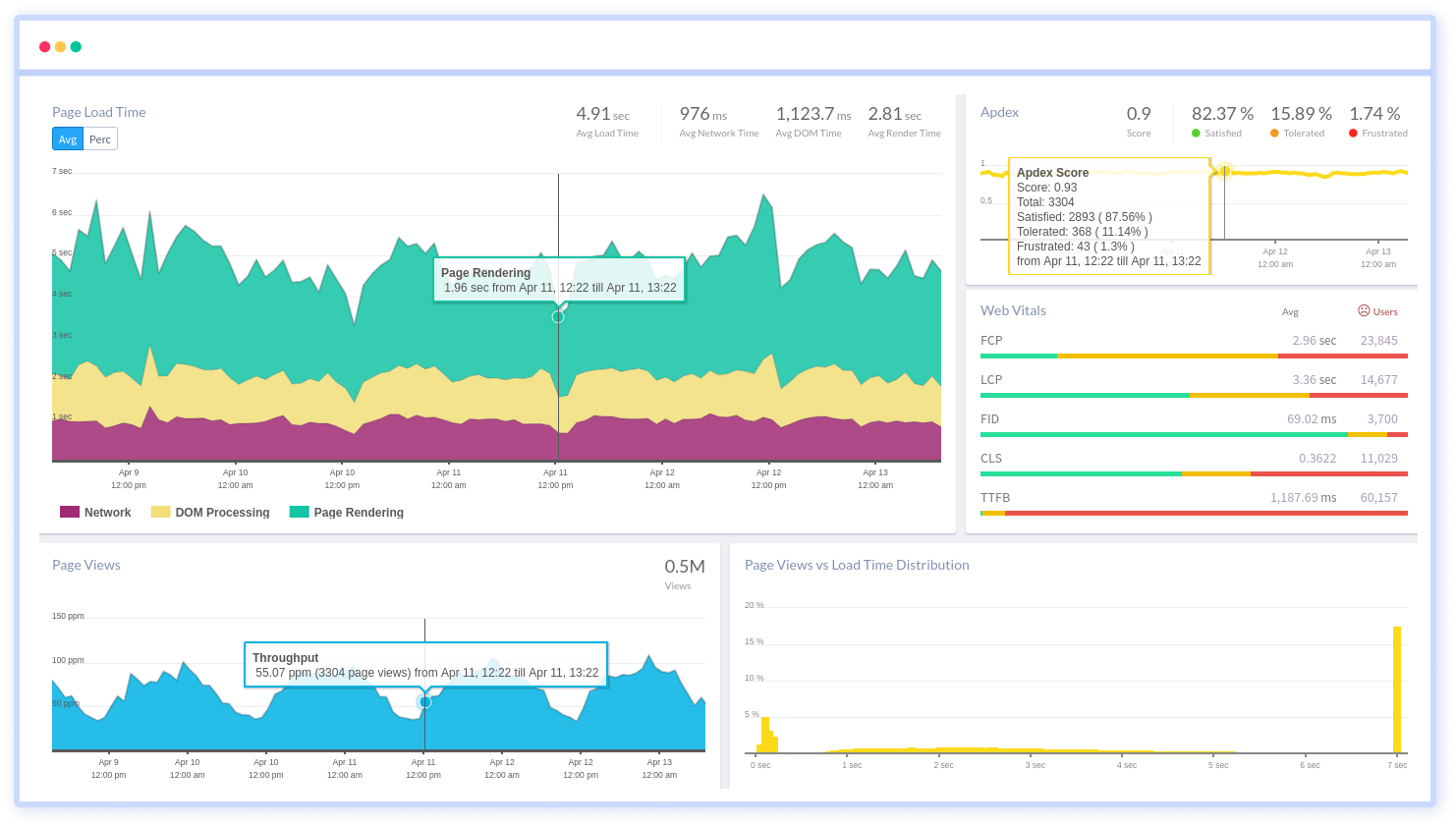
By understanding the complicated frontend performance issues that develop due to slow page loads, route modifications, delayed static assets, poor XMLHttpRequest, JS errors, core web vitals and more, you can discover and fix poor end-user performance with Real User Monitoring (RUM).
You can get a detailed view of each page-load event to quickly detect and fix frontend performance issues affecting actual users. With filterable data by URL, connection type, device, country, and more, you examine a detailed complete resource waterfall view to see which assets are slowing down your pages.
#1 Solution for Logs, Traces & Metrics
 APM
APM
Kubernetes
Logs
Synthetics
RUM
Serverless
Security
More