A beginner's guide to using CSS variables

If you look at the backend of a big website coded in CSS, you will encounter many repeating codes. They might be coding for particular text color or text size or even fitting the images to the right size for your screen. The problem comes in when you want to change these codes. Since they are so recurring, they demand global search.
Custom properties of CSS variables allow all such values to be stored in one place and can be referenced throughout the document without having to retype it every time. Also, readability and maintainability are a big plus.
CSS variables are cascading in nature, and they inherit values from their parents. You will get to know this better when we learn about fallback values.
Table Of Contents
- What are CSS Variables?
- SASS vs CSS - What Changed?
- Why CSS Variables?
- Inheritance & Precedence
- Scope Property
- Working with Invalid and Fallback Values
- CSS Variables with Inline Styles
- CSS Variables with Media Queries
What are CSS Variables?
CSS variables, also known as "CSS custom properties", are entities that store specific values that can be reused throughout a website or application.
They allow developers to define a value once and use it in multiple places, making it easy to update and maintain the styles of a website. With this program, you can build cross-browser-compatible websites that require minimal coding and maintenance.
However, CSS variables require a specific definition when they are initialized or substituted, unlike other programming languages that support simple initialization or substitution syntax.
CSS variables have several advantages over traditional CSS values. For instance, they can be updated dynamically using JavaScript, which allows for more flexibility and easier maintenance of styles in a document.
Syntax
To create a CSS variable, you use the -- prefix followed by the variable name and then assign it a value using the : character. For example -
:root {
  --main-color: blue;
}
This creates a CSS variable called --main-colour with a value of blue. To use this variable in your styles, you would reference it using the var() function, like this -
h1 {
  color: var(--main-color);
}
This would set the color of all h1 elements to blue.
You can also use CSS variables to set other styles, such as font size, padding, and more.
SASS vs CSS - What Changed?
SASS (Syntactically Awesome Stylesheets) and CSS (Cascading Style Sheets) are both languages that are used to style web pages.
SASS is a preprocessor language that extends CSS and adds features such as variables, mixins, and functions to make styling web pages easier and more powerful. You must have come across HTML CSS. Well, CSS is the language that is used to apply styles to HTML elements on a web page.
One key difference between SASS and CSS is that SASS is a preprocessor language, which means that it must be processed into CSS before it can be used in a web page.
This means that you need to use a tool to compile your SASS code into CSS before you can use it in your web page. CSS, on the other hand, can be directly added to a web page without any preprocessing.
Another key difference between SASS and CSS is that SASS allows you to use features such as variables, mixins, and functions, which can make your styling code more reusable and easier to maintain. CSS does not have these features, so you need to write your styles using the basic syntax of CSS.
In general, SASS is a more powerful and flexible language than CSS, but it does require a little more setup and learning in order to use it effectively. However, many web developers find that the added features of SASS make it worth the effort to learn and use in their projects.
| SASS | CSS |
|---|---|
| Preprocessor - makes the variable static and irresistible to change at runtime | Custom property - variables remain dynamic and can be changed during runtime |
| Variable needs to be compiled before execution | No need to compile the program additionally |
| Has variables, mixins and features to make styling code easier | Need to write each style separately using the basic syntax |
| Complex and higher learning curve | Simple and easy to manage |
Why CSS Variables?
Here are some examples of how CSS variables can be used, along with the reasons why they might be useful:
Reusability
CSS variables allow you to define values in a single place and reuse them throughout the stylesheet, reducing the need for repetitive code and making it easier to make global changes.
For example:
:root {
  --primary-color: #00b8d4;
}

.button {
  background-color: var(--primary-color);
  border-color: var(--primary-color);
  color: white;
}

.highlight {
  color: var(--primary-color);
}
In this example, the --primary-color variable is defined on the :root element, which represents the highest-level element in the document tree. It is then used as the background color and border color for the .button class and the text color for the .highlight class.
Maintainability
CSS variables can make your stylesheets more maintainable by allowing you to define and update values in a single place rather than having to search through the stylesheet to make changes.
For example:
:root {
  --primary-color: #00b8d4;
  --secondary-color: #b2ebf2;
}

.button {
  background-color: var(--primary-color);
  border-color: var(--primary-color);
  color: white;
}

.highlight {
  color: var(--secondary-color);
}
In this example, the --primary-color and --secondary-color variables are defined on the :root element. If you wanted to change the primary color of the website, you could simply update the value of the --primary-color variable and the changes would be reflected throughout the stylesheet.
Responsiveness
CSS variables can be used in media queries to create responsive styles that adjust to different screen sizes.
For example:
:root {
  --max-width: 1200px;
}

@media (max-width: 768px) {
  :root {
    --max-width: 100%;
  }
}

.container {
  max-width: var(--max-width);
  margin: 0 auto;
}
In this example, the --max-width variable is defined on the :root element and set to 1200px. It is then overridden in a media query for screens with a maximum width of 768px, setting the --max-width variable to 100%. The .container class uses the --max-width variable to set the maximum width of the element, which will be 100% on small screens and 1200px on larger screens.
Easy Customization
CSS variables can be used to allow users to customize the look and feel of a website or application by providing them with a set of predefined variables that they can modify.
For example:
:root {
  --font-size: 16px;
}
Improved Performance
Using CSS variables can improve the performance of your stylesheets by reducing the amount of CSS that needs to be parsed by the browser. This is because CSS variables are only evaluated when they are used, so the browser doesn't need to parse unnecessary styles.
Inheritance & Precedence
CSS variables inherit their values from their parent elements by default. This means that if a CSS variable is defined on a parent element, it will be inherited by all of its child elements unless the value is overridden.
For example, if you define a CSS variable --main-color on the body element and set its value to red, all elements inside the body will inherit that value unless they have a different value for --main-color explicitly set on them.
You can override the inherited value of a CSS variable by setting a new value for it on a child element. For example, if you have a div element inside the body and you want to set its --main-color to blue, you can do so using the colour property in the following way:
div {
    color: var(--main-color, blue);
}
In this example, the div element will have a --main-color value of blue, overriding the value of red that it inherited from the body element.
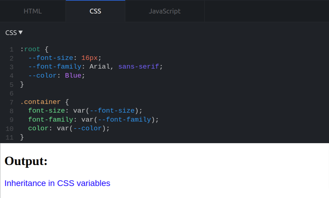
Here’s another example to make you understand better:
The following code snippet shows a parent-child relationship where the child does not have the variable for its background color. In this case, due to the absence of element for a variable, the child class inherits the variable value from the parent class.
/* CSS */

:root {
  --font-size: 16px;
  --font-family: Arial, sans-serif;
  --color: Blue;
}

.container {
  font-size: var(--font-size);
  font-family: var(--font-family);
  color: var(--color);
}

.text {
  /* Inherit the font-size and font-family values from the .container element */
  font-size: inherit;
  font-family: inherit;
  color: inherit;
}
<!-- HTML -->
<div class="container">
<p class="text">Inheritance in CSS variables</p>
</div>
In this example, the :root element defines the --font-size and --font-family variables. The .container element uses these variables to set the font size and font family for all of its children. The .text element then uses the inherit value to inherit the font size and font family values from the .container element. This means that the text will be displayed with a font size of 16px and the Arial font family.
Note that CSS variables are only inherited if they are used in the styles for an element. If a variable is not used, it will not be inherited by that element's children.
Precedence
In CSS, the precedence of a property is determined by the specificity of the selector used to specify the property. When multiple style rules apply to the same element, the more specific rule will take precedence and the values of the properties specified in the less specific rule will be overridden.
CSS variables, also known as custom properties, are treated like other properties in terms of precedence. The precedence of a CSS variable is determined by the specificity of the selector in which it is declared.
For example, consider the following CSS:
:root {
  --main-color: blue;
}

.header {
  color: var(--main-color);
}

#header-text {
  color: red;
}
In this example, the --main-color variable is declared in the :root selector, which has a high level of specificity. The .header class selector has a lower level of specificity, so the value of the color property specified in the #header-text rule will take precedence and override the value of the color property specified in the .header rule.
It is important to note that the precedence of CSS variables is not affected by the order in which they are declared in the stylesheet. The precedence of a CSS variable is determined solely by the specificity of the selector in which it is declared.
Scope Property
The scope property of CSS variables is a determining factor of how the variables function within the code. And based on their area of influence, it is divided into two groups -
- Global scope - accepts instructions in the entire program
- Local scope - accepts instructions within the selector
CSS variables have a specific scope within a document, which determines where they can be used and what elements they affect. The scope of a CSS variable is defined by where it is declared.
If a variable is declared on a parent element, it can be used in any of that element's children. However, if a variable is declared on a child element, it will only be available to that element and its siblings.
Global Scope
In CSS, you can define variables in the global scope by using the :root pseudo-class. These variables can then be accessed and used throughout your stylesheet.
Here is an example of defining a global variable and using it in your CSS:
:root {
  --primary-color: blue;
}

body {
  background-color: var(--primary-color);
}
To use this variable in your HTML, you can apply the style attribute to an element and use the variable like this:
<body style="background-color: var(--primary-color)">
  <!-- Your content goes here -->
</body>
Local Scope
In a particular selector, variables declared within the code block are scoped locally. For example:
.container {
  --secondary-color: green;
  background-color: var(--secondary-color);
}
In this case, the --secondary-color variable is only available within the .container element and its children.
To use this variable in your HTML, you can apply the style attribute to an element within the .container element and use the variable like this:
<div class="container">
  <div style="background-color: var(--secondary-color)">
    <!-- Your content goes here -->
  </div>
</div>
You can also access the --secondary-color variable from any descendent elements of the .container element, as long as they are not overridden by a locally scoped variable with the same name.
It's important to note that CSS variables with local scope take precedence over global variables with the same name. If you define a global variable and a local variable with the same name, the local variable will be used within the scope of the element where it is defined.
Working with Invalid and Fallback Values
In CSS, a fallback value is a value that is used if a specified value is invalid or not supported. For example, if you define a CSS variable and use it in your stylesheet, but the value of the variable is not valid or not supported by the browser, the fallback value will be used instead.
Usually, you will need to rely on fallback values in these scenarios:
- When your browser doesn't support CSS variables
- When your browser supports, but the variable is set to no value
- When your browser supports, but the variable is set to an invalid value
i.) When your browser doesn’t support CSS variables
When your browser itself is not compatible with CSS var() function, it simply ignores the code and takes on default values.
Google chrome 46 doesn't support CSS variables property and running the below program would not give any output on it.
<style>
  :root {
  --my_bg : #9e2e50;
  }
  div {
  width: 300px;
  height: 200px;
  color: black;
  font-weight: bold;
  font-size: 30px;
  background-color: var(--my_bg, black);
  }
</style>
</head>
<body>
  <center>
    <div>
      Atatus is one of the best performance monitoring tool.
    </div>
  </center>
</body>
ii.) When your browser supports, but the variable is set to no value
When a variable is set to no value or called outside its scope, the browser produces fallback value instead of the actual result.
<style>
  div {
      background-color: var(--my_bg, black);
    }
</style>
iii.) When your browser supports, but the variable is set to an invalid value
In the below example we will try assigning 16px value to color variable, which is of course an invalid value. CSS discards this command and restores what was earlier instructed., the text will appear in blue color.
<p> Atatus is an all-in-one performance monitoring tool. </p>p {
color: blue;
}
p {
color: 16px;
}
CSS Variables with Inline Styles
Inline styles in CSS allow you to apply a unique style to a single HTML element. To use CSS variables with inline styles, you need to use the style attribute in the HTML element and specify the variable name with the var() function. For example:
<p style="color: var(--main-text-color);">Atatus is one of the best performance monitoring tool</p>This will apply the --main-text-color CSS variable to the <p> element's text color. You can then define the value of the variable in the <style> section of your HTML or in an external CSS file.
<style>
  :root {
    --main-text-color: #333;
  }
</style>
Here, the :root selector is used to define the variable at the root level of the document, making it available to all elements on the page. You can also define the variable directly in the inline style, like this:
<p style="--main-text-color: #333; color: var(--main-text-color);">CSS variables with inline styles</p>In this case, the variable is defined and used within the same inline style. Note that you must use the var() function to reference the variable, otherwise it will not be applied to the element's style.
CSS Variables with Media Queries
CSS variables can also be used in media queries to create more dynamic and responsive designs.
To use a CSS variable in a media query, you can include the var() function in the query's condition.
For example:
@media (min-width: var(var name)) {
  /* CSS rules go here */
}
Here is a complete example showing how to use CSS variables in media queries:
<!DOCTYPE html>
<html>
  <head>
    <meta charset="utf-8">
    <title>CSS Variables with Media Queries Example</title>
    <link rel="stylesheet" href="style.css">
  </head>
  <body>
    <div class="container">
      <!-- Your content goes here -->
    </div>
  </body>
</html>
:root {
--primary-color: blue;
}
@media (max-width: 600px) {
:root {
--primary-color: red;
}
}
.container {
background-color: var(--primary-color);
}
In this example, the .container element has a background color that is set to the value of the --primary-color CSS variable. The value of this variable is blue by default, but it is changed to red when the viewport width is less than or equal to 600 pixels (as defined in the media query).
To use this in your HTML, you can apply the style attribute to an element and use the variable like this:
<div class="container" style="background-color: var(--primary-color)">
  <!-- Your content goes here -->
</div>
You can also define variables in the local scope by using the :root pseudo-class within a block of CSS that is scoped to a specific element. For example:
.container {
    --secondary-color: green;
    background-color: var(--secondary-color);
}
In this case, the --secondary-color variable is only available within the .container element and its children.
Conclusion
The reusability feature of CSS variables has made them a desirable choice for developers. The ease with which codes can be used throughout the website or application makes updating and styling them effortless and undemanding.
Creativity aside, they reduce code redundancy and provide a more intuitive way to specify and use values in your stylesheets, making it easier to work with complex styles.
CSS variables can be set based on the size of the viewport, allowing you to create styles that change depending on the screen size.CSS variables enhance cross-browser compatibility and maintaining them is extremely straightforward.
Overall, CSS is gaining traction, thanks to these additional custom properties.
Atatus: Real-time Monitoring
Atatus enable you to gain visibility into poorly performing parts of your website that negatively impact your end users through a scalable, end-user monitoring solution. Improve the user experience with a better understanding of your front-end performance errors.
Atatus's Real User Monitoring improves end-user performance by diagnosing the complex front-end issues arising from slow page load times, route changes, late static assets, poor XMLHttpRequest, and JS errors
In addition to Google's Core Web Vitals and Other Web Vitals, we gather critical performance data that helps you understand what's causing slow performance at the user level if they're experiencing slow loading times, sudden changes, or trouble interacting with the page.

Identify and solve front-end performance issues that are impacting real users with an in-depth view of every page-load event. Identify which assets are slowing down your pages using the detailed full resource waterfall view, which allows you to filter by URL, connection type (2G, 3G, 4G), device, country, and more.
Identify performance issues and user behavior without requiring users to load pages. The Single Page Application route shows how user interactions affect performance independent of the JavaScript framework, showing how user interactions impact their experience after the page has loaded.
Try Atatus for free for 14 days if you are not already a client!
#1 Solution for Logs, Traces & Metrics
 APM
APM
Kubernetes
Logs
Synthetics
RUM
Serverless
Security
More