The A to Z Guide of CSS Grid: From Fundamentals to Advanced Techniques
The aspect of look and feel of a website could be a challenging task for the developers. It is of no doubt that presentation is a key area for enhancement of user experience.
This is where CSS comes in to play allowing you to style your website as per your requirement. It presents different approaches to website development.
CSS holds a variety of features and elements that help you style your website. Now how would you divide your page into segments, define its relationships and make it responsive too?
CSS holds a solution for it! With CSS grid layout, you can create responsive web designs in an effortless manner.
In this article, we’ll walk you through the basics of CSS Grid with examples and learn how to use them for your various purposes. Let’s get started!
Table of Contents
- Introduction to CSS Grids
- CSS Grid Terminologies
- CSS Grid Properties
- Tricks while using CSS Grids
- Use cases of CSS Grids
Introduction to CSS Grids
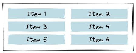
CSS Grid is a powerful layout system that allows web developers to create complex and responsive layouts using a two-dimensional grid. It is part of the CSS (Cascading Style Sheets) specification and provides a new way of laying out web pages that goes beyond the limitations of traditional block and inline layout.
With CSS Grid, you can define a grid of rows and columns and then place content within those cells. This gives you fine-grained control over the layout of your web page and allows you to create a wide range of designs, from simple to complex.
Some of the benefits of using CSS Grid include:
- Flexibility: CSS Grid allows you to create flexible, dynamic layouts that adapt to different screen sizes and devices.
- Efficiency: By using CSS Grid, you can avoid the need for complex and nested HTML structures or external frameworks, making your code cleaner and easier to maintain.
- Control: CSS Grid gives you precise control over the placement of elements on your web page, which can be especially useful for complex designs.
To use CSS Grid, you must define a grid container and specify its rows and columns. Using grid lines or grid areas, you can then place elements within the grid. CSS Grid also provides a range of properties for controlling the sizing and alignment of grid items.
If you're new to CSS Grid, this blog will provide you with a solid foundation to get started.
Browser support
All the modern browsers support grid properties. They are as follows:
- Google Chrome (57.0)
- Internet Explorer/Microsoft Edge (16.0)
- Mozilla Firefox (52.0)
- Safari (10)
- Opera (44)
CSS Grid Terminologies
Grid terminologies are important to understand before diving into Grid concepts, since their meanings aren't very different and it will be confusing if you don't.
1. Grid Container
In CSS Grid, a grid container is the parent element that contains a grid layout. It is defined using the display: grid or display: inline-grid property on the container element.
Once a container element is defined as a grid container, you can use a variety of properties to control the layout of the grid.
<div class="container">
  <div class="item item-1"> </div>
  <div class="item item-2"> </div>
  <div class="item item-3"> </div>
</div>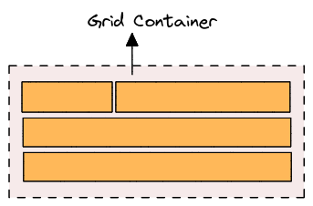
2. Grid item
The child elements of the grid container that are placed into the grid. Grid items are positioned using grid lines, which are defined by the grid tracks.
<div class="container">
  <div class="item"> </div>
  <div class="item">
    <p class="sub-item"> </p>
  </div>
  <div class="item"> </div>
</div>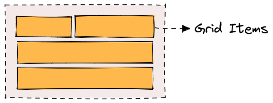
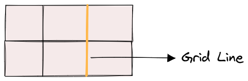
3. Grid line
A line that divides the grid into rows or columns. Grid lines are numbered from 1 to n, where n is the number of rows or columns in the grid.
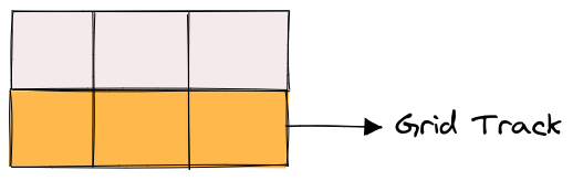
4. Grid track
The space between two adjacent grid lines. Grid tracks can be sized using the grid-template-columns and grid-template-rows properties.
- The space between two row lines are referred to as the row tracks and
- The space between two column lines are referred to as the column tracks.
A size is assigned to these tracks whenever a grid is created.
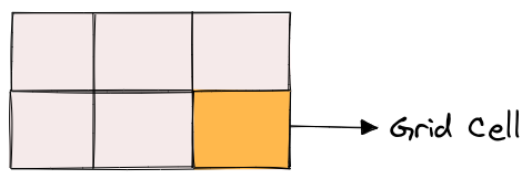
5. Grid cell
The intersection of a row and a column in the grid. Grid cells can contain grid items or be empty.
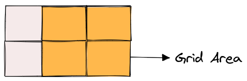
6. Grid area
A rectangular area of the grid that can contain one or more grid cells. Grid areas are defined using the grid-template-areas property.
If you're looking for a way to simplify your CSS development, check out our blog post on the top CSS frameworks for front-end developers.
CSS Grid Properties
There are two main types of CSS Grid properties:
1. Parent properties (Grid Container)
Grid Container properties are used to define the layout of the grid container itself. These properties are applied to the parent element that contains the grid items.
- display
- grid-template-columns & grid-template-rows
- grid-template-areas
- grid-template
- column-gap, row-gap
- grid-gap
- justify-items
- align-items
- place-items
- justify-content
- align-content
- place-content
- grid-auto-columns & grid-auto-rows
- grid-auto-flow
- grid
i.) display
The display property is used to define the container element as a grid container.
To use display with CSS Grid, set the value to grid. This will turn the container element into a grid container, allowing you to use other grid properties to define the grid layout.
Here's an example of how to use the display property with CSS Grid:
.container {
  display: grid
}
ii.) grid-template-columns & grid-template-rows
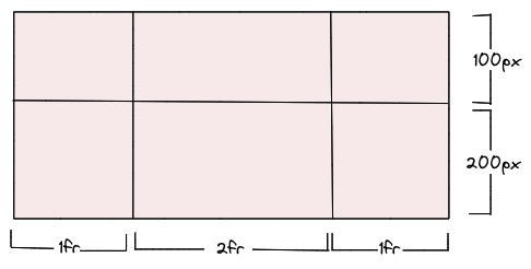
grid-template-columns and grid-template-rows are used to define the size and position of columns and rows in a CSS grid. These properties allow you to create a flexible and responsive grid layout that can adjust to different screen sizes and content.
.container {
  display: grid;
  grid-template-columns: 1fr 2fr 1fr;
  grid-template-rows: 100px 200px;
}
In this case, the values represent the track size, and the space between them is the grid line.
Defining values:
- <track-size - Track size can be expressed as a length, percentage, or fraction of the grid's free space.
- <line-name> - an arbitrary name of your choice
We can then place elements inside the grid by using the grid-column and grid-row properties. For example, if we wanted to place an element in the first row and second column, we could use the following CSS:
.item {
  grid-row: 1;
  grid-column: 2;
}
This would position the element in the second column of the grid's first row.
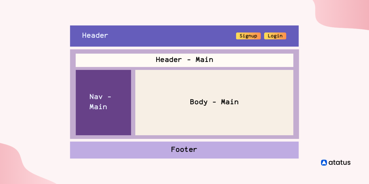
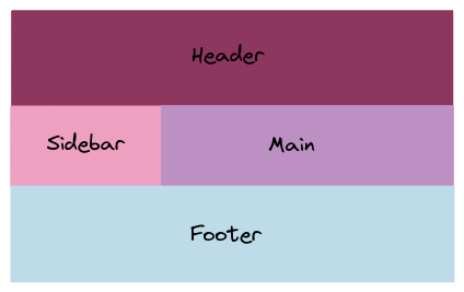
iii.) grid-template-areas
grid-template-areas allows you to define the layout of a grid by assigning names to areas within the grid. These names are used in the grid-area property to place items within the grid. Here's an example:
.container {
  grid-template-areas:
    "<grid-area-name> | . | none | ..."
    "...";
}- <grid-area-name> - name of the grid area
- . – signifies an empty grid cell
- none – no grid areas are defined
.grid-container {
  display: grid;
  grid-template-columns: 1fr 3fr;
  grid-template-rows: 50px 100px 50px;
  grid-template-areas:
    "header header"
    "sidebar main"
    "footer footer";
}

.header {
  grid-area: header;
  background-color: lightblue;
}

.main {
  grid-area: main;
  background-color: lightgray;
}

.sidebar {
  grid-area: sidebar;
  background-color: lightsalmon;
}

.footer {
  grid-area: footer;
  background-color: lightpink;
}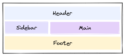
The above CSS will create 2 columns and 3 rows. The resulting grid will have a header that spans both columns, a sidebar area on the left, a main content area on the right, and a footer that spans both columns at the bottom.
iv.) grid-template
grid-template is a shorthand property in CSS Grid that allows you to define both the number and size of grid columns and rows in one declaration.
Syntax:
grid-template: none | <rows> / <columns>;none– sets all three properties to their initial values<rows>|<columns> – setsgrid-template-columnsandgrid-template-rowsto the specified values, respectively, and setsgrid-template-areastonone
Here's an example:
.grid-container {
  display: grid;
  grid-template: repeat(2, 1fr) / repeat(2, 1fr);
  grid-gap: 10px;
}

.item {
  background-color: lightblue;
  padding: 20px;
}
The resulting grid will have three columns and four rows with the specified gaps between the grid items. The background color and padding of the items are added to make it clear where each item is located.
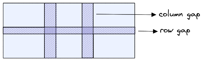
v.) column-gap, row-gap
column-gap and row-gap defines the space between columns and rows, respectively.
.grid-container {
  display: grid;
  grid-template-columns: 1fr 1fr 1fr;
  grid-template-rows: 50px 50px;
  column-gap: 20px;
  row-gap: 10px;
}
We have a grid container with three columns and two rows. Here we have set a column-gap of 20px and a row-gap of 10px to create space between the columns and rows.
vi.) grid-gap
grid-gap is a shorthand property in CSS grid layout that allows you to specify the gap between grid columns and rows at the same time.
Syntax:
grid-gap: grid-row-gap grid-column-gap;Here's an example of how to use grid-gap:
.grid-container {
  display: grid;
  grid-template-columns: 1fr 1fr 1fr;
  grid-template-rows: 50px 50px;
  grid-gap: 20px 10px;
}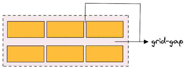
We have set a grid-gap of 20px horizontally and 10px vertically to create space between the columns and rows.
The first value of grid-gap represents the gap between columns and the second value represents the gap between rows.
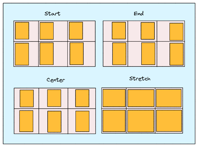
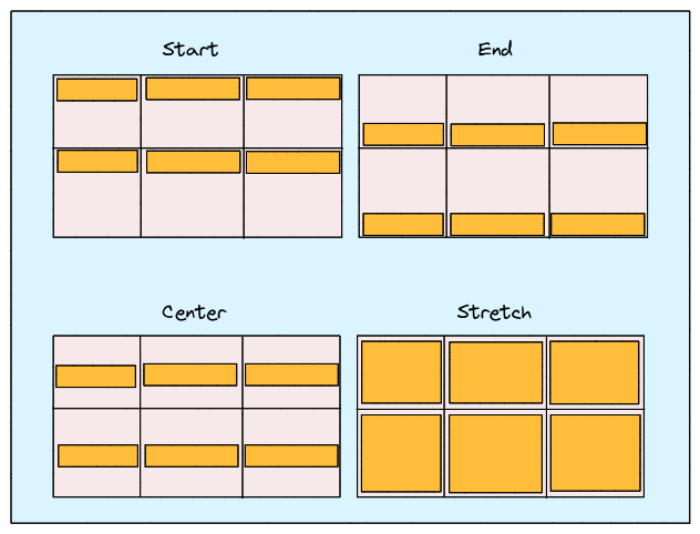
vii.) justify-items
justify-items is a CSS Grid property that defines how the grid items are aligned along the main-axis (the horizontal axis) within their grid container. It is used to control the positioning of items in the grid container when there is extra space available in the main-axis direction.
Here are the possible values for justify-items in CSS Grid:
stretch(default): This value stretches the grid items to fill the available space along the main-axis.start: This value aligns the grid items along the start edge of the grid container in the main-axis direction.end: This value aligns the grid items along the end edge of the grid container in the main-axis direction.center: This value centers the grid items along the main-axis of the grid container.
You can apply the justify-items property to a grid container by using the following CSS syntax:
.container {
  display: grid;
  justify-items: start | end | center | stretch;
}
viii.) align-items
align-items defines how the grid items are aligned along the cross-axis (the vertical axis) within their grid container. It is used to control the positioning of items in the grid container when there is extra space available in the cross-axis direction.
Here are the possible values for align-items in CSS Grid:
stretch(default): This value stretches the grid items to fill the available space along the cross-axis.start: This value aligns the grid items along the start edge of the grid container in the cross-axis direction.end: This value aligns the grid items along the end edge of the grid container in the cross-axis direction.center: This value centers the grid items along the cross-axis of the grid container.
.container {
  display: grid;
  align-items: start | end | center | stretch | space-around | space-between | space-evenly;
}
ix.) place-items
place-items is a shorthand CSS Grid property that combines the align-items and justify-items properties into a single declaration. It is used to set both the horizontal and vertical alignment of grid items within their grid container.
The possible value for place-items in CSS Grid is:
<align-items> <justify-items>: This value specifies the alignment for the vertical and horizontal axes respectively. You can use any of the possible values foralign-itemsandjustify-itemsto set the alignment for each axis.
.center {
  display: grid;
  place-items: center;
}
x.) justify-content
justify-content defines how the grid items are aligned along the main-axis (the horizontal axis) within their grid container. It is used to control the positioning of the grid container along the main-axis when extra space is available in that direction.
Here are the possible values for justify-content in CSS Grid:
start(default): This value aligns the grid container along the start edge of the main-axis.end: This value aligns the grid container along the end edge of the main-axis.center: This value centers the grid container along the main-axis.space-between: This value evenly distributes the grid items along the main-axis, with the first item at the start edge and the last item at the end edge.space-around: This value evenly distributes the grid items along the main-axis, with equal space between each item and half that space at the start and end edges.space-evenly: This value evenly distributes the grid items along the main-axis, with equal space between each item and at the start and end edges.
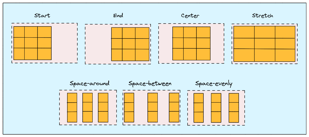
You can apply the justify-content property to a grid container by using the following CSS syntax:
.container {
  align-content: start | end | center | stretch | space-around | space-between | space-evenly;
}
xi.) align-content
align-content is a CSS Grid property that defines how the grid items are aligned along the cross-axis (the vertical axis) within their grid container. It is used to control the positioning of the grid container itself along the cross-axis when there is extra space available in that direction.
Here are the possible values for align-content in CSS Grid:
stretch(default): stretches the grid items to fill the available space along the cross-axis.start: aligns the grid container along the start edge of the cross-axis.end: aligns the grid container along the end edge of the cross-axis.center: centers the grid container along the cross-axis.space-between: evenly distributes the grid items along the cross-axis, with the first item at the start edge and the last item at the end edge.space-around: evenly distributes the grid items along the cross-axis, with equal space between each item and half that space at the start and end edges.space-evenly: evenly distributes the grid items along the cross-axis, with equal space between each item and at the start and end edges.
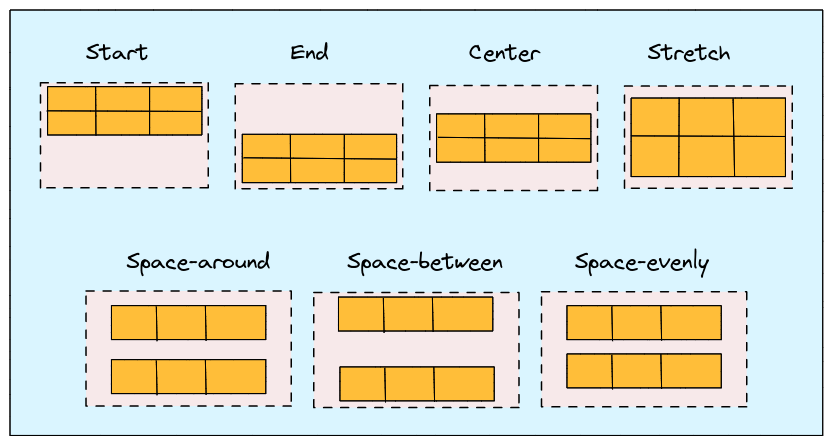
You can apply the align-content property to a grid container by using the following CSS syntax:
.container {
  align-content: start | end | center | stretch | space-around | space-between | space-evenly;
}
xii.) place-content
The place-content property in CSS grid allows you to align and justify grid items along both the horizontal and vertical axes. Here is an example of how to use place-content:
.container {
  display: grid;
  grid-template-columns: repeat(3, 1fr);
  grid-template-rows: repeat(3, 100px);
  height: 400px;
  place-content: inherit;
}

.item {
  background-color: #ccc;
  padding: 20px;
}
Other values that can be used with place-content include:
<align-content> / <justify-content> – align-content is set as the first value and justify-content is set as the second value. You can also assign the first value to both the properties if the second value is omitted.
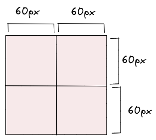
xiii.) grid-auto-columns & grid-auto-rows
grid-auto-columns and grid-auto-rows are properties that allow you to define the size of rows and columns that are created automatically to fill the grid container.
These properties come into play when there are more grid items than cells in the explicit grid, which means that some cells are created automatically to accommodate the additional items.
.container {
  grid-auto-columns: <track-size> ...;
  grid-auto-rows: <track-size> ...;
}
The <track-size> value in a CSS grid can be specified as a fixed length, a percentage of the available space, or as a fraction of the remaining free space using the fr unit.
.container {
  grid-auto-columns: 60px;
}
xiv.) grid-auto-flow
It specifies how the grid container should automatically place grid items that don't have a specific grid position set.
The possible values for grid-auto-flow are:
row: This is the default value, and it means that the auto-placement algorithm should place items in rows, filling up each row before moving on to the next one.column: This value specifies that the auto-placement algorithm should place items in columns, filling up each column before moving on to the next one.dense: This value tells the auto-placement algorithm to try to fill in any empty cells as it goes along, rather than leaving them empty and moving on to the next row or column. This can result in items being placed in unexpected locations, but it can also help to fill the grid more efficiently.
Here is an example of how to use grid-auto-flow in CSS:
.grid-container {
  display: grid;
  grid-template-columns: repeat(3, 1fr);
  grid-auto-flow: row;
}
xv.) grid
The grid property is the shorthand for setting all of the below properties in a single declaration.
grid-template-rowsgrid-template-columnsgrid-template-areasgrid-auto-rowsgrid-auto-columnsgrid-auto-flow
.container {
  grid: 100px 300px / 3fr 1fr;
}
The above code block can also be written as below:
.container {
  grid-template-rows: 100px 300px;
  grid-template-columns: 3fr 1fr;
}
Confused about when to use CSS margin and when to use padding? We've got you covered with a breakdown of each property. Learn how to use them effectively in our latest blog post - CSS Margin vs Padding.
2. Child Properties (Grid Items)
Child properties are the CSS properties applied to the individual child elements of a grid items.
- grid-column-start, grid-column-end, grid-row-start & grid-row-end
- grid-column & grid-row
- grid-area
- justify-self, align-self & place-self
i.) grid-column-start, grid-column-end, grid-row-start & grid-row-end
The properties grid-column-start, grid-column-end, grid-row-start, and grid-row-end are used to specify the location of a grid item within the grid container.
Here's an example that demonstrates how to use these properties:
.item {
  grid-column-start: <number> | <name> | span <number> | span <name> | auto;
  grid-column-end: <number> | <name> | span <number> | span <name> | auto;
  grid-row-start: <number> | <name> | span <number> | span <name> | auto;
  grid-row-end: <number> | <name> | span <number> | span <name> | auto;
}
Example:
.container {
  display: grid;
  grid-template-columns: repeat(3, 1fr);
  grid-template-rows: repeat(2, 100px);
}

.item {
  background-color: #ccc;
  padding: 20px;
}

.item-1 {
  grid-column-start: 1;
  grid-column-end: 3;
  grid-row-start: 1;
  grid-row-end: 2;
}
In this example, we have a grid container with 3 columns and 2 rows.
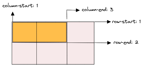
The grid-column-start and grid-column-end properties are used to specify the start and end positions of the grid item along the horizontal axis (columns). For example, the grid-column-start value of 1 and grid-column-end value of 3 for the .item-1 class specifies that the grid item should start at column 1 and end at column 3.
Similarly, the grid-row-start and grid-row-end properties are used to specify the start and end positions of the grid item along the vertical axis (rows). For example, the grid-row-start value of 1 and grid-row-end value of 2 for the .item-1 class specifies that the grid item should start at row 1 and end at row 2.
ii.) grid-column & grid-row
The grid-column and grid-row properties specify a grid item's location within a grid container.
When using these properties on a child grid item, you can define the starting and ending grid lines on the horizontal (for grid-column) and vertical (for grid-row) axes to determine the position and size of the item in the grid.
Syntax:
.item {
  grid-column: <start-line> / <end-line> | <start-line> / span <value>;
  grid-row: <start-line> / <end-line> | <start-line> / span <value>;
}
.grid-container {
display: grid;
grid-template-columns: repeat(3, 1fr);
grid-template-rows: repeat(2, 50px);
}
.grid-item {
background-color: pink;
font-size: 24px;
}
.grid-item-1{
grid-column: 1 / 3;
grid-row: 1 / 2;
}In this example, the .grid-container is a grid with 3 columns and 2 rows. Each .grid-item is a child of the .grid-container and has its position defined using the grid-column and grid-row properties.
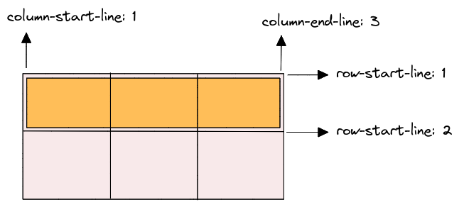
For instance, the first .grid-item has grid-column: 1 / 3; and grid-row: 1 / 2;, meaning that it spans from the first to the second grid column and from the first to the second grid row. The second .grid-item has grid-column: 2 / 4; and grid-row: 2 / 3;, meaning that it spans from the second to the fourth grid column and from the second to the third grid row.
You can adjust the values of grid-column and grid-row to position your grid items as desired within the grid container.
iii.) grid-area
The grid-area property is used to assign a grid item to a named grid area, specified by the grid-template-areas property on the parent container.
Syntax:
.item {
  grid-area: <name> | <row-start> / <column-start> / <row-end> / <column-end>;
}
To use grid-area, you need to follow these steps:
- Define the grid layout on the parent container using the
grid-template-areas,grid-template-rows, andgrid-template-columnsproperties. - Assign a name to each grid area using the
grid-areaproperty on the child items. The name should correspond to the name you defined in thegrid-template-areasproperty. - Set the position and size of the grid item using the
grid-row-start,grid-row-end,grid-column-start, andgrid-column-endproperties.
Here's an example:
.container {
  display: grid;
  grid-template-areas:
    "header header"
    "sidebar main"
    "footer footer";
  grid-template-rows: 80px 1fr 80px;
  grid-template-columns: 200px 1fr;
  background-color: #DAF5FF;
}

.header {
  grid-area: header;
  background-color: #89375F;
}

.sidebar {
  grid-area: sidebar;
  background-color: #E8A0BF;
}

.main {
  grid-area: main;
  grid-row-start: 2;
  grid-row-end: 4;
  background-color: #BA90C6;
}

.footer {
  grid-area: footer;
  background-color: #C0DBEA;
}
In this example, we have a container with a grid layout that defines three rows and two columns, and three named grid areas. Each child item is assigned to a grid area using the grid-area property, and its position and size are set using the grid-row-start, grid-row-end, grid-column-start, and grid-column-end properties.
iv.) justify-self, align-self & place-self
The justify-self, align-self, and place-self properties are used to control the alignment and placement of grid items within their grid cells. These properties are applied to individual grid items, rather than to the grid container as a whole.
Here's a brief explanation of each property:
justify-self: This property controls the horizontal alignment of a grid item within its cell. It can take values likestart,end,center,stretch, andauto.align-self: This property controls the vertical alignment of a grid item within its cell. It can take values likestart,end,center,stretch, andauto.place-self: This is a shorthand property that combinesjustify-selfandalign-selfinto a single declaration. It takes two values, the first for horizontal alignment and the second for vertical alignment, separated by a space.
Here's an example of how these properties can be used:
.grid {
  display: grid;
  grid-template-columns: repeat(3, 1fr);
  grid-template-rows: repeat(3, 100px);
}

.grid-item {
  background-color: #ccc;
  border: 1px solid #999;
  display: flex;
  justify-content: center;
  align-items: center;
}

.item1 {
  justify-self: start;
}

.item2 {
  align-self: end;
}

.item3 {
  place-self: center stretch;
}
In this example, we have a grid container with 3 columns and 3 rows. Each grid item has a background color and a border, and is centered both horizontally and vertically using display: flex, justify-content, and align-items. The justify-self, align-self, and place-self properties are then used to control the alignment of individual items within their cells.
The first item is aligned to the start of its cell horizontally using justify-self: start. The second item is aligned to the end of its cell vertically using align-self: end. The third item is centered both horizontally and vertically using place-self: center stretch, which sets the horizontal alignment to center and the vertical alignment to stretch.
Tricks while using CSS Grids
To create more flexible and maintainable CSS grids, you can use these tricks to simplify your code.
1. Use the repeat() function to simplify grid templates:
/* Instead of this... */
grid-template-columns: 1fr 1fr 1fr 1fr 1fr;

/* Use the repeat() function for cleaner code */
grid-template-columns: repeat(5, 1fr);
2. Use auto-fit or auto-fill to create flexible grids:
/* This grid will automatically create as many columns as will fit in the container */
grid-template-columns: repeat(auto-fit, minmax(250px, 1fr));

/* This grid will always create 3 columns, and will fill any extra space with empty cells */
grid-template-columns: repeat(auto-fill, minmax(250px, 1fr));
3. Use grid-gap to add spacing between grid items:
/* This grid will have a 20px gap between grid items */
grid-gap: 20px;
4. Use grid-template-areas to create named grid areas:
/* Define named grid areas */
grid-template-areas:
  "header header header"
  "nav main aside"
  "footer footer footer";

/* Reference named grid areas when placing items on the grid */
header {
  grid-area: header;
}
nav {
  grid-area: nav;
}
main {
  grid-area: main;
}
aside {
  grid-area: aside;
}
footer {
  grid-area: footer;
}
5. Creating a responsive grid with media queries:
.container {
  display: grid;
  grid-template-columns: repeat(4, 1fr);
  grid-gap: 20px;

  @media (max-width: 768px) {
    grid-template-columns: repeat(2, 1fr);
  }

  @media (max-width: 480px) {
    grid-template-columns: 1fr;
  }
}
6. Nesting grids for more complex layouts:
.container {
  display: grid;
  grid-template-columns: 1fr 2fr;

  .item {
    display: grid;
    grid-template-columns: 1fr 1fr;
    grid-gap: 20px;
  }
}
Use cases of CSS Grids
CSS grids provide a powerful layout system allowing web developers to create complex and responsive designs easily. Here are some of the most common use cases of CSS grids:
- Creating complex layouts: CSS grids allow you to create complex layouts that are difficult to achieve using other CSS layout methods. For example, you can create a layout with multiple rows and columns and specify the size and position of each element in the grid.
- Responsive design: CSS grids are perfect for creating responsive designs that adapt to different screen sizes and devices. You can use media queries to adjust the layout of your grid based on the viewport size.
- Creating flexible layouts: With CSS grids, you can create flexible layouts that can adapt to different content sizes. You can specify the size of each grid item or use the auto keyword to allow the browser to calculate the size based on the content.
- Aligning content: CSS grids easily align content within your layout. You can specify the alignment of each grid item within its grid cell or the entire grid within its container.
- Nesting grids: You can nest grids within other grids to create more complex layouts. This allows you to create modular and reusable layouts that can be easily modified as your design requirements change.
Conclusion
In conclusion, understanding the basics of CSS Grid is essential for any web developer. With its flexibility and power, CSS Grid can help you create complex and responsive layouts with ease. By understanding the basics, such as grid containers and grid items, designers can take advantage of the many features of CSS grid, including grid lines, tracks, and areas.
Furthermore, by utilizing the different units of measurement and functions, designers have even more control over the layout and can create responsive designs that adapt to different screen sizes. With this complete guide to CSS grid, designers can confidently incorporate this technique into their workflow and create stunning layouts for their websites.
Whether you're a beginner or an experienced developer, taking the time to learn CSS Grid is definitely worth it. So start experimenting with this flexible and dynamic layout system, and take your web design skills to the next level.
Atatus Real User Monitoring
Atatus is a scalable end-user experience monitoring system that allows you to see which areas of your website are underperforming and affecting your users. Understand the causes of your front-end performance issues and how to improve the user experience.
By understanding the complicated frontend performance issues that develop due to slow page loads, route modifications, delayed static assets, poor XMLHttpRequest, JS errors, core web vitals and more, you can discover and fix poor end-user performance with Real User Monitoring (RUM).
You can get a detailed view of each page-load event to quickly detect and fix frontend performance issues affecting actual users. With filterable data by URL, connection type, device, country, and more, you examine a detailed complete resource waterfall view to see which assets are slowing down your pages.
#1 Solution for Logs, Traces & Metrics
 APM
APM
Kubernetes
Logs
Synthetics
RUM
Serverless
Security
More