10 Best Grafana Alternatives in 2026
Grafana is powerful, but power without simplicity is just complexity. If your team is drowning in YAML configs, fighting data source plugins, or struggling to give non-technical stakeholders a clean view of what's happening in production, you're not alone.
Grafana is a popular open-source data visualization platform. With its frontend written in TypeScript and a Go back-end, it allows users to create interactive dashboards using data from sources like InfluxDB, Prometheus, and Elasticsearch. But it uses a time-series database as its default, making it great for IT metrics like server uptime and API latency and far less suitable for business metrics that require segmentation by customer type, product category, or geography.
And for non-technical users? Its extra-technical nature is consistently cited as a major frustration. That's why thousands of engineering teams are evaluating alternatives.
If any of these sound familiar, you're evaluating the right page:
- Your team spends more time maintaining Grafana than actually acting on its data
- You need APM, RUM, and logs in one place, Grafana requires 3+ separate tools
- Grafana Cloud costs are climbing and you can't justify the TCO
- Non-engineers can't read your dashboards without a tutorial
- You've outgrown open-source and need SLA-backed support
👇 We've evaluated 10 alternatives so you don't have to. Jump to Atatus for the #1 recommendation.
Switch from Grafana to Unified Observability in Just 14 Days
Get APM, Logs, Traces, Real User Monitoring, and Infrastructure Monitoring in one platform. Reduce troubleshooting time and gain complete visibility across your stack.
In This Blog:
- Why Teams Are Moving Away from Grafana?
- What to Look for in a Grafana Alternative?
- Quick Comparison Table
- Atatus vs Grafana: Side-by-Side Comparison
- The 10 Best Grafana Alternatives
- How to Migrate from Grafana to Atatus?
- Grafana Replacement Checklist
Why Teams Are Moving Away from Grafana?
Grafana is mature and capable, but it comes with real trade-offs that push teams to look elsewhere. Here are the most common pain points we hear:
What to Look for in a Grafana Alternative?
Before evaluating tools, anchor your decision to what your team actually needs. Here are the criteria that matter most:
- Full-stack observability: Metrics, logs, traces, and frontend performance, ideally in a single platform without data silos.
- Ease of setup: Time-to-value matters. Look for auto-instrumentation and pre-built dashboards that work out of the box.
- Business-friendly UX: Your VP of Engineering shouldn't need a tutorial to read a dashboard. Prioritize clean, intuitive interfaces.
- Alerting that works: Smart, threshold-based, and anomaly-detection alerts with minimal noise and easy routing to Slack, PagerDuty, etc.
- Transparent pricing: Avoid tools that hide costs behind data ingestion fees. Look for predictable, per-host or per-seat pricing.
- Real User Monitoring (RUM): Understanding how actual users experience your app is as important as backend metrics.
- Support quality: When production is down, you need a real human, not a community forum.
Quick Comparison Table
Use this table to quickly narrow down your options before diving into the full tool breakdowns below.
Atatus is the only tool on this list with full APM + RUM + Logs
No plugin dependencies. No hidden ingestion fees. Compare to your current stack.
The 10 Best Grafana Alternatives (Detailed Breakdown)
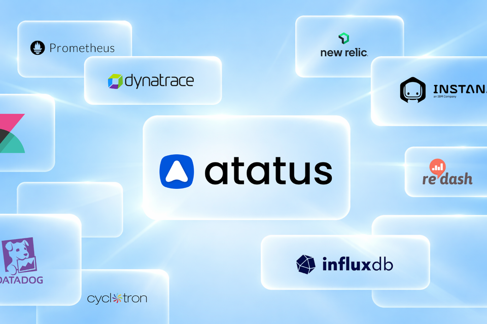
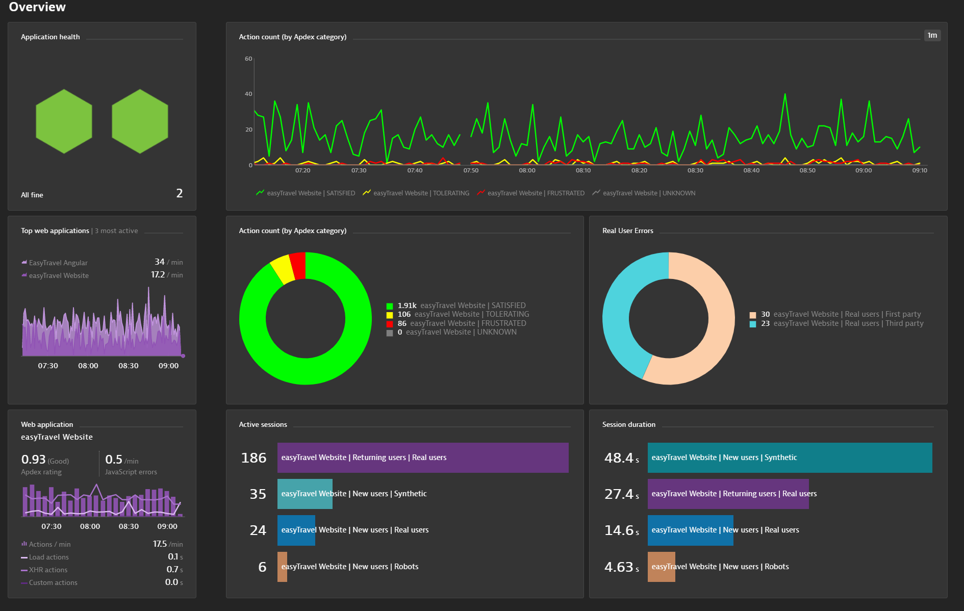
1. Atatus - Full-Stack Observability Without the Grafana Complexity
Atatus is a SaaS-delivered application performance and error-tracking tool that offers full-stack visibility for all your applications.
Millions of performance data points from across your applications can be dynamically collected by the platform, enabling you to resolve issues more rapidly and enhance the digital user experience.
And with the flexibility of cloud or on-premise deployment, everything takes place in real-time in the field.
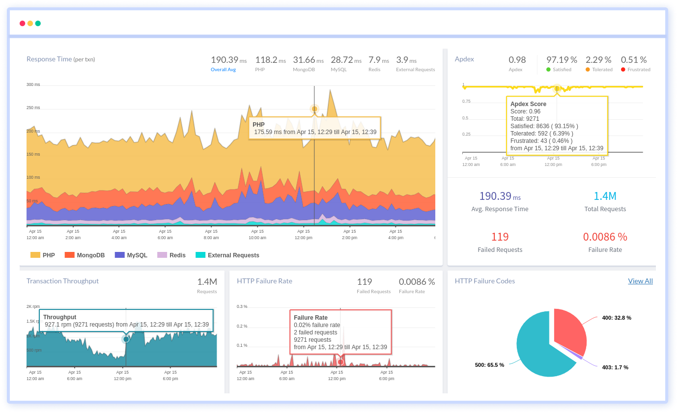
Atatus provides a user-friendly interface for creating custom dashboards to display metrics, alerts, and other data, making it easy for organizations to display data in a way that makes sense for their business needs.
It supports alerting based on performance thresholds, making it easy to monitor performance and receive notifications when performance issues arise.
What Atatus does that Grafana can't (natively)?:
- Application Performance Monitoring (APM)
- Real User Monitoring (RUM)
- Unified Log Management
- Distributed Tracing (OpenTelemetry)
- Infrastructure Monitoring
- Smart Alerting (no YAML)
- Pre-built Dashboards
- SLA-backed Support
Why teams choose Atatus over Grafana?
- Faster time-to-value: 30 minutes to your first dashboard. No plugin installations, no data source configs.
- Lower total cost of ownership: One subscription replaces Grafana + Prometheus + Loki + Tempo + alerting tooling.
- Non-engineers can use it: Pre-built dashboards your product and business teams can actually read.
- Predictable pricing: No surprise data-ingestion bills. See pricing →
- Real support: Dedicated team, not community forums, when production is down.
2. Kibana
Kibana is a web-based analytics platform that collects data from different sources and displays them. It is a part of the three-pronged Elasticstack along with Logstash and Elasticsearch.
Since it's written in java, developers and non-developers can work on it alike.
Using Kibana with Elasticsearch, you can search, view, and visualize indexed data. It allows you to create charts, tables, histograms, and maps. Multiple visualization methods are combined in its Dashboards to provide a processable view of large data sets.
Kibana performs well when visualizing data from Log management, Infrastructure monitoring, APM, SIEM, or Business.
Kibana’s data visualization pointers:
- Kibana offers various types of visualizations, such as bar charts, pie charts, line graphs, etc. Choose the visualization that best represents your data.
- You can filter the data based on specific conditions to show only the relevant information.
- It provides various aggregation features, such as sum, average, count, etc., which can be applied to the data to summarize it and make it easier to understand.
- Kibana offers various options to customize the visualizations, such as changing the axis labels, adding a title, adjusting the colors, etc.
- You can save visualizations and share them with others by exporting them or embedding them in a dashboard.
- It also allows you to create multiple visualizations and combine them in a dashboard to understand your data better.
- Kibana has a rich library of plugins that can enhance its capabilities, such as adding new visualizations, integrating with other tools, etc.
Among Kibana's main advantages is that it allows you to analyze logs in a way that Grafana cannot.
Cons:
- Integrated product requires the full ELK stack to function
- Fewer out-of-the-box dashboard templates than alternatives
3. Instana
Instana is a cloud-based observability platform for application performance management (APM) and IT operations.
It helps organizations to monitor and manage their microservice-based applications and infrastructure by providing real-time visibility, automated anomaly detection, and performance optimization.
Instana uses artificial intelligence and machine learning algorithms to automatically detect performance issues, identify root causes, and provide recommendations for resolution.
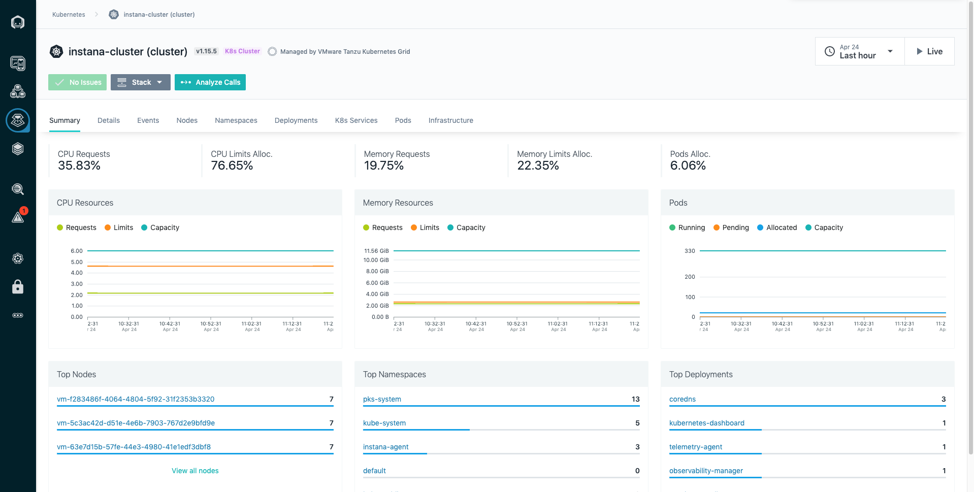
- Customizable dashboards provide a consolidated view of key performance metrics, including CPU utilization, memory usage, request latency, and more.
- Interactive topology maps provide a visual representation of the components of an application and their relationships, helping teams to understand how changes in one component can impact other parts of the application.
- Graphs and charts that display performance metrics over time
- Instana provides detailed traces of individual requests, showing the flow of requests through the different components of an application and highlighting areas of potential performance bottlenecks.
- Customizable alerts can be set up to trigger notifications when performance thresholds are breached
Cons:
- No support for profiling or real user monitoring
- Custom pricing model adds procurement friction
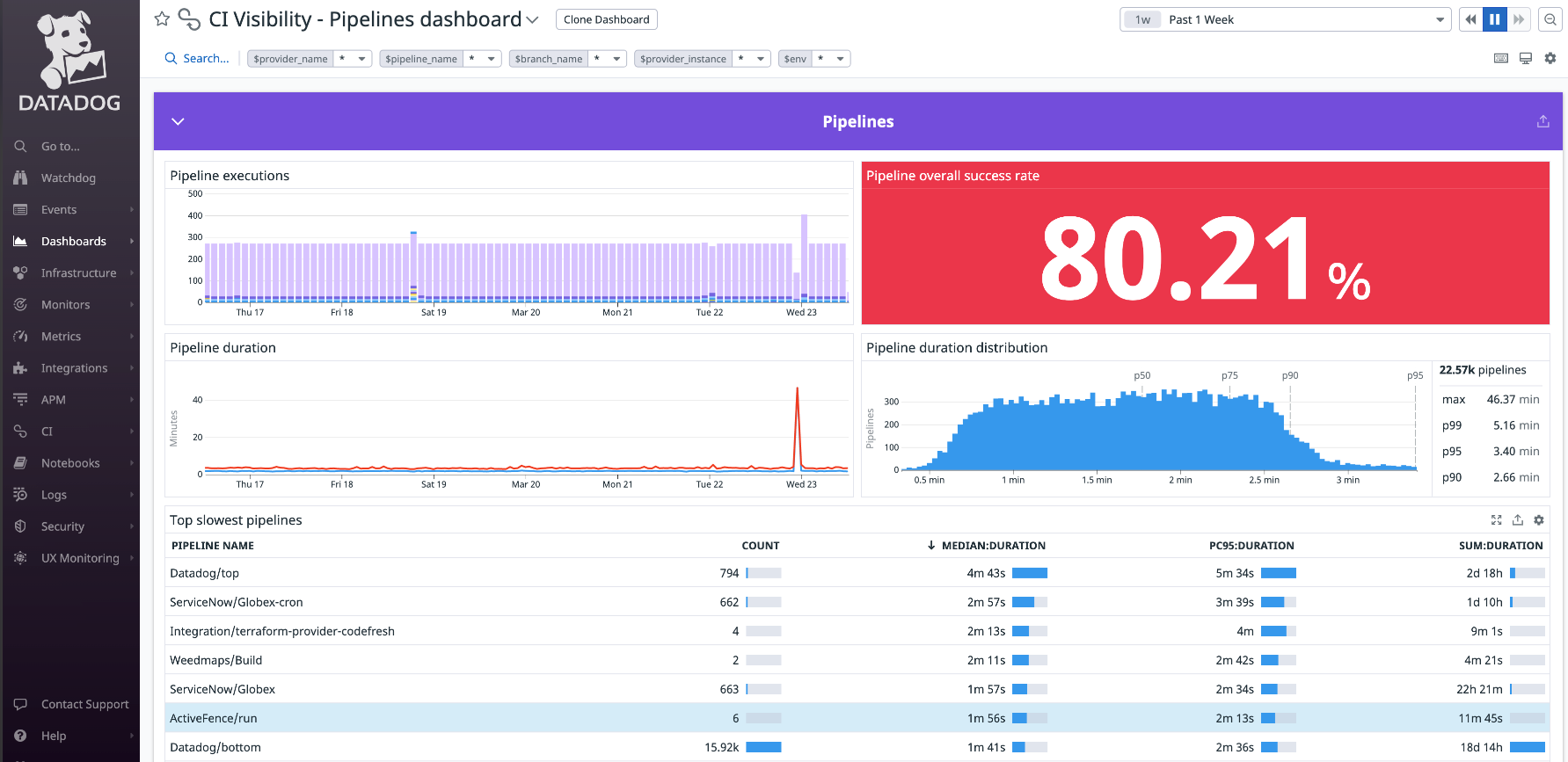
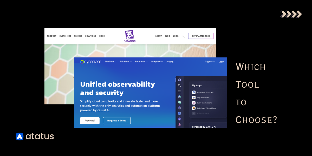
4. Datadog
Datadog is a cloud-based monitoring and analytics platform that helps organizations monitor and optimize their applications, infrastructure, and business processes.
The data visualization process in Datadog provides teams with the tools they need to effectively monitor and understand the performance of their applications and infrastructure, enabling them to identify and resolve issues and improve performance quickly.
- Datadog integrates with a wide range of systems and applications to collect performance data, including cloud services, infrastructure, logs, and custom metrics.
- It provides a range of tools for analyzing performance data, including interactive dashboards, alerting, anomaly detection, and correlation with logs.
- The visualization features include time series graphs, heat maps, histograms, and pie charts.
- Teams can customize visualizations to fit their specific needs by adjusting the data displayed, changing colors, adding annotations, and more.
- Datadog provides options for sharing visualizations with others, including embedding in other tools, exporting, and sharing links.
- It also provides collaboration features, such as the ability to comment on visualizations, to enable teams to work together and make data-driven decisions.
Cons:
- Complex UI with a steep learning curve
- No public playground for evaluation
- Features overlap and per-product pricing adds up fast
5. New Relic
New Relic is a software analytics platform that provides comprehensive monitoring, troubleshooting, and data visualization capabilities for modern software applications and infrastructure.
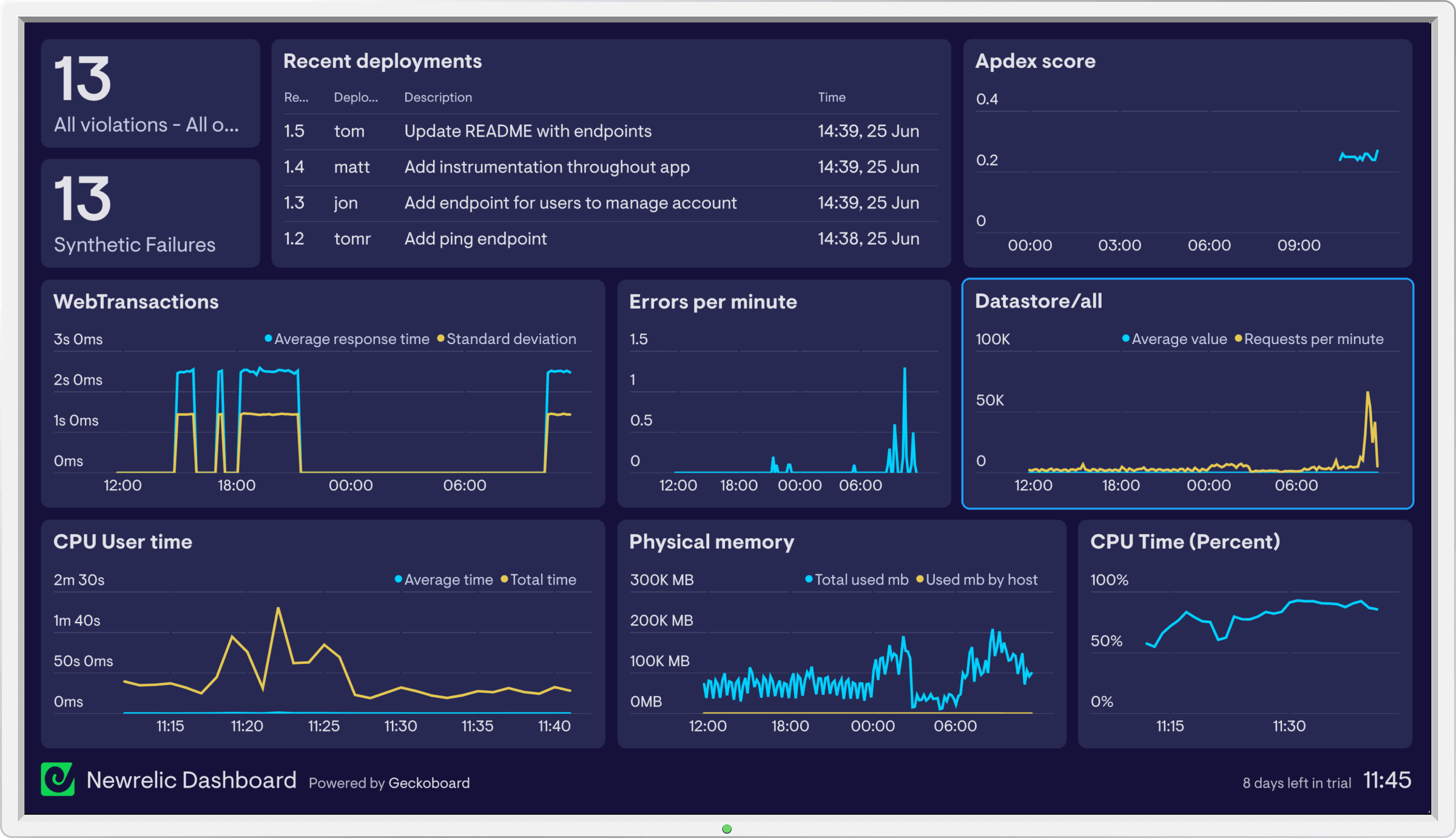
New Relic is a leading observability platform based on distributed tracing. It provides the following functions:
- Real-time monitoring
- Trace analysis in multi-tier applications
- Customizable bar charts, line graphs, and more
- They also provide visibility into mobile application performance
Cons:
- Complicated user interface for new users
- $0.30/GB ingestion pricing gets expensive at scale
Compare your current stack to Atatus in 15 minutes.
No sales call required. Start a free trial and see your data in Atatus today.
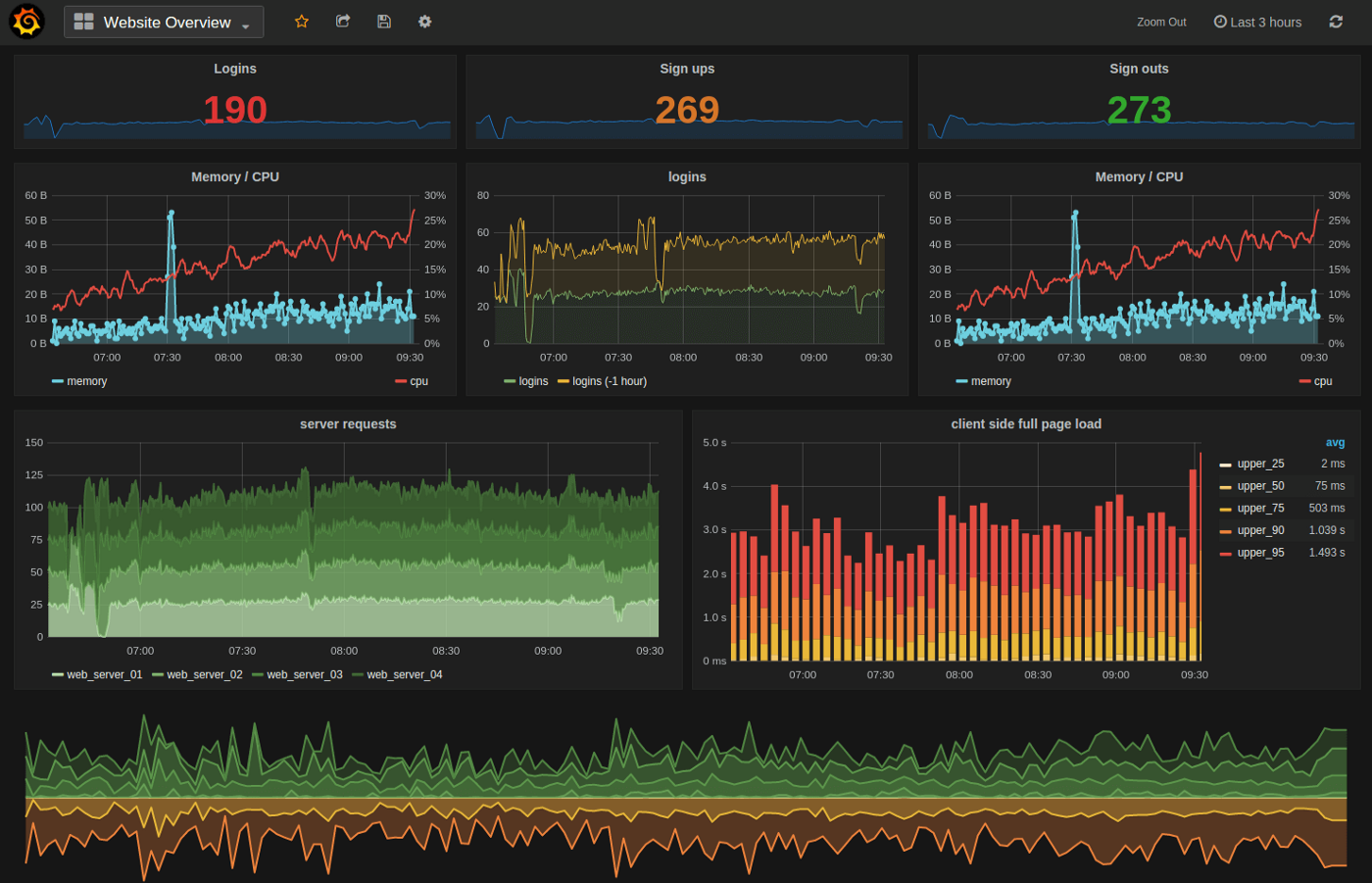
6. InfluxDB
InfluxDB is a real-time analytics data store that manages metrics, events, and real-time analytics. InfluxDB does not replace Grafana, but you can use it as a Grafana data source.
It is a time series database that visualizes data through its visualization tool, InfluxDB Chronograf.
- InfluxDB Chronograf provides a user-friendly interface for creating custom dashboards to display metrics, alerts, and other data.
- A range of pre-built templates
- Tools for exploring and analyzing data, including a query builder and the ability to interact with data in real time.
- Designed specifically for time series data, InfluxDB Chronograf provides a range of time series visualizations, including line graphs, bar charts, and more.
- Easy integrations to consolidate data from multiple sources in a single view.
Cons:
- Must be used with grafana or other alternatives
- Have to learn InfluxQL
- Slower than other time series database
7. Dynatrace
Dynatrace is a software intelligence platform that provides comprehensive monitoring and data visualization capabilities for digital business applications and cloud infrastructure.
- Customizable dashboards with metrics graphs
- Interactive topology maps
- Dynatrace provides detailed traces of individual requests, showing the flow of requests through the different components of an application
- Dynatrace uses artificial intelligence and machine learning algorithms to automatically identify the root cause of performance issues, even in complex, multi-tier applications.
- It also provides real-time performance data, enabling teams to identify and resolve issues in near real-time quickly.
Cons:
- False alarm issues in complex environments
- Unstable and hard-to-predict pricing model at $69/host/mo
8. Prometheus
Prometheus is a popular open-source monitoring and alerting system that provides data visualization capabilities. It records metrics in a time series database using an HTTP pull model.
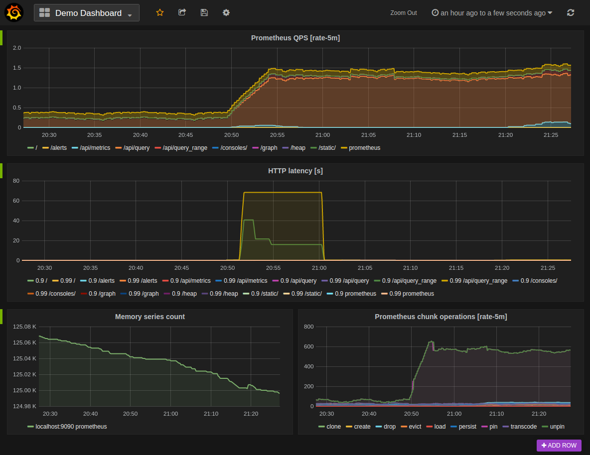
Prometheus provides a web-based graphical user interface (GUI) for creating custom dashboards to display metrics, alerts, and other data.
- Prometheus provides PromQL for customizing dashboards
- It highly supports histograms, making the interpretation of data simpler
- Labels are key-value pairs that can be used to categorize and filter metrics, making it easy to compare metrics across different systems, applications, or other dimensions.
- Alerting features based on metrics threshold
Cons:
- Limited native visualization requires Grafana or similar
- Horizontal scaling is not straightforward
9. Cyclotron
Cyclotron provides a range of interactive visualizations, including bar charts, line graphs, heat maps, and more, enabling organizations to display data in a way that makes it easy to understand and analyze.
With Cyclotron, you can retrieve data from numerous data sources, including Elasticsearch, Graphite, InfluxDB, Prometheus, and others.
- Drag-and-drop interface for creating dashboards and reports
- Cyclotron provides a range of data connectors, making it easy to connect to various data sources, including databases, cloud services, and APIs.
- Provides tools for filtering and transforming data
- Allows embedding, exporting, and sharing links
Cons:
- Limited interactivity compared to alternatives
- Fewer pre-built dashboard templates
10. Redash
Redash is yet another popular data visualization platform. With drag and drop, easy navigation, and resizable visualization features, this tool can be handy. Also, sharing dashboards with your teammates is a breeze.
Its other useful features include:
- Querying in natural syntax
- More than 35 SQL and NoSQL data sources.
- Keyboard shortcuts and live autocompletion
- Cache management
- Custom snippets for frequently used codes.
- Integrations with popular databases and platforms
Cons:
- Complex SQL queries required for advanced use cases
How to Migrate from Grafana to Atatus?
Most teams are fully live on Atatus within two weeks. Here's what the process looks like:
Grafana Replacement Checklist
| ☐ Native APM (no plugin required) | ☐ Real User Monitoring built-in |
| ☐ Unified log management | ☐ Distributed tracing (OpenTelemetry) |
| ☐ Infrastructure monitoring | ☐ Smart alerting without YAML |
| ☐ Pre-built dashboards out of the box | ☐ Non-technical stakeholder access |
| ☐ Predictable pricing (no per-GB billing) | ☐ Dedicated support (not community forums) |
| ☐ Sub-30 min time to first dashboard | ☐ No ongoing plugin maintenance |
Final Recommendation
Choosing a Grafana alternative comes down to understanding what Grafana is actually missing for your team. Here's a quick decision framework:
| If you need… | Best choice | Why |
|---|---|---|
| Full-stack observability (APM + RUM + Logs + Infra) in one platform | Atatus | Only option with all five pillars natively at $49/mo |
| Deep log analysis with an ELK-based setup | Kibana | Best-in-class log search with Elasticsearch |
| Enterprise-scale, AI-powered microservices monitoring | Instana or Dynatrace | AI-driven root cause, enterprise SLAs |
| Maximum integrations + enterprise budget | Datadog | Widest integration ecosystem |
| Open-source metrics collection for Kubernetes | Prometheus | De-facto standard for K8s metrics |
| SQL-first analytics and BI reporting | Redash | Natural language queries, 35+ connectors |
For most engineering teams, especially those moving away from Grafana because of complexity, cost, or the pain of maintaining multiple monitoring tools, Atatus is the clear recommendation. It delivers full-stack observability out of the box, with a pricing model that doesn't punish growth and a UI your whole team can actually use.
As always: keep your requirements in mind. The best tool isn't the most expensive or the most feature-rich, it's the one that solves your specific problems without creating new ones.
Start Full-Stack Monitoring in 30 Minutes
Atatus replaces Grafana, Prometheus, Loki, and Tempo with a single platform. APM, RUM, Logs, Traces, and Infrastructure Monitoring in one place.
Frequently Asked Questions
1) What is the best Grafana alternative for full-stack observability?
Atatus is the top-rated Grafana alternative for teams needing full-stack observability. It combines APM, RUM, Logs, Distributed Tracing, and Infrastructure Monitoring in a single platform with no plugins required, no YAML configs, and no per-host pricing surprises.
2) How long does it take to migrate from Grafana to Atatus?
Most teams complete migration from Grafana to Atatus in under 14 days. Atatus provides auto-instrumentation, OpenTelemetry support, and pre-built dashboards that eliminate the manual setup Grafana requires.
3) Is Atatus cheaper than Grafana Cloud?
Yes. Atatus offers with predictable per-host pricing. Grafana Cloud scales costs sharply once you factor in data ingestion, plugin maintenance, and the additional tools needed for APM and RUM — which Grafana doesn't include natively.
4) Does Atatus support OpenTelemetry?
Yes. Atatus natively supports OpenTelemetry for distributed tracing, allowing you to instrument applications once and send telemetry data to Atatus without vendor lock-in.
5) Can non-technical stakeholders use Atatus dashboards?
Absolutely. Unlike Grafana, Atatus is designed for both engineers and business stakeholders. Pre-built dashboards, intuitive navigation, and clean UX mean your VP of Engineering and product managers can read dashboards without engineering support.
#1 Solution for Logs, Traces & Metrics
![]() APM
APM
![]() Kubernetes
Kubernetes
![]() Logs
Logs
![]() Synthetics
Synthetics
![]() RUM
RUM
![]() Serverless
Serverless
![]() Security
Security
![]() More
More

![Splunk vs Prometheus: A Side-by-Side Comparison [2025 Guide]](/blog/content/images/size/w960/2024/08/Datadog-vs-sentry--13-.png)