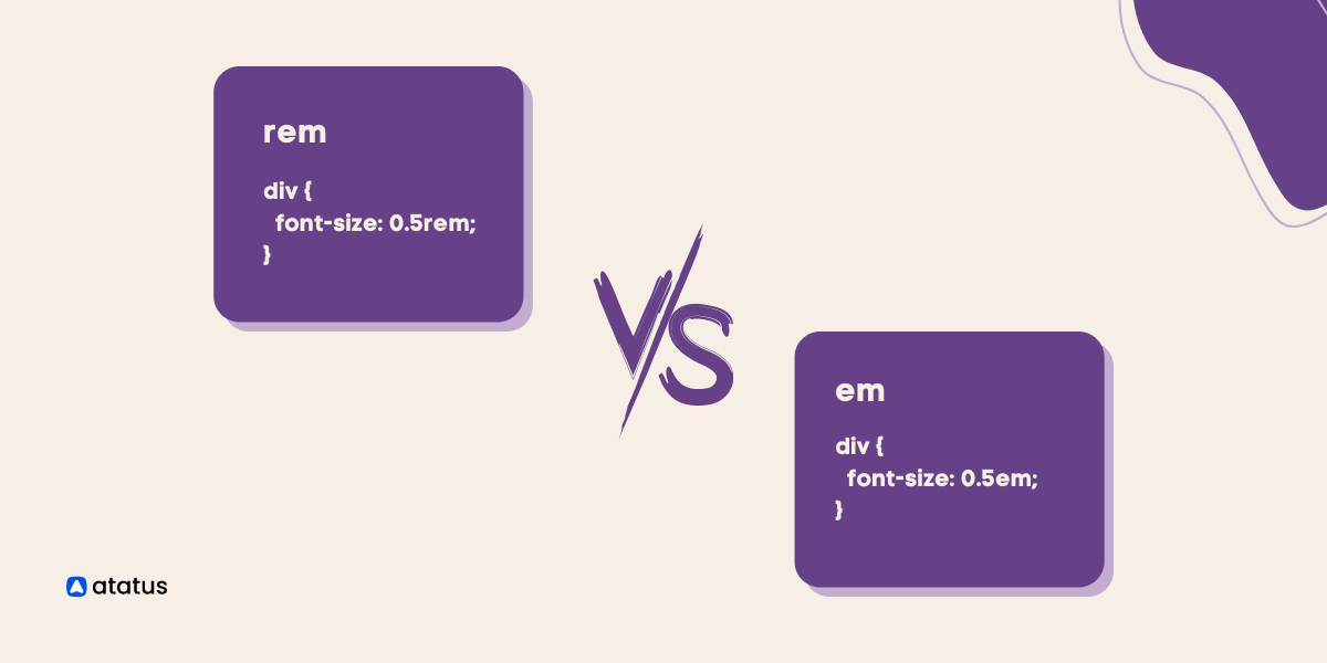
rem vs em: Understanding the CSS Unit Basics
CSS is the most important component of modern web design, but implying it effectively can be tricky. One of the most noteworthy concepts to grasp in CSS units is the distinction between rem CSS unit and em CSS unit. Web developers who want to create flexible and responsive web pages must contemplate the differences between these two units.
One of the primary distinctions between rem CSS unit and em CSS unit is that an em unit is relative to the CSS font size of its parent element, whereas a rem unit is always relative to the root CSS font size.
Relative CSS length units highlight a length in relation to another length parameter. This may be the size of the parent element or the important HTML. These are configurable units that empower in the drafting of responsive web design.
Both em and rem are scalable units in CSS that determine attribute attributes such as the theme, hue, format, border, spacing, yet more. em and rem are more compatible with internet standards and specifications than px, and thus can be used for responsive design.
rem, in contrast, is relative to the CSS font size of the root element, which is confined by the browser settings and not just limited to a single parent element. em is relative to the CSS font size of its parent element, so if an element has a font size of 14px, 1em is equal to 14px.
Table Of Contents
- What is CSS?
- What are CSS Units?
- rem in CSS
- em in CSS
- rem Units vs em Units
- Applying ems and rems in CSS
What is CSS?
A computer language used for organizing and setting out web pages is called Cascading Style Sheets (CSS). With an external CSS file, you can change just one file to change the entire website's layout.
In markup languages like HTML or XML, it is used to stylize certain components. HTML serves as a website's structural foundation, and CSS provides the site's overall aesthetics; as a result, the two are closely related.
CSS decouples the presentational style of a document from its content, allowing web developers to efficiently enforce consistent styles across various web browsers. CSS describes how HTML elements should be displayed on screens, in printed form, or in other formats.
CSS was designed to function in tandem with other markup languages such as HTML. There are three different ways to implement CSS, and the external style allows for simultaneous updating of multiple sites. You may also use internal or inline styles to style certain HTML components.
What are CSS Units?
CSS units are measurements used in Cascading Style Sheets (CSS) to specify the size, position, and other layout-related properties of elements in a web page. There are several different units of measurement available in CSS, including:
- Pixels (px)
- Points (pt)
- em (em)
- rem (rem)
- Percentages (%)
- Viewport units (vh, vw, vmin, vmax)
Each of these CSS units serves a specific purpose and is best suited to different types of measurements.
For example, pixels are used for specifying the exact size of an element, while percentages are used for specifying the size of an element relative to its parent element.
It's important to choose the appropriate CSS unit of measurement for each property in order to achieve the desired layout and appearance of a web page.
We will look into rem and em in CSS units in detail.
rem in CSS
Relative CSS length units are proportional to another value, such as the CSS font size of the parent element or the viewer size. With appropriate modifications, you might design it so that the size of text or more components evolves relative to the rest of the page by employing relative units.
The acronym rem stands for root em. The font size for elements in CSS units is determined by rem CSS units in relation to their root elements. The default CSS font size value for most browsers is 16px, so an element with a value of 1rem will also have a CSS font size of 16px.
The rem units are helpful for scaling CSS elements in relation to the standard CSS font size. A value or data type's length is expressed in rem. rem is compatible with all properties that take length as a value.
The font size of the root element's rem reclaims its values. Consequently, 1rem acknowledges the very same value throughout your entire CSS code.
It is advised to use rem rather than px because some browsers do not automatically resize when the settings are altered. Some people may need to magnify your text up to 400% to read it.
Using rem, you ensure that your text meets these requirements. Instead of the size given in the stylesheet, the rem units used in media queries rely on the browser's default size or the user's size preferences.
<!DOCTYPE html>
<html>
  <head>
    <title>Em vs Rem</title>
    <style>
      html {
      	font-size: 30px;
      	background-color: #E3F6FF;
      }
      .parent {
      	font-size: 20px;
      	background-color: #E3F6FF;
      }
      .child-rem {
      	font-size: 2rem;
      	margin: 1.5rem;
      	background-color: #E3F6FF;
      }
    </style>
  </head>
  <body>
    <div class="parent">
      This is parent
      <div class="child-rem">
        This is Child in rem unit system
      </div>
    </div>
  </body>
</html>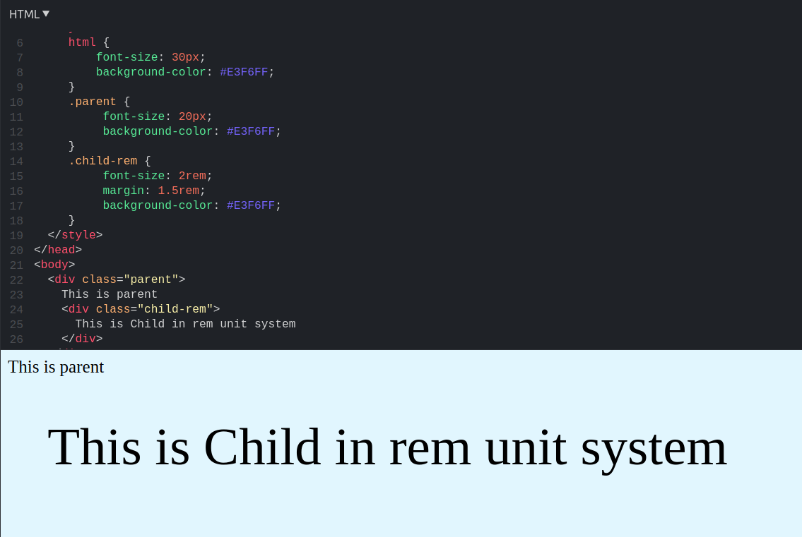
em in CSS
The CSS unit em has the same value as the parent element's determined font size. For instance, if a div element has font: 16px; specified, 1em will be 16px for both the div and any children of the div.
When utilizing em in your project, it is recommended that you avoid explicitly defining font-size anywhere other than the root element. Using em CSS units effectively enables versatility in the sizes of different components while enhancing layout across the entire page.
The font size of an element in relation to its parent may be changed using the em unit. It thus manages to make it simple to sustain the size correlation amongst elements in a responsive design.
em manages further with layouts that demands submenu items to successively decline in font size, such as sidebar menu. It is possible to automatically scale the size of every child element in accordance with the parent size.
Font size properties that engage em units have a size that is related to the parent's font size. It is related to the font size of the underlying element when used on other attributes.
<!DOCTYPE html>
<html>
  <head>
    <title>Em vs Rem</title>
  </head>
  <style>
    html {
    	font-size: 30px;
    	background-color: #E3F6FF;
    }
    .parent {
    	font-size: 20px;
    }
    .child-em {
    	font-size: 2em;
    	margin: 1.5em;
    }
  </style>
  <body>
    <div class="parent">
      This is parent
      <div class="child-em">
        This is Child in em unit system
      </div>
    </div>
  </body>
</html>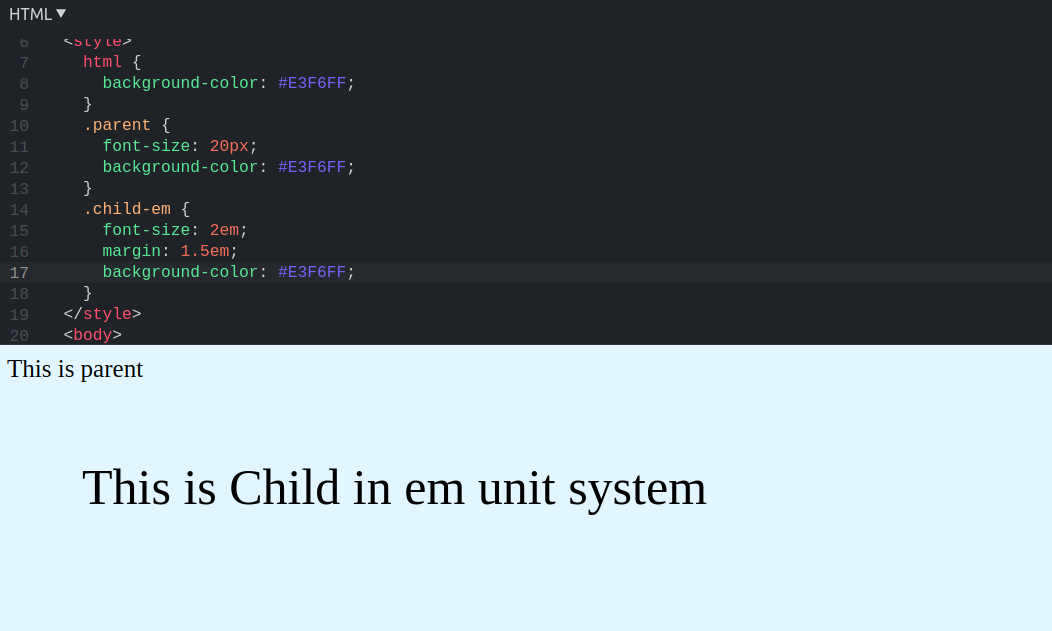
rem Units vs em Units
| Parameter | rem | em |
|---|---|---|
| Definition | Relative to the root element (html) font size | Relative to the parent element's font size |
| Consistency | Consistent, since it always refers to the same base font size | Can cause issues with cascading font size values |
| Default font-size | 16px (default font size of root element) | Based on parent element's font size |
| Browser support | Widely supported in modern browsers | Universal support |
| Use case | To size elements relative to the root element's font size for a consistent and scalable design | To size elements relative to the parent element's font size |
One of the major difference between em and rem CSS units is how the browser calculates their px value. It is important to understand this difference in order to determine when each unit should be used.
How rem unit is translated into pixel value?
The rem unit in CSS is translated into pixels based on the root element (html) font size. The default html font size of the root element is usually 16px, so 1rem is equal to 16px. To convert a rem value to pixels, multiply the rem value with the font-size of the root element.
Here's an example:
html {
  font-size: 16px;
}

body {
  font-size: 1.2rem;
}

p {
  font-size: 0.8rem;
}
In this instance, the body element will have a font size of 16 * 1.2 = 19.2px, and the p element will have a font size of 16 * 0.8 = 12.8px.
How em unit is translated into pixel value?
The em unit in CSS is relative to the font size of the parent element. If a parent element's font size is not specified, then it is relative to the root element's font size (which is usually 16px).
Here's an example:
html {
  font-size: 16px;
}

body {
  font-size: 1.2em;
}

p {
  font-size: 0.8em;
}
In this example, the body element will have a font size of 16 * 1.2 = 19.2px, and the p element will have a font size of 19.2 * 0.8 = 15.36px.
The belief that em units are relative to the parent element's font size is a common misunderstanding. According to the , em units are relative to the CSS font size of the element they are applied to.
Although, parent element's font size can indirectly impact the value of em units through inheritance.
Applying ems and rems in CSS
em is best used for values specific to specific elements and their children. By doing so, you can easily create a layout that adapts to a wide range of screen sizes and font sizes.
When using the rem unit for global values, such as font-sizes, margins, and padding, the document's size won't be affected by its parents' font sizes. Here are a few other ways in which rem and em can be applied;
- When it comes to sizes and spacing, use
rem. Media queries should be made usingem. - Choose
remunits to create elements that function based on user perceptions, andemunits to improve elements that rely on their parent elements to deploy. - An easily accessible website can be designed with features that can be customized to the requirements of the user by utilizing
remunits instead ofpxunits. - Developers may hastily tweak size values with
emunits and guarantee that their design elements will configure accurately. The main benefit provided byemunits is the ability to use a font size other than the html element's to determine sizing values.emunits ought to be employed exclusively in relation to a certain design feature because of this. remunits should be used on webpages instead ofpxunits since they ensure stable sizing irrespective of elemental inheritance. The important application ofremunits is that they offer a mechanism for user font size options to impact each single component of the platform's design.
Conclusion
Em and rem are two different CSS units which are identical, configurable, and related. Relying on the font sizes in your design, the browser interprets rem and em units into pixel values.
Em CSS units are evaluated depending on the element's font size. Inheritance of CSS font size from any parent element can affect rem units.
While some prefer to use em CSS units to indicate where items are positioned on the screen concurrently with their parent elements, others prefer to use rem units for consistency and predictability.
The chief difference among them is how webpages quantify pixel values. Rem is renowned owing to its flexibility , responsiveness, and reliability. Even though em might be challenging adopt, it might be the top choice if you prefer your webpage to be upgradable.
Monitor Your Entire Application with Atatus
Atatus is a Full Stack Observability Platform that lets you review problems as if they happened in your application. Instead of guessing why errors happen or asking users for screenshots and log dumps, Atatus lets you replay the session to quickly understand what went wrong.
We offer Application Performance Monitoring, Real User Monitoring, Server Monitoring, Logs Monitoring, Synthetic Monitoring, Uptime Monitoring, and API Analytics. It works perfectly with any application, regardless of framework, and has plugins.

Atatus can be beneficial to your business, which provides a comprehensive view of your application, including how it works, where performance bottlenecks exist, which users are most impacted, and which errors break your code for your frontend, backend, and infrastructure.
If you are not yet an Atatus customer, you can sign up for a 14-day free trial!
#1 Solution for Logs, Traces & Metrics
 APM
APM
Kubernetes
Logs
Synthetics
RUM
Serverless
Security
More