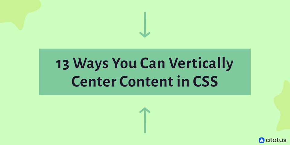
13 Ways You Can Vertically Center Content in CSS
It was always a struggle to center items in the vertical axis, whether we were trying to position an icon or image beside the text, build one of those popular "hero" banners, or a modal overlay. Vertical centering components in CSS is not the easiest task, despite the fact that it is conceptually straightforward. This was especially true before modern CSS elements like flex and grid were supported by browsers.
We'll look at some older methods as well as some more recent methods for vertically centering content in CSS in this article. Since there is no one-size-fits-all answer to this problem, and each one has its own set of constraints, it isn't a bad idea to be familiar with all of these strategies in order to discover the best solution in various cases.
Vertical Center
CSS makes horizontal centering a breeze. When an inline element has to be centered, we utilize the text-align center on its parent. We give the element width and set the left and right margins to auto when it's a block-level element.
Most people use vertical-align first when using text-align: center to center things vertically. If you're used to working with tables, you're probably familiar with the vertical-align attribute, which may lead you to feel vertical-align is the way to go.
Vertical-align, on the other hand, only functioned on table cells. Vertical alignment is a similar concept. It also works with some inline items and applies to table cells. Vertical-align values have meaning in relation to a parent inline element.
- The values for a line of text are proportional to the line height
- The numbers in a table cell are relative to the table height algorithm, which is normally the row's height
Unfortunately, vertical-align does not apply to block-level components such as a paragraph within a div, which is where most of us realize it isn't the be-all and end-all for vertical centering.
We do have alternative techniques for centering block-level items, and we can still use vertical-align where appropriate, so it's not all bad. Which approach you use will be determined by the item you want to center in relation to its container element.
We will go over the following:
- Margin Auto
- Negative Margin
- Translate
- Tables and Vertical Align
- The Ghost Element
- Flex Items and Align Self
- Flex Container and Margin Auto
- Ghost Items Inside a Flex Container
- Grid Container and Align Items
- Grid Item and Align Self
- Grid Container and Margin Auto
- Ghost Elements on the Grid
- Exact Element Placement
#1 Margin Auto
The position property can be used to center an element vertically, which is an older CSS trick.
We can set the margin to auto and give the top and bottom positions of the element equal values. This automatically places the element on the y-axis with proper margins. To prevent the element from spanning the entire height, we must set the height of the element specifically. We've set the top and bottom positions to zero in this example.
.container {
	position: relative;
}

.center {
	position: absolute;
	top: 0;
	bottom: 0;
	margin: auto;
	height: 50vh;
}
#2 Negative Margins
For many developers, this was one of the first and is still their go-to method. In this method, the top is placed in the vertical direction at halfway (50 percent). Then, using a negative margin, move the element's upper half over the mid-point.
.container {
	position: relative;
}

.center {
	position: absolute;
	top: 50%;
	left: 10vw;
	right: 10vw;
	height: 50vh;
	margin-top: -25vh;
}
#3 Translate
We can modify the last centering method to find a solution that solves the explicit heights problem. We use translateY to move the element up 50% along the y-axis after putting the top of the element in the center.
.container {
	position: relative;
}

.center {
	position: absolute;
	top: 50%;
	transform: translateY(-50%);
}
#4 Tables and Vertical Align
Using the behavior of table cells and vertical-align to center an element on the container is fairly easy and one of the first approaches back in the day, when everything was tabled.
For content inside table cells, CSS provides the vertical-align attribute. We may use this to center the content by declaring the element a table cell (and its parent as a table). Set the display of a div to table-cell if you're using one. You can also utilize actual table elements, however, this is not a semantically accurate option.
.container {
	display: table;
	height: 100%;
}

.center {
	display: table-cell;
	text-align: center;
	vertical-align: middle;
}
When using tables, you don't have to define a specific height for an element like you did with the previous centering technique. This solution, however, isn't optimal if you wish to position a non-centered element inside the cell.
#5 The Ghost Element
Using inline-block with a ghost (pseudo) element that has 100 percent of the parent's height and setting the vertical-align property to centre is another oldie that hasn't caught on for some reason.
.container::before {
	content: '';
	display: inline-block;
	height: 100%;
	vertical-align: middle;
	margin-left: -1ch;
}

.center {
	display: inline-block;
	vertical-align: middle;
}
Because of the constantly cringy behavior of whitespace between inline-block components, it really works fairly nicely, with the most visible "gotcha" being that it moves the horizontal center just a little to the right.
Flex for Vertical Centering
It's fair to claim that the introduction of flex solved a lot of web developers' design problems, including vertical centering. We can simply create simple, responsive, and uncomplicated vertical centering solutions with this contemporary addition to CSS.
The only disadvantage of these flex-based solutions is that older versions of Internet Explorer do not support them (below IE9). To support older browser versions, you must use the WebKit, Moz, or ms prefix. Even so, flex gives you a lot of versatility when it comes to managing page layouts and element placement.
The align-items and justify-content attributes can be used to control the alignment of items within the parent flexbox. If the flex-direction equals row, set align-items to center vertically centers all items inside the flexbox.
.container {
	display: flex;
	align-items: center;
}
#6 Flex Items and Align Self
This method allows you to vertically center only one element within a flexbox. To place the element in the center, it uses the flex attribute align-self.
.container {
	display: flex;
}

.center {
	align-self: center;
}
#7 Flex Container and Margin Auto
Setting the margin to auto is another way to center a single element in a flex container. The browser then generates proper margins in both directions automatically.
.container {
	display: flex;
}

.center {
	margin: auto;
}
#8 Ghost Items Inside a Flex Container
Using ghost elements to center content isn't the most attractive solution. However, it completes the task. As a result, you'll have more vertical spacing flexibility. Multiple items can be stacked inside the flexbox and ghost elements can be used to push them to the center.
.container {
	display: flex;
	flex-direction: column;
}

.container::before,
.container::after {
	content: "";
	flex: 1;
}
CSS Grid for Vertical Centering
Grid is one of the most significant CSS additions in recent years. Vertically centering with a CSS grid is simple since it allows us to adjust the layout along both the x and y-axis. It also gives us a variety of options for accomplishing this goal.
Grid is similar to flexbox in that older versions of current browsers, such as Internet Explorer, Chrome, and Firefox, do not fully support it. Even though grid support isn't accessible by default in some older versions, you can enable it.
The first several methods for vertical centering with the grid are identical to those used with flexbox.
#9 Grid Container and Align Items
By setting the align-items attribute to centre, we may vertically centre all items within a grid.
.container {
	display: grid;
	align-items: center;
}
If you wish to vertically center numerous items within the parent element, divide the grid into columns and arrange them in a row.
#10 Grid Item and Align Self
If you simply want to center one object within the grid, use align-self: center to style that item.
.container {
	display: grid;
}

.center {
	align-self: center;
}
#11 Grid Container and Margin Auto
We may vertically center a single item inside a grid by setting its margin to auto, just like we did with flexbox.
.container {
	display: grid;
}

.center {
	margin: auto;
}
#12 Ghost Elements on the Grid
The ghost element method we used with flexbox may be used to CSS grid. To do so, we'll need to start by making a three-row grid. The ghost elements we add then take up the first and last rows' space, pushing our element to the center row.
.container {
	display: grid;
	grid-template-rows: repeat(3, 1fr);
}

.container::before,
.container::after {
	content: "";
}
#13 Exact Element Placement
With the use of numerous item characteristics, the grid allows us to designate the exact location where an element should be positioned. This feature allows us to insert an element in the exact middle of a three-row grid, making our lives easier.
.container {
	display: grid;
	grid-template-rows: repeat(3, 1fr);
}

.center {
	grid-row: 2;
}
And It’s a Wrap!!!
Some methods are better suited for inline components, while others are better suited for block-level elements. Some may function better with your preferred method of building a layout, while others may not operate with earlier versions of a well-known browser.
We rarely center items in a design vertically. The line-height approach and the equal padding method are two of the most common methods we use. We've always been able to get by with one or the other.
None of the methods above are difficult, and we are confident that once you've tried them once or twice, you'll find them simple to repeat. The challenge, if there is one, is that none of the methods listed above are ideal for every situation. The trick is to be aware of several of the above and to know how to apply them appropriately.
Monitor Your Entire Application with Atatus
Atatus provides a set of performance measurement tools to monitor and improve the performance of your frontend, backends, logs and infrastructure applications in real-time. Our platform can capture millions of performance data points from your applications, allowing you to quickly resolve issues and ensure digital customer experiences.
Atatus can be beneficial to your business, which provides a comprehensive view of your application, including how it works, where performance bottlenecks exist, which users are most impacted, and which errors break your code for your frontend, backend, and infrastructure.
#1 Solution for Logs, Traces & Metrics
 APM
APM
Kubernetes
Logs
Synthetics
RUM
Serverless
Security
More