CSS Margin vs. Padding
Developers can adjust the space within and outside of elements on a webpage using the CSS margin and padding attributes to give it the appropriate look and feel.
Despite how crucial these qualities are, most developers, especially beginners, frequently misunderstand them. The controversy around CSS margins vs. padding is clarified in this article.
We'll discuss the CSS box model, the definitions of the margin and padding properties, when to use each one, and how, as well as the differences between them.
We will cover the following:
- Overview
- CSS Box
- Margin
- Padding
- How to Create Margin with CSS?
- How to Create Padding with CSS?
- What is The Difference Between Margin and Padding?
- When to Use Margin and Padding?
- Tips for Using Margin and Padding
Overview
A website's visual appeal is equally as significant as its content. Even if your website has unbeatable content, it won't matter if the interface is poor and the website's elements are scattered throughout.
To avoid this, be sure to design everything with the margin and padding properties in mind.
This is why it's vital to examine the differences between padding and margin.
CSS Box
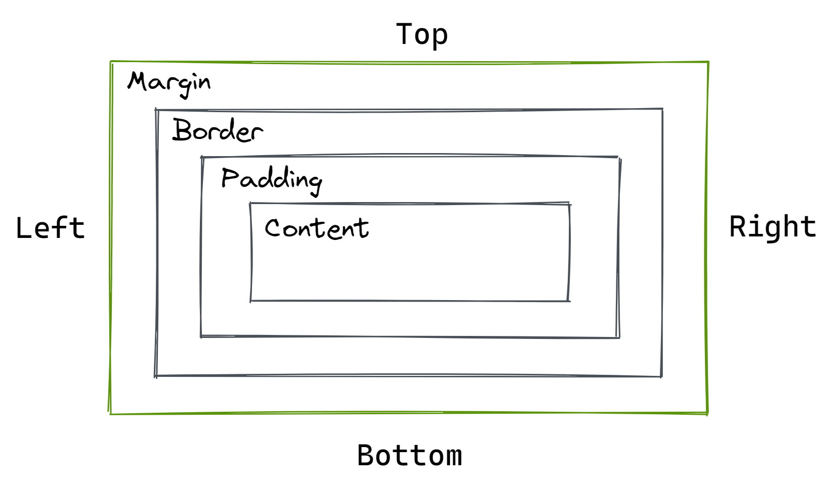
Understanding the CSS box model and how HTML elements render when it is applied is essential for understanding CSS margin vs. padding.
Every new HTML element that is introduced to a page appears as a box in the browser.
The content edge, padding edge, border edge, and margin edge are the four sections that make up each box and are determined by their respective edges.
Let's explain the four regions of each box using the preceding graphic as an example.
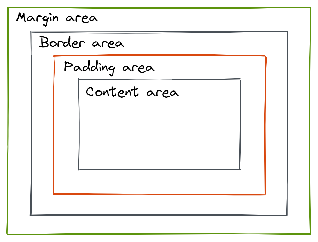
1) Content Area
The value of the supplied HTML element is represented by the content area, which is determined by the content edge.
For instance, the content of an element added to a webpage renders as text, but the content of an element added to the same webpage renders as an audio player.
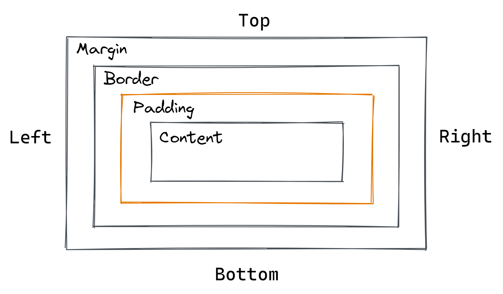
2) Padding Area
The padding area, which is enclosed by the padding edge, surrounds the content area. The area between a component's content area and border area is known as the element's padding area.
The CSS padding shorthand property or one of its sub-properties can be used to specify the padding area's size: padding-top, padding-right, padding-bottom, and padding-left.
The ability to set the padding area's size using the CSS padding property is essential because an element's padding area size has a substantial impact on or can significantly enhance the presentation of information on a webpage.
3) Border Area
The border area follows, which serves as the edge or shield for the box encircling every block-level HTML element and surrounds an element's padding area.
By including the CSS border property in an element, the border area is made visible.
4) Margin Area
An element's border area is separated from other elements around it by an invisible area called the margin area, which is specified by the margin edge.
The CSS shorthand margin property and its sub-properties determine the margin area's size: margin-top, margin-right, margin-bottom, and margin-left.
Margin
A margin is an area around an element on a website page, such as an image, body content, headline, or navigation. It is that defined space that exists between two elements' edges or borders. An element is surrounded by a margin, to put it simply.
Margins are a component of the CSS box model, which includes all the characteristics of HTML element features, and are intended to enclose a piece of content. When designing a website, you can choose and modify the margin property's size whenever you like.
The spacing between two elements can be specified using CSS margins' properties. Typically, they are transparent with no background color to establish that clear boundary.
The following are some popular CSS margin properties:
- Margin: This property is utilized to set every other property in a single declaration.
- Margin-left: This is used to set an element's left margin.
- Margin-right: This is used to set an element's right margin.
- Margin-top: This is used to set an element's top margin.
- Margin-bottom: This controls how much room an element's bottom margin has.
Margin can be configured in terms of length, percentage, and inherit values, just like padding. But it also encourages:
- Auto – A suitable margin value will be determined by the browser for use. In most cases, it will center on the web element.
- Negative Values – Brings elements closer to one another.
The typical margin code is:
div {
    margin: 50px;
    margin-top: 20px;
    margin-right: 40px;
    margin-bottom: 70px;
    margin-left: 20px;
}
Margin also has a shorthand feature in CSS called margin:. Additionally, the quantity of values affects it:
1) Four Values
If you wish to figure out the margin's four sides. For example:
margin: 100px 25px 100px 25px;2) Three Values
Appropriate when both the right and left margins are equal:
margin: 100px 25px 100px;3) Two Values
The first number refers to the top and bottom margin, meanwhile the second value addresses the right and left margin:
margin: 100px 25px;4) One Value
When you need the length of the four margins to be the same. For example:
margin: -30px;Type the following code to automatically set the margin:
div {
    width: 250px;
    margin: auto;
}
The element will be placed in the container's horizontal center. In other words, the element will occupy the set width, and the left and right margins will each take up the same amount of space.
When moving elements up, down, left, right, or in the middle, use a margin. Margin also affects the space between elements. Margin can also be used to overlap components in addition to that.
You could use a margin, for example, to overlay another image on top of the image element. Alternatively, specify a certain space between the text box and the image.
Padding
The space between an element and the border box around it is represented by padding, another element of the CSS box model.
To prevent the content of an image or piece of text from hitting any portion of the border box or other surrounding elements, padding controls the area that surrounds the object within a defined boundary. When designing page elements, you can build padding and modify it as you see fit.
Padding lets you add space inside an element's boundaries as opposed to the margin, which only lets you add space around the outside borders of other elements.
The following are some popular CSS padding properties:
- Padding-top: A padding-top makes room above the concerned page elements.
- Padding-right: Right-side padding makes room inside the element's right-side borders.
- Padding-bottom: You can add a room on the lower side within the element's boundaries by padding the bottom.
- Padding-left: You can leave room on the left side of the element within the given borders by using padding-left.
You can alter the values of an element's padding property as follows:
- Length – A fixed value, typically expressed in px, pt, or cm.
- Percentage – The padding's size is proportional to the element's width.
- Inherit – Enables the parent element to be followed by the CSS padding properties.
Remember that auto and negative numbers cannot be used as paddings.
Here is an example of a typical padding CSS code:
div {
    padding-top: 30px;
    padding-right: 50px;
    padding-bottom: 30px;
    padding-left: 50px;
}
The shorthand for padding is padding:. The code above is condensed into a single line. This is done to avoid having a lengthy CSS file, which could extend the time it takes for your website to load.
There are one to four values that the padding shorthand property can take.
1) Four Values
Sometimes it is necessary to define the top, right, bottom, and left padding values. For instance, the code above could be expressed as:
padding: 30px 50px 30px 50px;2) Three Values
You can combine the values for the right and left padding if they are the same length. The code would then be:
padding: 30px 50px 30px;3) Two Values
The first number refers to the top and bottom padding, meanwhile the second value addresses the right and left padding:
padding: 30px 50px;4) One Value
When you wish to give the padding's four sides a single length specification. For example:
padding: 30px;When you don't want the content of an element to extend past the boundaries of its container, use padding. Additionally, you can use it to change the size of web elements.
How to Create Margin with CSS?
Use CSS to create margins by doing the following actions:
- Margin Order and Properties
You can set four margins around any element in the CSS panel of your browser in the following order: top (margin-top), right (margin-right), bottom (margin-bottom), and left (margin-left). - Choose The Margins You Want to Adjust
One to four values can be used to set margins. Apply one value if you want an element's margins to be the same on all sides. It matters which order two or more variables are applied if you want various amounts of space. Only the top and bottom are impacted by two values, followed by the right and left. Top, right, and left margins are impacted by three values, followed by bottom margins. The margins on the top, right, bottom, and left are each affected by four variables. - Give The Value
Manual margin settings can be made with lengths or percentages. You can also use the inherit function to take the padding from the parent element or the auto function to allow the computer browser set them. The "%" symbol is used for percentage, while the units used for length are pixels (px), points (pt), and centimeters (cm). - Avoid Collapsing
The two margins can combine in a process known as "collapse" if an element with a bottom margin is followed by an element with a top margin. To generate more space between those two pieces, the larger margin absorbs the smaller one. Use the block formatting context function to contain the element to prevent collapse, or make formatting rules for the contents of flex and grid containers.
How to Create Padding with CSS?
To create padding in CSS, follow these steps:
- Padding Order and Properties
Like margins, padding can be adjusted to surround four sides in the following order: top (padding-top), right (padding-right), bottom (padding-bottom), and left (padding-left) - Choose The Number of Sides You Wish to Pad
Again, you can set padding using one to four values, with one value having an equal impact on all sides. Only the top and bottom are impacted by two values, followed by the right and left. Top, right, and left margins are impacted by three values, followed by bottom margins. The top, right, bottom, and left margins are each impacted by four values. - Give the Value
Padding can be controlled by length, percentage, or inheritance.
What is The Difference Between Margin and Padding?
Although these two CSS attributes are similar and frequently used interchangeably, they are quite different, and web developers can benefit from knowing these differences.
#1 Spacing
Padding controls the space between an element's border and its content, whereas margin controls the space between the border and the components around it. This is one of the key differences between margin and padding.
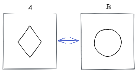
The extra room created by utilizing the margin property is depicted in the figure below. The arrow denotes the extra margin (invisible space) that is placed between the two pieces to prevent them from being too near to one another.
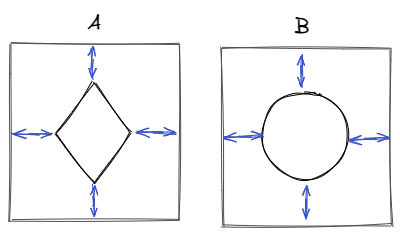
In contrast, the illustration below shows the extra space created by padding. The arrows represent the padding that has been applied to prevent the content (the circle and triangle) from being too close to the edge of the element.
In short, margin allows us to establish space between elements whereas padding allows us to specify space inside of an element.
#2 Background Color
The margin and padding don't show any extra space. However, padding will no longer be invisible if a background color is added to an element since it takes on the color of the element, while the margin-free space is still hidden.
#3 Set to Auto
When margin: auto is applied to an element with a fixed width, the element is horizontally centered (or vertically when using a flexbox).
Additionally, this functionality is incredibly helpful because centering elements have always been difficult for web developers to understand or remember.
On the other hand, padding cannot be set to auto.
#4 Negative Value
If you want elements to overlap, you can set margin values to be negative. When you wish to use gorgeous designs on your website, this negative value might be really helpful.
However, padding values can only be positive since negative padding makes the content area smaller than the content itself by causing borders to intrude into the content.
#5 Inline Elements
Padding modifications are only visible on the left and right sides of an inline element; the top and bottom are not affected.
When to Use Margin and Padding?
What are the appropriate times to utilize padding and margin?

As much of padding vs. margin, including their differences and functions, has already been covered, the next part will concentrate on the situations in which one is preferable over the other.
When designing or updating website layouts, you will need to make layout adjustments as you go. At the same time, you must decide whether to modify the current margins and padding to achieve your goals.
When Do I Use a Margin?
There are a few justifications for a designer using margin in CSS code:
- Make space for objects on a website, such as a photo and the text that describes it.
- Adjust the spacing between items
- Keep things from touching each other
- Overlap elements
- Horizontally center an object in space
- A component can be moved up, down, or side to side.
Shorthand margin property codes resemble padding and appear like margin-top, margin-bottom, margin-right, and margin-left.
There is a shortcut you can use to modify the size of all the regions at once: margin: 50px. This increases the side spacing by 50 pixels.
When Do I Use a Padding?
Are you unsure about when padding is the right choice for your CSS design?
Here are a few explanations for why you might utilize padding:
- Padding is used if you don't want the content to touch the container's edges.
- Padding is also used when an element's background should be seen in the empty space.
- The element's size can also be increased, for example, by making a button bigger.
Padding-top, padding-bottom, padding-right, and padding-left are a few examples of padding codes. The amount of padding around content on a webpage can either enhance or harm its appearance.
The padding area is surrounded by a border area as well. This serves as the boundary for the box that envelops each block-level HTML element. Simply add the border property to an element to make the border area visible.
Also Read: 13 Ways You Can Vertically Center Content in CSS.
Tips for Using Margin and Padding
With margin or padding, certain content elements may look and function better. So, when choosing between the two, keep it in mind. The following tips may also be helpful to you:
- If you're creating a responsive grid, utilize padding rather than margin to add space within a column.
- If a web page includes numerous columns that would stack vertically on a smaller screen, use padding on the columns.
- When putting a border around the text, image, and container elements, use the margin properties.
- To create uniform spacing between elements, add bottom margin first.
- Include a bottom margin when a container is positioned inside a column. When content is stacked vertically on smaller displays, it will add extra space.
- Instead of padding, which impacts the button style, use margin to create space around buttons.
- Use margin to provide more space around interactive elements.
Also Read: HTML Fonts (Web Fonts).
Conclusion
Both margin and padding are space-adders for web elements in CSS, although they have different effects. The space between an element's content and its border is known as padding. On the other side, the margin defines the element's outermost space.
Choosing which property to use while constructing a website can be a little challenging for beginners. But as you experiment and play with them, you'll get to know them better.
Atatus Real User Monitoring
Atatus is a scalable end-user experience monitoring system that allows you to see which areas of your website are underperforming and affecting your users. Understand the causes of your front-end performance issues and how to improve the user experience.
By understanding the complicated frontend performance issues that develop due to slow page loads, route modifications, delayed static assets, poor XMLHttpRequest, JS errors, and more, you can discover and fix poor end-user performance with Real User Monitoring (RUM).
You can get a detailed view of each page-load event to quickly detect and fix front-end performance issues affecting actual users. With filterable data by URL, connection type, device, country, and more, you examine a detailed complete resource waterfall view to see which assets are slowing down your pages.
#1 Solution for Logs, Traces & Metrics
 APM
APM
Kubernetes
Logs
Synthetics
RUM
Serverless
Security
More